Download
1 / 15
160 likes | 385 Views
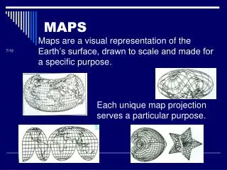
POLITICAL MAPS. Jeffrey Pang. Creative Commons 2.0, March 2009. Map from: http://www.maps-for-free.com/. Maps can tell you a lot :

E N D
POLITICAL MAPS
Jeffrey Pang. Creative Commons 2.0, March 2009 Map from: http://www.maps-for-free.com/ Maps can tell you a lot: This location is a coastline, has some rivers, and seems to have a pretty tall mountain range. The climate seems pretty mild on the coast, but it also gets drier as you go east. Without some sort of context, it is hard to tell where this is. The mountain range on this map is the Sierra Nevada Mountains in California and Nevada. But how could you know that?
It is always better when you can see all the coastlines. You will have more patterns to help you figure out what you are looking at. • Geography helps us understand why things are the way they are in the world. • But if we do not know where we are, it’s kind of hard to understand those lessons. Anyone know where this is? You might spend a while looking for these details on a large map. It’s kind of like seeing pictures in clouds, whatever it takes for you to remember a few of these for each area of the world, you need to do it! It would also be nice to see the whole picture! Like the boot of Italy means you are in Europe Or the “peace” fingers of the Red Sea mean you’re in the Middle East
It always helps to look for patterns on maps, but everything gets a little easier when the maps become “political”. Political maps add human factors and characteristics to the geography. Below we see changes to the map when the countries have been added. Mirar abajo. Creative Commons 3.0, 2008. Mirar abajo. Creative Commons 3.0, 2008. Outline Map of Europe Political Map of Europe with countries
Political Map of Europe Often there is a color change between countries on political maps. This can help you see the borders more clearly. However, in this case the colors do not really have any other special meaning.
Physical Map of Europe You can pick up a lot of geographic patterns and predict what geographic issues might occur by using a physical map.
Physical and Political Map of Europe Even though there is no map legend on this one, everyone can tell where the mountains and rivers are located.
http://mapofeurope.com. Used with Permission for this instance only. This travel map does not seem to have too much detail about this region’s physical geography. However, could you use this map to figure out some characteristics of the physical geography of Europe?
Stefan2904. Creative Commons 3.0, April 22, 2007 Where are the wealthiest countries in Europe? Which countries in Europe have a large enough population to require a large amount of power resources? It can get a little complicated when maps start adding in other types of data. This map indicates the locations of the nuclear reactors in Europe. Political maps within a GIS system can tell you a lot. Take a look at this map and see what you can find out.
POLITICAL MAPS • Election maps are thematic maps like any other. We are most familiar with the maps that appear on the TV on the night of the presidential election. • Most of the election maps will appear in two colors: red and blue. This is unlikely to change in the United States anytime soon. It has been a long time since a third political party, or any independent candidate that did not have a party, has been a serious candidate for President. • However, we have had several elections where there were more than two candidates. That is OK, if you get one of those maps on the EOC test, just follow the key and use your head. You will be fine.
Election maps are thematic maps like any other. We are most familiar with the maps that appear on the TV on the night of the presidential election like the one below. 2004 Presidential Election Map
These maps can be a lesson in population density. This is a map of the results of the 2000 presidential election, the closest in history. A lot more people live in blue states than the red. In fact, Al Gore (blue) actually had more votes than George Bush (red) in this election, but the electoral college, which you learned about last year, gave it to George Bush. Interesting Note: Florida was the last state to be decided. In the end, when all the counting was done, it appears George Bush won the state by fewer votes than there are students in this school!
Usually on the maps of the United States the conservative Republican party is red and the more liberal Democratic party is blue. It is the opposite on this political map of Latin America. It does not matter, a key is a key! Always analyze the key! Unknown. Creative Commons 3.0, November 2010.
Alaska New York So tell me about the population density of the US and how it might relate to those political maps you just saw. Dallas
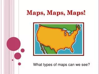
The more complicated the map, the more it has to tell you. You may have heard the statement: “Maps are the language of geography”. Maps are very much a language. Your job when you look at a map is to understand the “language”. What is it trying to tell you? If you can figure that out, you can handle just about any map.