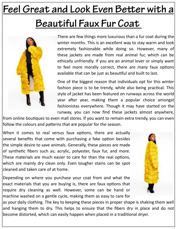
Download
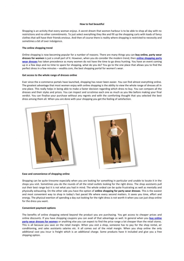
1 / 18
200 likes | 425 Views
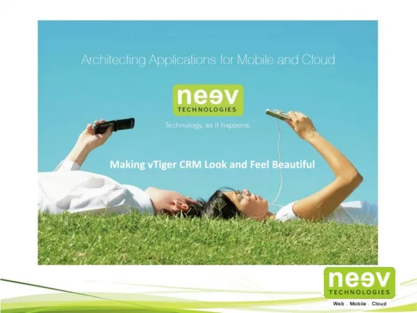
Making vTiger CRM Look and Feel Beautiful

E N D
Why change vTiger? • Neev has always been a huge supporter of Open Source Software. In fact, many Neevites are active contributors. • We found that the UI/UX community is inactive when it comes to its participation in Open Source. • The result is that many popular applications today do not have a good User Interface (UI)/User Experience (UX). • So, the UX team at Neev has come up with a makeover for vTiger, one of the most popular CRM systems. • The following slides would cover some of our redesigns and the philosophy behind these changes.
Navigation Tree • Nowadays, most of the laptops and LED screens available in the market are wide-screened. • vTigerhas a top navigation bar under the logo, which means close to about 80 px of vertical space is taken up by the logo, search and navigation bar. • So, we compressed the logo and search into the top, which in turn freed up some very valuable space (50px to be precise) for the content area. • We then made use of all that real estate on the sides by moving the navigation bar to the left so that the users are now able to see more content per screen.
Navigation Tree Before and After
Dashboard • vTiger’s dashboard does not serve the purpose of letting users see valuable information at a glance. • vTiger follows an out of date method of displaying charts where users have to either scroll up and down or click on the page to view the reports. • We fixed this by compressing the charts, making them look pretty and made all the charts visible on a single screen. • Now, be it sales figures or leads, this dashboard provides users everything at one go to enable better planning for activities. • Also, instead of having action items as text links, we added icons on the right to refresh a graph and edit it.
Dashboard Before
Dashboard After
Calendar • In the calendar page, half the screen is consumed by the header, tabs and the navigation bars so that the user has to scroll down to see the calendar. • We compressed all this to the top so that the user can now focus on the main calendar. • Although the ‘+’ and ‘Add’ icons exist, vTiger does allow the user to click on them. Instead, we added a ‘Quick Create’ button with a drop-down to select the task type. • Instead of having only the ‘previous’ and ‘next’ options to navigate the months, we listed out all the months in the available space and added a navigate bar to switch among months. The user is now spared from repeated clicking. • Similarly, the year can be selected from a simple dropdown at any time irrespective of the view mode.
Calendar Before
Calendar After
Trouble Ticket • In any ticket interface, with the volume of tickets being raised, the ability to filter through these tickets, sort and prioritise them is of utmost importance. • We decided to provide a nested filter within the column that will let the user filter and sort the tickets easily. • Also a status filter alone proves insufficient. So we added additional filters for Priority and Assignee. • Ticket titles are usually brief and generic which necessitates the reviewer to open each ticket to get an idea about it which is time consuming. We added a provision for a description of the ticket right below the title so that the user gets an idea or what the ticket is about at a glance.
Trouble Ticket Before
Trouble Ticket After
Documents View • For the documents page, instead of the tabular format, we came up with a typical blog editor style which is easier to manage. • The ‘search’ feature occupied quarter of the screen. So, we compressed it and moved it to the top right corner along with other icons which can be accessed whenever required. • All the actionable elements are organized instead of being spread out across the page. • Instead of a word-based description of the document type, we added icons to display the document type. As a visual aid, this proves easier to identify the type of document.
Documents View Before
Documents View After
The Final Word • When it comes to product development, although there is more emphasis on functionality and features, companies should also realize that UI and UX too play a crucial and critical role. • The addition of sophisticated technologies in the backend should lead to more productivity while using your product. • In case you are looking for help on Usability or User Interface of your project, feel free to Contact Us
sales@neevtech.com Neev Information Technologies Pvt. Ltd. Sweden Singapore India - Bangalore India- Pune USA Neev AB, BirgerJarlsgatan 53, 6tr, 11145, Stockholm Phone: +46723250723 #13 L’Square, 3rd Floor PariharChowk, Aundh, Pune – 411007. Phone : +91-64103338 The Estate, # 121,6th Floor, Dickenson Road Bangalore-560042 Phone :+91 80 25594416 #08-03 SGX Centre 2, 4 Shenton Way, Singapore 068807 Phone: +65 6435 1961 1121 Boyce Rd Ste 1400,Pittsburgh PA 15241 Phone : +1 888-979-7860