Download
1 / 12
120 likes | 240 Views
Analyzing a poster, website homepage, and teaser trailer created for a new horror film, incorporating common conventions seen in existing products to attract and engage an audience effectively.

E N D
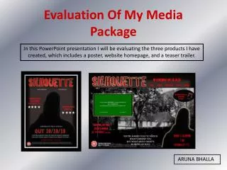
In this PowerPoint presentation I will be evaluating the three products I have created, which includes a poster, website homepage, and a teaser trailer. Evaluation Of My Media Package ARUNA BHALLA
Initial Planning As part of my A2 coursework, I created a promotional package for a new film. In this package I produced a poster, website homepage, and a teaser trailer. After studying, and analysing other existing products it was important to make sure my package consisted of common conventions that present day packages contained. I looked at three different films, and analysed, in great detail, the poster, website, and trailer for each particular film. This enabled me to form an accurate understanding over what a promotional package should consist of, and what common conventions are used to attract and sustain a high audience. By creating thorough textual reports on each product I was able to pick out key features that each item had. After looking at three different horror posters, I found that every poster had a simple, yet effective layout. They used dark colours, and a powerful font. I did this for three websites, and three trailers too. At the end I was able to create a list of common conventions that each product had; this then assisted me in creating my own products, and was a list I could refer back to, and gain ideas, to ensure my products remained realistic and conventional.
These are the three films that I analysed in detail, all three posters have similar features, and encouraged me to create a similar horror poster. Scary, font is used to create tension. Dark, dull colours are used. Each poster has the required credits, and institutional information. Actors names are another common feature.
Product Number 1 - Poster • After looking at those three posters, I gathered all the conventions found, and applied them to my horror poster. This was so my product worked successfully within the film industry. Firstly, I used a red, dark, ‘cracked’ as I felt this would be most suitable for my target genre, and would create tension for the audience. I used the actors names, as this was a common convention. I included the required institutional information, to create a realistic effect.
Product Number 1 - Poster Overall, I was generally pleased with my poster, as it contained the conventions many other existing posters contained. I noticed that horror posters never give too much away, and only have one main picture, therefore I only added the silhouette image. I used the colours black, and red to create a sense of fear, and add tension. Black connotes mystery, death and often evilness. These are all aspects that will be presented in my trailer therefore I feel my poster successfully promotes my trailer well. Red promotes blood, and suggests danger, again existing features that many horror films contain. It was conventional to add the actors/actresses names to encourage fans of specific actors to go watch the film. I noticed that in the three posters I analysed, two had a tagline that was present on the website and poster, therefore I added my own slogan to make my poster realistic and conventional. I added the line ‘INSPIRED BY TRUE EVENTS’ to add tension, and suspense for my target audience. Again this adds a sense of realism to the poster, and the audience are more likely to go watch something that is based on genuine facts.
These are the three films that I analysed in detail, all three websites have similar features, and encouraged me to create a similar horror website homepage. Product Number 2- Website Most websites are a good way to promote sales of the films, for example they encourage the target audience to purchase the ‘psp’ or ‘DVD’ version online, and there is usually a tab to present this. Each poster has tabs, that enables the audience to browse through the website There is usually a picture of the setting in which the film is set.
My website holds many conventions of a horror website, firstly I used a long shot of the house in which the film will be set. This is conventional as both ‘Vacancy’ and ‘The Strangers’ both had long shots of a location, therefore I wanted to follow this feature. Next, on the right hand side I added a link to encourage my audience to browse through the actors, and actresses that will be appearing in my film. I placed this tab on top of the silhouette as I felt it would be most effective, and grab the audiences attention. The same slogan that was on my poster appears in the middle of the website homepage, this was so my website sustained the same theme as my poster. On the top of the homepage there are a selection of tabs, which promote the website, they allow the audience to browse through the website and gain knowledge on the film. As most film websites are another way of promoting sales I added a tab advertising ‘PSP’ and ‘DVD’ sales. This is an effective way to promote the film to a higher extent and encourage extra sales. I felt it would be a good idea to show the trailer on the homepage, as this is a deciding factor as to whether or not people will go to watch the film. Product Number 2 - Website
Product Number 3 – Trailer Teaser trailers are an effective way to advertise a film, and encourage a specific audience to go watch a film. I analysed three trailers, and looked at certain conventions that each trailer had. • Most horror trailers were set in the dark, and used isolated settings. I have followed this convention successfully as I too used a dark, isolated setting. • There is usually fast, chilling music in the back ground to create suspense. My product also has similar music to create tension. • There is usually a chase scene in many trailers, and out of the three that I analysed two had a dramatic chase scene. My last scene is a chase scene, therefore I have conformed towards the conventions of a horror trailer. • Many horror trailers have a hopeless victim, this encourages the audience to sympathise with them. My trailer contains a girl, who seems hopeless. I am generally pleased with my trailer, it was the hardest product to create, and I put a tremendous amount of effort into ensuring my teaser trailer is effective and encourages the audience to watch the film.
Combination of main product and ancillary tasks. I created a website homepage, and poster as part of my ancillary tasks, and the teaser trailer is the main project. It is conventional for all three products to link together, and represent each other. Firstly we have the poster, and website, I feel these two products successfully combine together to create a conventional promotion package. I have used a set theme, which include the same colour background, font and style on both products; this is so the audience an establish a visual link between the two. Moving on, the website represents the trailer in an effective way too, it gives the audience an insight to what the teaser trailer will be about and who will be starring. The poster also promotes the trailer, it has the stars names, and the release date. Therefore it is clear to say that the website homepage, and poster complements the trailer, and each other. As I had analysed other websites and posters, I found that they too are combined together and hold the same sort of information. On horror posters, for example ‘when a stranger calls’ promotes the website address, therefore I felt it would be conventional to do the same. Many websites have a link to allow the audience to watch the trailer, supporting the argument that websites always link back to the main product, which in this case is the trailer. Overall, I am pleased with how my three products all represent each other, and successfully promote each other well.
Target Audience It was very important to keep referring back to the ideas my target audience put forward. I used my questionnaire, and internet forum as a means of what my target audience where looking for from a horror promotion package. I have used many ideas that my target audience have suggested for example one person recommended to ‘quick intense shots’ I have done this effectively in my trailer as I wanted to created tension and suspense. I noticed on my questionnaire many people voted for ‘everyday horror,’ ‘serial killers’ etc, therefore I have based my teaser trailer on a girl being followed and eventually chased by a serial killer. By following the ideas that my target audience wanted my teaser trailer will work successfully, and work within the horror genre. It is conventional for many directors, whilst producing films, to get suggestions from their target audience. This is so the film works effectively, and pleases the targeted audience. As for my poster, I continued to use my questionnaire results, which allowed me to create a realistic product, in which my target audience enjoyed. Firstly, the majority of people wanted to see the ‘release date’ and ‘a catchy slogan’; accordingly I added these features so that my poster holds the conventions of a real horror poster. When asked my target audience proposed the idea that they would like to see the trailer on the website homepage, therefore I added a link for my teaser trailer. Many people asked for the most ‘scariest part’ to be at the end, so in my teaser trailer I used the dramatic, scary scene at the end to create tension and attract my target audience. I learnt that it is important to consider what my target audience are looking for in a horror promotion package, because without their input my products will not work successfully. By following many ideas that my target audience put forward my products should be exciting, and appeal directly to my specific audience.
Media Technologies How did you use new media technologies in the construction and research, planning and evaluation stages? I used many different forms of technology whilst creating my media package, and I was introduced to new software. For my poster, and website I used Adobe Photoshop, because I had used this program last year I was able to develop my existing skills, and strengthen my confidence. For creating my teaser trailer I had to use Final Cut Express, a software in which I had never come across before. At first it was difficult to come to terms with certain icons, and I struggled to edit correctly. But once I got used to certain techniques I was able to edit, and create my teaser trailer effectively I learnt what certain buttons are used for, and how to create texts scenes. For my soundtrack, I used a program called ‘Garage Band’ this assisted me in creating an atmospheric soundtrack that would complement my trailer; again this was a software I had not used before, so I researched on how to use certain buttons and in the end created a conventional soundtrack. After I created my website with Photoshop, I used a program created specifically for websites. This enabled me to create working links on my website homepage. Equipment When I was shooting my scenes for my trailer, I used a camcorder, and a tripod. The tripod assisted me in making sure their were no shaky scenes. I had to re shoot many scenes, before creating the final trailer. The technology I used.
Original Images Images played an important part when I was creating my poster, and website. I decided to use a silhouetted man for my picture. At first it was difficult to create an effective image of just the outline of a person, as the lighting was a problem. So I used a digital camera, with the correct lighting, and changed the settings so that the picture was darkened. Finally I was able to produce a picture of just the silhouette. For my poster I only used that one picture, to create enigma, a common convention in the horror genre. Ifeel this picture is enough to keep the audience guessing as to what is going to happen. However for my website, I found it was conventional to use a long shot of a location; therefore I used a long shot picture of a house. To create tension, and to make the picture atmospheric I altered the colours to black and white this added suspense. Alongside the picture of the house I used the picture of the silhouette to sustain a running theme between the poster and website. I edited the pictures using Adobe Photoshop, and this enabled me to create a precise, accurate picture. As I used Photoshop my skills developed tremendously and I was able to create my products with confidence and ease. The original image of the silhouette. The original image of the house.