1 / 0

ENGL354 Language for Public Relations

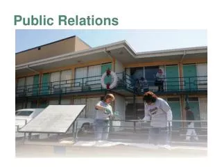
ENGL354 Language for Public Relations. Lecture 6 Public Relations at Work: Writing for the Web. http://www.polyu.edu.hk/dso/talks/20130326.html. All the mispronounced words… . EXPERT!!!! He is an EXPERT! (not “expertise”) Finances Competence Scrutiny. He has the ability to scrutinize!

naiya
Download Presentation

ENGL354 Language for Public Relations

An Image/Link below is provided (as is) to download presentation Download Policy: Content on the Website is provided to you AS IS for your information and personal use and may not be sold / licensed / shared on other websites without getting consent from its author. Content is provided to you AS IS for your information and personal use only. Download presentation by click this link. While downloading, if for some reason you are not able to download a presentation, the publisher may have deleted the file from their server. During download, if you can't get a presentation, the file might be deleted by the publisher.

E N D

Presentation Transcript


  1. ENGL354 Language for Public Relations

    Lecture 6 Public Relations at Work: Writing for the Web
  2. http://www.polyu.edu.hk/dso/talks/20130326.html
  3. All the mispronounced words… EXPERT!!!! He is an EXPERT! (not “expertise”) Finances Competence Scrutiny. He has the ability to scrutinize! Sanitation Public allies “She has a good looking” –WHAT?! What is a “good looking”?  She has GOOD LOOKS. 
  4. Today’s Lecture Introduction to Websites Writing for Websites Concise web writing Scannable web writing Objective web writing Interactive websites Website evaluation Blogs! Another web tool Website Design Phases Color schemes Genres of languages Analyzing iconic images
  5. Introduction to Websites
  6. Communicating with Publics: The Internet For centuries, the mass media controlled the flow of information: It is centralized. It costs a lot of money to become a publisher. One-way communication. The Internet came into widespread public use in 1990s: Widespread broadband. Cheap/free, easy-to-use online publishing tools. New distribution channels.
  7. Communicating with Publics: The Internet The internet is a “pull” medium  users go to websites because they need specific information. Traditional print media is “push”  information is pushed at receivers whether they want it or not. Through internet don’t just send information to every target audience, but “entice each individual, one at a time, to your site”. (Holtz, 1998)
  8. Communicating with Publics: The Internet A website, from a public relations standpoint, is a distribution system in cyberspace. Primarily a website serves two purposes: retail sales and/or image building Organizations use their websites to market products and services and post news releases, corporate backgrounds, product information, photos of key executives or locations Journalists use websites extensively to retrieve current news releases and other materials
  9. Communicating with Publics: The Internet PR Communications through websites can be (Theaker, 2008): Business to business: reaching third parties, shareholders, potential investors, industry bodies, analysts, trade media, etc. Business to consumer: reaching potential and existing customers through information resources, e-commerce systems, entertainment sites, etc. Internal: providing tailored information to staff, clients and affiliates using intranets, extranets, and password-protected areas on corporate sites.
  10. Organizations use their websites in different ways
  11. Communicating with Publics: The Internet Websites should follow same principles as all other corporate communications (Horton, 2001): Simplicity Timeliness Openness Definition Flexibility Individuality Meaningful Measurable
  12. Websites As a PR writer you should keep these things in mind: The Web is not linear  dynamic, interactive, interlinking medium. Conduct periodic online audits: establish your internet footprint. Caution: everything you do online leaves a mark! Be aware of these elements and think of how to develop them for your public: Structure Graphics Organization Writing You can’t just take existing texts and paste them on the web (shovelware).  Must adapt content. Reading from computer screens is much harder on the eyes than printed texts. You can address several different publics within one site. There is still a need for a planning sheet and careful consideration of the public!
  13. Publics and Websites Who are they? What are they interested in? What do they need to know? (What do they not need to know?) What is the reading level of your publics? Fluency and familiarity with the internet?
  14. Publics and Websites Example: Low-literacy users: less likely to scan text. They focus on each word  narrow field of vision (ignore objects outside the text). Will skip over whole chunks of language; lose place easily when scrolling down pages. Users with spelling deficiencies: cannot use internal search features easily. Consider: people with (learning) disabilities or teenagers.
  15. Publics and Websites Survey by Redsquare (UK firm) found internet users don’t like: Slow data speeds Disorganized mess – be consistent with your approach to visual identity, navigation, layout and the structuring of information. Substandard design Slow response – if you have a feedback option, be quick to reply (not more than a couple days). Don’t ignore enquires. Too much information – provide succinct, relevant punchy content!
  16. Writing for Websites
  17. Concise Web Writing Characteristics of effective writing for the web (Smith, 2012): Short Single Screen Active Voice Accurate Style Guide Also: accurate and stylistically consistent. Assume reader will scan only (won’t read content word-for-word). Make it easier for readers to download
  18. http://www.nytimes.com/
  19. Concise Web Writing Keep it short: readers don’t read word-for-word. Write for a single screen: readers don’t like to scroll. Use active voice: clear, more direct, more powerful. Write clearly: Use subheads, Meaningful subheads, Headlines: self-explanatory, context self-evident = plain titles. Emphasize accuracy: correct grammar, spelling  especially important on websites! Adopt a style guide. (webstyleguide.com)
  20. http://www.awfullychocolate.com/
  21. Brief interlude!!! In case you’re wondering, here’s the easiest, yummiest chocolate cake recipe! Ingredients 1 cup flour 1 cup sugar 1/4 cup unsweetened cocoa powder 1 teaspoon baking powder 1/4 teaspoon baking soda 1/4 teaspoon salt 3/4 cup milk, topped up with white vinegar OR plain yoghurt 1/4 cup shortening 1/2 teaspoon vanilla 1 egg 1/2 cup powdered sugar (for topping) Instructions In a bowl combine flour, sugar, cocoa powder, baking powder, baking soda, and salt. Add milk, shortening and vanilla. Beat with an electric mixer on low speed till combined. Beat on medium speed for 2 minutes. Add egg and beat 2 minutes more. Pour into a greased and floured (I use cocoa powder in place of the flour) 9" round cake pan. Bake in a 350 degree oven for 30 to 35 minutes or until a toothpick inserted in the center comes out clean. Cool on rack for 10 minutes. Remove from pan and cool thoroughly on a rack. Serves 8.
  22. Scannable Web Writing General tips: Information should be organized into segments. Keep in mind: it is more physically difficult to read from a computer screen than from a book! Use inverted pyramid style. Use simple background designs  makes the page load more quickly. Make use of table of contents, summaries, etc. Don’t use high-resolutions photos or graphics.
  23. Scannable Web Writing Chunked text: avoid long paragraphs. Links and navigation tools: Use well-placed links. Make sure your readers where to go next for any information they want. Use forward  and back  arrows. Include “back to homepage” . Table of contents: organize topically. OR: site map. Summary: readers tend to only read first sentence or paragraph.
  24. Bad website: http://www.englishaustralia.com.au/page.php?id=1
  25. Scannable Web Writing Legible text: Use simple type font (e.g. serif font) Use both capital and lower-case letters Black lettering  white background (other way around is less effective!) Use large-enough text. Avoid: moving, blinking, zooming. Color blindness: a genuine issue with readers. Simple background: Don’t overkill with graphics. Don’t use graphics just for show. Simple background color.
  26. Objective Web Writing Use: unexaggerated, non-promotional writing. NOT hype or “marketese”. Journalistic: avoid promotional writing associated with advertising. Information should stand on its own. Balanced in nature. Include links to other sites: showing readers to other websites is good business. Increases your credibility by helping readers compare with other sources. Keep these up to date.
  27. Interactive Websites http://www.aam.co.uk/ Consider including the following to help your reader obtain needed information, etc.: Email links Electronic forms Search feature Audio options Video options Animation: keep to a minimum. Use strategically! Cookie technology E-commerce Pop-up windows
  28. Website Evaluation Recognized sponsor: observe domain name (.com? .edu? .org?), follow legitimate and recognized organization/individual. Verifiable information: quality websites will have documentation about the source. Email contacts should be provided for author or webmaster. Authoritative information: information should be attributed to an expert authority. The site should include information about qualifications/credentials. Differentiate between official organizational information or individual opinion.
  29. Website Evaluation Objective information: it should be clear if a website is advocating a cause, selling a product, soliciting support, or offering objective information. Up-to-date information: stay current. Quality sites note revision dates for all pages. Annual statistics: should be updated at least yearly. Comprehensive information: provide a range of information. Audio-visual elements: need to supplement the written information.
  30. Website Evaluation Quick loading features: images, charts, etc. slow down websites loading. Text should load before graphics. Use smaller-size photos and include links to larger versions if necessary. Offer different options for downloading: flash vs. simple format. User-friendly: keep the user in mind. Site maps, menus, internal search tools  very useful. Forward/back buttons. Single-screen pages.
  31. Website Evaluation Accessibility: every potential user should be considered. International websites: multi-lingual options. Consider: visual, hearing, motor handicaps. Double check if there are any guidelines/laws regarding usability. Culture consideration: be culturally sensitive
  32. Summary: Writing for the Web Define the objective of the site. Design the site with the audience (public) in mind. Don’t just place existing materials on the site; redesign the material with strong graphic components. Update the site constantly. Don’t overdo graphics. Complex graphics take a long time to download. Make the site interactive. Use feedback to evolve the site.
  33. Blogs! http://www.cakewrecks.com/home/2013/3/13/ken-day-come-ons.html
  34. http://nevertoosweetforme.com/
  35. http://thepioneerwoman.com/
  36. http://myplasticfreelife.com/
  37. Blogs http://frugaltraveler.blogs.nytimes.com/ http://blog.ted.com/ Started around 2006ish. Online diary style writing. Effective tool for organization’s PR to communicate. Usually involves several contributors. Blogs serve as a sort of online newspaper or newsletter.  No media gatekeeper. Upside: can be own reporter, editor, publisher. Downside: newspapers have higher credibility.
  38. Blogs Blogs invite readers to comment, so readers can interact with the organization and each other. Scroll down style in single view. Articles are time-stamped. Blogs can feature achieves and tags, to make it easy to access older posts. Becoming more multi-dimensional and gradually merging with websites.
  39. Blogs Benefits of blogs for PR: Can encompass the corporate image (e.g. simplicity). Personalizes the company: employees can contribute and present their ideas/opinions.  Builds credibility/trust/likeability/familiarity. Can help the reader understand the usefulness of your products or services. Can present these topics in a fun and engaging way. Can develop long-term relationship between organization and publics. Create loyalty and continue bringing people back to website. Blogs can invite users to subscribe to get email updates  brings more traffic to the site. Comments on blogs serve to create interaction and engagement between organization and readers.
  40. Blogs Logistical things to include with blogs: Consider a style/design that fits the corporate image. Include who writes articles. Can include pictures/graphics, music links, videos, etc. Date Tags Comments (monitored) Condense them with “read on” option/link. Opportunities to share: twitter, facebook, google plus, etc. http://blogs.panasonic.com.au/consumer/
  41. Blogs Attracting readers: Teenagers and young people focus more on social media sites. Blogs attract adults. Develop site towards readers: offer information, how-to’s, tips, advice.
  42. Examples of Good Corporate Blogs: YouTube: http://youtube-global.blogspot.ie/ Tells about new features/products. Shares new videos. Tells about special promotions/programs. Patagonia: http://www.thecleanestline.com/ Tells adventure stories from people they sponsor, creation of new products, climate campaigns, stories from employees. Guest posts from environmentalists. Very personalized – hard to tell it’s a corporate blog! Dell Computers: http://en.community.dell.com/dell-blogs/default.aspx Series of blogs giving users tips, guides, announces new products/services. Dropbox: https://blog.dropbox.com/ Mainly gives updates about services/products, but maintains the company image (clean, simplicity). Garmin: http://garmin.blogs.com/my_weblog/ Shares stories of sponsored atheletes. IBM: http://www.ibm.com/blogs/zz/en/ Builds honesty/credibility, trust from the readers. Personalizes the company.
  43. Websites Design
  44. Phases Phase one: First impression Colours, headings, pictures, visual focus, and the homepage’s organisation Phase two: Exploration Step one: orientation (intertextual/intratextual/extratextual links) Step two: Engagement Trust Involvement Openness Dialogue Phase three: Exit Overall evaluation Return visits
  45. Colour dimensions on websites Primary colours Secondary colours Tertiary colours Artist colour wheel (Beaird, 2010)
  46. 1. The Scheme of Colors Monochromatic Analogous Complementary Split complementary Triadic Tetradic
  47. Monochromatic colour scheme
  48. Analogous colour scheme Groups of colors that are adjacent to each other on the color wheel
  49. Complementary colour scheme Consists of colours that are located opposite to each other on the colour wheel
  50. Split complementary colour scheme Use the two colors adjacent to the base colour’s complement
  51. Triadic colour scheme Three colors on the color wheel in an equilateral triangle
  52. Tetradiccolour scheme Four colours arranged in complementary pairs
  53. What color schemes are they?
More Related