Download
1 / 28
280 likes | 422 Views
What is ELEMENT and PRINCIPLES OF design? Nik Mohamad Farid Bin Hj Nik Ismail Senior Lecturer H/Phone: 019-3844584. The elements and principles of design.

E N D
What isELEMENT and PRINCIPLES OF design?Nik Mohamad Farid Bin Hj Nik IsmailSenior LecturerH/Phone: 019-3844584
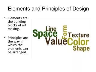
The elements and principles of design The elements and principles of design are the building blocks used to create a work of art. The elements of design can be thought of as the things that make up a painting, drawing, design etc. Good or bad - all paintings will contain most of if not all, the seven elements of design. The Principles of design can be thought of as what we do to the elements of design. How we apply the Principles of design determines how successful we are in creating a work of art.
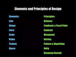
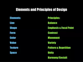
Elements of Design • Line is a mark with greater length than width. Lines can be horizontal, vertical or diagonal, straight or curved, thick or thin. • Shape is a closed line. Shapes can be geometric, like squares and circles; or organic, like free formed shapes or natural shapes. Shapes are flat and can express length and width. • Forms are three-dimensional shapes, expressing length, width, and depth. Balls, cylinders, boxes and triangles are forms. • Space is the area between and around objects. The space around objects is often called negative space; negative space has shape. Space can also refer to the feeling of depth. Real space is three-dimensional; in visual art when we can create the feeling or illusion of depth we call it space. • Color is light reflected off objects. Color has three main characteristics: hue or its name (red, green, blue, etc.), value (how light or dark it is), and intensity (how bright or dull it is). • Texture is the surface quality that can be seen and felt. Textures can be rough or smooth, soft or hard. Textures do not always feel the way they look; for example, a drawing of a porcupine may look prickly, but if you touch the drawing, the paper is still smooth.
Principles of Design • Balance - Balance is the concept of visual equilibrium, and relates to our physical sense of balance. • Gradation - Gradation of size and direction produce linear perspective. • Contrast - In design, big and small elements, black and white text, squares and circles, can all create contrast in design. • Harmony - everything appears to fit with everything else. The whole is better than the sum of its parts. • Repetition - can be used on all of the Visual Elements. If things are repeated without any change they can quickly get boring. However, repetition with variation can be both interesting and comfortably familiar. Repetition gives motion • Dominance - Dominance relates to varying degrees of emphasis in design. It determines the visual weight of a composition, establishes space and perspective, and often resolves where the eye goes first when looking at a design • Unity - The concept of unity describes the relationship between the individual parts and the whole of a composition. http://designelementsandprinciples.com/gradation2.htm
Line A mark drawn with a pointed or moving tool such as a pencil, brush, pen, etc. It is the path of a dot through a space.
Direction The element of direction can have a powerful influence on the mood of a painting. It is something often overlooked, but making a conscience decision about the dominant direction in a painting can have a noticeable effect on the atmosphere of the work. Sometimes the subject will dictate the dominant direction. Sometimes the subject will allow you to impose a direction on it. In the paintings below the subject dictates the direction. The strong horizontal lines of the water, boats and buildings in the first example give a feeling of stillness and calm. In the second example, the diagonal lines of the shoreline and the rocks reinforce the feeling of movement. The third example has a dominant vertical direction which adds a static orderly influence to what might be a random chaotic painting. DIRECTION In this subject it is possible to impose either a horizontal, vertical or oblique dominant direction. The drawings below show the effect of different treatments
A horizontal emphasis tends to make the buildings look sleek and clean and creates a fairly static atmosphere A diagonal dominance reinforces the chaotic nature of the subject Emphasizing a vertical direction maintains the random chaos, but gives a solid formal feeling to the work
Element: Shape Visual (below): Tangram consisting of triangle, square and parallelogram shapes. Shape is a two-dimensional area enclosed by lines - it is the silhouette representation of form, being flat without depth or thickness. Shape is divided into two categories - organic (freeform/naturalistic) and geometric. Light and shading techniques applied to shape can create an illusion of three dimensional form
Element: Form Visual (below): Form creating transitional space Form is a three dimensional object embodying volume and thickness. Length, depth and height measurements present form as a visible mass which can be viewed from many angles
Element: Space The emptiness or area between around above, below, or within objects. Positive space is the main area or object of focus in an artwork. Negative space is everything else. Space can be used to make a two-dimensional artwork appear three-dimensional by giving a feeling of depth. Smaller objects in a space seem farther away. Larger objects in a space seem closer
Element: Colour (A) Visual (below):Triadic colour in texture. • Colour adds impact and visual interest to a design. It encompasses three properties - hue, value and intensity. • Hue refers to a specific colour such as 'red'. • Value is the lightness or darkness of a colour. Tints (where white is added to a colour) are very high in value (very light). Shades (where black is added to a colour) are medium to low in value (medium to dark). • Intensity refers to the brightness or dullness of a colour (the degree to which grey has been added to a colour).
Element: Colour (B) Visual (below, left to right): Psychological quality of colour; Emphasis of primary colours; Movement and sensuality of colour; Colour in unified abstract design without physical representation; Colour Wheel and Complementary colours.
The colour wheel is a way of representing the chromatic scale in a circle using all the colours made with the primary tria - red, yellow and blue.Secondary colours are mixed from two primaries next to each other on the colour wheel. They are green (yellow and blue combined), purple (red and blue combined) and orange (red and yellow combined).Colours have a psychological quality. 'Warm' colours contain yellow and appear to come forward. 'Cool' colours contain blue and appear to recede.Complementary colours contrast one another and are opposite on the colour wheel (such as purple and orange). They are vibrant and not harmonious as their name may imply
Element: Tone Visual (below, left to right): Sensitive tonal treatment and line creating silhouette representation of form. Tone refers to the degree of lightness or darkness of a surface.It may be flat or graduated.Tone describes the relationships between colours within a design.It also refers to any colour that has been 'greyed' by either the addition of its complement or by the use of black or white.
Element: Texture Texture is the character of a surface and is both tactile and visual.It can be real or implied by the employment of different media.Texture as a tactile feature may present as rough, smooth, soft, hard, glossy etc.As a visual feature, texture is the result from light being absorbed or reflected unevenly by the surface of objects
Principle: Balance Balance in Design is similar to balance in physics A large shape close to the center can be balanced by a small shape close to the edge. A large light toned shape will be balanced by a small dark toned shape (the darker the heavier it appears to be)
Principle: Gradation Gradation applies to the incremental change in the state of a design element. Gradation of size and direction produce linear perspective. The illusion of reduced scale as distance increases is a product of gradation in size and direction.
Principle: Repetition Repetition in nature is a common sight, from schools of fish to forests of trees, patterns of leaves to spores on a mushroom. The important thing to notice with natural repetition is the presence of variation. The examples of natural repetition in this slide show also exhibit variation. Due to constant exposure, our hard wired response is to always expect repetition to be accompanied by variation. When the variation is missing, repetition becomes monotonous.
Principle: Contrast Contrast is the juxtaposition of opposing elements eg. opposite colors on the color wheel, contrast in direction, contrast in tone etc. The maximum contrast in a work of art is usually located at the center of interest. Too much contrast scattered throughout a painting can destroy unity and make a work difficult to look at. Unless a feeling of chaos and confusion are what you are seeking, it is a good idea to carefully consider where to place your areas of maximum contrast.
Principle: Harmony Harmony is the visually satisfying effect of combining similar, related elements. eg. adjacent colors on the colour wheel, Similar shapes and related textures Harmony in a painting or design helps bring about unity. All harmony and no contrast, however, can become monotonous. A balance must be struck between areas of harmony and areas of contrast.
Principle: Harmony Renzo Piano's buildings demonstrate a harmony between form and environment. His Columbus International Exhibition building in Genoa, Italy, makes use of sail structures and intricately rigged booms that pay homage to the history of the ancient sea port on which it sits. The principles of harmony and contrast seem completely contradictory, but it is the balance between these two that is vital to the success of any work of art.
Principle: Dominance The principle of dominance plays a major role in where emphasis occurs in a design. Repeated elements without some form of dominance can create monotony and confusion. Without a dominating size, the arrangement of elements in this photograph is not as interesting as it could be. The eye has a confusing path to follow around the photograph
Principle: Dominance To have a dominant element requires subordinate elements. Often the subordinate element attracts more attention by way of contrast. This is most noticeable with dominant and subordinate color arrangements.
Principle: Dominance This Photograph is dominated by horizontal, vertical and oblique straight lines. It gains tension and interest from the contrasting subordinate curves of the bird.
Principle: Unity The most obvious effect of the principle of Unity is the cohesive linking of various elements in a design. "The Jockey Artémision" from the National Archaeological Museum of Athens conveys a feeling of fear and tension through the powerful diagonal thrust and dramatic, contrasting scale between horse and rider. This unity between artistic concept and practical execution gives the work much greater impact than simply portraying a horse and rider.
Principle: Unity The tight color harmony and formal, symmetrical design visually unify this painting. The scratchy aggressive lines and dirty splattered marks link the subject with its intended use.Edmund Burke Feldman when describing "organic unity" states "Our tolerance for sameness is limited; we require variety to satisfy our visual appetites and yet not so much variety that the sense of wholeness is sacrificed." Unity is not a principle that can be applied individually to each design element. It is more a general principle applying to the combined impact of all the elements