
Reduction Block Printing Process Tutorial
E N D
Presentation Transcript
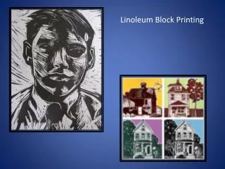
I chose Daryl Dixon from The Walking Dead as my subject. I tried to choose a picture that was clear, not overly detailed and had clear lights and shadows in it as my source image. I printed the photo out so it was easier to see.
I outlined some of the shadow shapes with Sharpie marker so they were easier to make out.
I also planned out what colors I was going to use, so I knew that the shapes would form a clear image. I tried to look at the photo in terms of highlights, mid-tones and shadows. I decided to use the white of the paper for my highlights, silver for the middle-light areas, brown for the middle-dark areas, and black for the darkest areas. I originally considered creating accents of red, but eventually decided against it.
I placed the block on my paper and traced around it so I would know what size I was working with before making my sketch. I drew this freehand, but you could also make things simpler here by using a light table and tracing (if your source photo is big enough)
I cleaned up the lines and made the outlines really clear and dark using soft graphite (ebony pencil) I also cut my sketch out at this point.
This is my sketch upside down on the linoleum block so that the graphite lines are touching the block. I taped the paper down so it didn’t wiggle as I was transferring. I applied pressure to the back with the end of a thick marker and rubbed back and forth so the graphite would transfer onto the block.
This is how the sketch transferred onto the linoleum block. As you can see, it’s still a little fuzzy and some of the lines are hard to make out.
Using a Sharpie, I cleared up the lines so I could see them better. The ink shouldn’t show when you print, so you can make all kinds of marks on the block as a tool for yourself.
At this point, I colored in my sketch. Its not a good idea to do this before you transfer the sketch onto the block because the crayon wax might prevent the pencil lines from transferring properly. You don’t need to color completely neatly, you’re just trying to make it clear for yourself what colors go where. I tried to balance out my colors so there was a little of every color in all areas of the image. I also really tried to pay attention to what shapes were shadows/highlights/mid-tones. I also tried to make sure the light source was clear and consistent so everything made sense.
Time to carve out my first color! I am going to carve all the WHITE shapes first because when I roll my first round of ink, the carved areas will not be inked. I was getting confused even with my sketch nearby what shapes needed to be white (the sketch and the image on the block are reversed from each other). What I did to help myself with that issue was to make little marks inside every shape needing carving (you can draw with pencil right onto the block)
Here’s what the block looks like with the white parts carved out. I tried to keep my carve marks going in a consistent direction. On the face and hands, I curved my carves slightly to show that the body parts have rounded volume and form.
I inked my first color (silver) and pulled three prints. See how the areas I just carved show up as white. I set these prints off to the side to dry and washed my block, brayer and ink plate.
Remember, I just printed silver. Now, I am going to carve all the areas that will show up as silver. Again, I am trying to carve in a consistent direction and show volume with my carves. I actually slightly extended my carves over the original lines that I drew on the block. This will create almost a transition/blending effect instead of having all hard-edged shapes.
Now to print my next color, which will be brown. I had to mix the brown ink using red, orange and turquoise. A palette knife and small cup work well for mixing and moving the ink to the inking plate. You can also mix your colors right on the inking plate.
The colors I used before mixing (I also added in some red) Mixing colors is a little more advanced but can be done.
Block inked with brown ink…I am preparing to get it registered so I can print on top of the original print. Make sure you have both the printed image and the block facing the same way otherwise this won’t work at all! Try to find some feature of the image to double check that everything is on the same side. I used the crossbow as a reference point. I brought the edge of the block right up to the edge of the print at a 90 degree angle and carefully laid it down. I tapped a couple times so the paper stuck, then flipped it over and applied pressure to the back with a barren.
Here’s all three printed with the silver and the brown on top of it.
Now its time to carve again. This time, I am going to carve out everything that is going to be brown. Again. I tried to fade my carves into the previous color so my flat shapes had a little more dimension. Again, I tried to keep my carves in a consistent direction.
Getting the image registered a second time…make sure it is going the same way as your print. Just as before, I lay it on the edge and set it down carefully. Tap, flip and burnish. This takes a little practice and a little knack, but it can be done. If your image isn’t very detailed, it won’t show up as a mistake if the print isn’t 100% registered.
Here’s how it looks with the third color printed. I was noticing a big difference in the quality of my print depending on how much ink I used and the consistency (I added a little water at certain points). Additionally, the barren I used made a difference, too. It just depends how dark and crisp you want the ink to show up, or if you’re okay with a little distortion.
Here’s all three…as you can see, they are all slightly different. I trimmed the images so they had a consistent border and looked like a cohesive series.
This is one of the final prints, signed in pencil. I think this one came out the best of the three.
My overall thoughts… What came out well- Overall, I enjoyed the process and was happy with my print. I liked the colors I chose because they match the colors used in The Walking Dead show. I also liked how I didn’t keep my shapes flat, but instead tried to break them up a little but and work the colors into one another. I was happy with how the images were registered. It was a tiny bit off, but I think it actually added to the overall effect. Additionally, my printing itself wasn’t perfect, but the grittiness and distortion kind of of made me think of the overall vibe of the show and this particular character. I was really reminded of how much I enjoy block printing, and the unique results you can get from this process.
My overall thoughts… What I could have done differently- I wish I hadn’t left so few areas that were solid black. I think having my black shapes be larger overall would have made for a nice contrast with the white shapes and would have really “popped” on top of the other colors. I also thought there were a few minor details that didn’t read as clearly as I wanted; most of all, the moustache could have been broken up with some light shapes a little more.