Download
1 / 6
60 likes | 70 Views
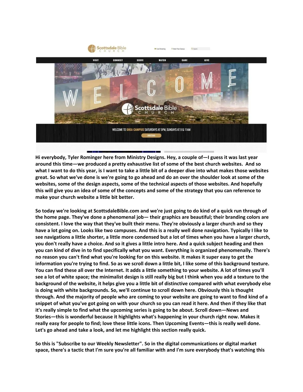
MINISTRY DESIGNS Youtube: https://www.youtube.com/watch?v=kLrVf0uxBYw Website: https://ministrywebsitedesigns.com/scottsdale-bible-church-website-review/ Hi everybody, Tyler Rominger here from Ministry Designs. Hey, a couple of—I guess it was last year around this time—we produced a pretty exhaustive list of some of the best church websites. And so what I want to do this year, is I want to take a little bit of a deeper dive into what makes those websites great. So what we've done is we're going to go ahead and do an over the shoulder looks at some of the websites, some of the design aspects, some of the technical aspects of those websites. And hopefully this will give you an idea of some of the concepts and some of the strategy that you can reference to make your church website a little bit better. So today we're looking at ScottsdaleBible.com and we're just going to do kind of a quick run through of the home page. They've done a phenomenal job— their graphics are beautiful; their branding colors are consistent. I love the way that they've built their menu. They're obviously a larger church and so they have a lot going on. Looks like two campuses. And this is a really well done navigation. Typically I like to see navigations a little shorter, a little more condensed but a lot of times when you have a larger church, you don't really have a choice. And so it gives a little intro here. And a quick subject heading and then you can kind of dive in to find specifically what you want. Everything is organized phenomenally. There's no reason you can't find what you're looking for on this website. It makes it super easy to get the information you're trying to find. So as we scroll down a little bit, I like some of this background texture. You can find these all over the Internet. It adds a little something to your website. A lot of times you'll see a lot of white space; the minimalist design is still really big but I think when you add a texture to the background of the website, it helps give you a little bit of distinctive compared with what everybody else is doing with white backgrounds. So, we'll continue to scroll down here. Obviously this is thought through. And the majority of people who are coming to your website are going to want to find kind of a snippet of what you've got going on with your church so you can read it here. And then if they like that it's really simple to find what the upcoming series is going to be about. Scroll down—News and Stories—this is wonderful because it highlights what's happening in your church right now. Makes it really easy for people to find; love these little icons. Then Upcoming Events—this is really well done. Let's go ahead and take a look, and let me highlight this section really quick. So this is "Subscribe to our Weekly Newsletter". So in the digital communications or digital market space, there's a tactic that I'm sure you're all familiar with and I'm sure everybody that's watching this video has downloaded one. It's called a lead magnet???? and basically what that does is it gives you the opportunity to exchange something of value for somebody's email address. And so, although a newsletter is valuable to most people, somebody that's visiting your site may or may not be concerned about what's going on in the newsletter because they feel they may be able to find the information that they're looking for on your website. So if I had a recommendation for the folks at Scottsdale, I'd try to find something that would be of value to people visiting their website for the first time, and maybe revamp this section a little bit, but it's still predominant, it's well-placed, it get's to the point, "hey, we want to continue to communicate to you. We're going to go ahead and send you our weekly updates and let's go ahead and get to know each other here." I love that they have the map--easy to find, easy to navigate. They know based on these two locations specifically where their campuses are, so that's well done as well. And it makes it super easy for you to contact them, with their phone number here, their address, and their social icons there. So their home page is well done. Again, the navigation is phenomenal, very easy to understand, very easy to find what you're looking for. As far as the overall layout goes, there really is not a lot of critiquing that needs to be done here. I think that it is a well-designed, up-to-date, relevant site. So, what I want to do is I want to jump into some of the technical aspect of the site and see how they've done on some of their marketing components and some of their...like the technical on-page things that make a site really great. So one thing I've noticed, is they could ..???? .. you know the majority of websites have one. This is going to be a place holder, it's going to be an identifier, most likely it's going to be their logo. Really super easy to add and it should probably be included. Let's see ... I also notice, that there's no SSL certificate. Now, the reality is, an SSL certificate stands for Secure Socket Layer???? and basically what that is, is it's an additional layer of security for your website. The reason that they are becoming more and more important is because as the search engines are ... when the search engine identifies the site is secured by an SSL certificate, it's going to show it favoritism. So your search engine rankings will increase when your site is covered with an SSL. So let's jump over to a website called GT Metrics, it's GTmetrics.com. Basically what this is, is a site speed audit. Right so, you type your URL on there and it will audit the load speeds of your site and it looks like probably because their site's so large that they could have done a little bit of a better job here. We want to see these load speeds on the very high end, you know three seconds, four seconds, and then on the low side, as quickly as one second. It's most likely that they're using a content management system and it wasn't fully optimized for load speeds. So, you know we can get into some of the technical aspects here but I don't want to waste a lot of time on that. What's important is, is that we see good grades here, As and Bs, and we do that by working through their suggestions down here. And then obviously increase or I'm sorry, decrease the load speed of the website. So I use a tool for Search Engine Optimization audits and things like that, called SEMRush.com. And they've got a phenomenal amount of traffic going to their website and it looks like it's about eight thousand two hundred visitors per month which is wonderful it looks like they're ranking for about 3000 key terms. And if they were to buy the traffic it would actually cost them about $18,000 a month. So one thing that I did notice is their Stephen Ministry. So in their specific location or in their general vicinity there's four thousand four hundred searches per month for that specific term. And it looks like they're ranking eleventh on the search engines which is the top rank on the second page. So if I could make a recommendation for this church I would say hey let's put some emphasis, create some content around the Stephen Ministry and really try to optimize that particular page because it's going to increase the ranking. Maybe you know, shoot some videos and point some YouTube links back to that page, really kind of increase the load speeds of that, that particular page, because what it's going to do is it's going to give you the opportunity to grab another 4000 visitors per month to your website. Google has a wonderful mobile-ready tool. Looks like their site is optimized perfectly for mobile. So that's wonderful. So a tool that I use for on-page SEO or on-page development optimization in general is a tool called Click X greater. It's a phenomenal tool that comes with a whole suite of digital marketing insights. And one of the more powerful things that they do is it's called their website grader and what it does is it gives them a detailed report of everything that they've got going on with their digital marketing side of things. So if we take a quick look, you know they've got their landing page, their title tags are well-placed. It's 70 characters or less which is exactly it's supposed to be. The reason for that is because that's what the search engines will display. We've got, the description tag is ... is well done it's under 150 characters which is what we're looking for. Links and images: there are 14 images on the page. There are 86 internal linkings, links to individual pages, so these are all good things. Again this audit brought to the attention the SSL certificate which, again is a simple thing to add. Wonderful socials. So it looks like they're doing pretty good. They're not doing any pay-per-click which is fine. Something that they could leverage however is the Google Ad Grants , which would then allow them to drive up to $10,000 in free traffic to the website on a monthly basis. This report here is similar to what we got at GT Metrics. They could do some things with leveraging the browser cache to increase the load speeds, reduce the server response time, minify the css this will all increase those load speeds. But I want to bring you back to the report at SEM Rush??. The reason that we want to do these things is because not only does it help you eliminate your bounce rates—so the quicker the site loads, somebody is going to stay on there significantly longer. But it also helps in the search engines and so it looks like they're already doing a pretty good job in the search engines with some of their rankings and some of their search terms and things like that. So really the only thing that I would recommend or the reason why I would you recommend increasing those load speeds is because it's going to help with traffic retention. So jump right back here over to the site. This is a little tool here that I have that tells me when I'm getting pixeled by Facebook. And I notice I'm not doing any pixeling. And so they get a tremendous amount of traffic coming to their website. But it doesn't look like they're doing anything to follow up with that traffic that's coming there. So if I could make a recommendation, add a Facebook pixel? and even if they're not running ads to these individuals, you can still pixel them and up to six months later if you want to target a specific group of people or the people that have been visiting your website, it gives you that opportunity. It's highly targeted advertising because it's people that already know who you are. They have already been on your site and it would be advantageous for you to be able to do that and ultimately, grow your leads. So so that's just my quick evaluation of Scottsdale Bible overall, it's a phenomenal site. They've done a wonderful job. Their design is beautiful. Again, just a couple of tweaks: increase those load speeds, maybe get an SSL certificate on the site, add a ????????? and possibly do some Facebook pixeling. Hope this video is valuable. Again I'm Tyler Rominger, from Ministry Designs. Thank you for watching. Subscribe to the YouTube channel. We plan to produce these videos pretty consistently. What we want to do is educate the church as a whole on what to do and when to do it as it relates to a church website. Thanks and have a great day.

E N D
Hieverybody,TylerRomingerherefromMinistryDesigns.Hey,acoupleof—Iguessitwaslastyear aroundthistime—weproducedaprettyexhaustivelistofsomeofthebestchurchwebsites.Andso whatIwanttodothisyear,isIwanttotakealittlebitofadeeperdiveintowhatmakesthosewebsites great.Sowhatwe'vedoneiswe'regoingtogoaheadanddoanovertheshoulderlookatsomeofthe websites,someofthedesignaspects,someofthetechnicalaspectsofthosewebsites.Andhopefully thiswillgiveyouanideaofsomeoftheconceptsandsomeofthestrategythatyoucanreferenceto makeyourchurchwebsitealittlebitbetter. Sotodaywe'relookingatScottsdaleBible.comandwe'rejustgoingtodokindofaquickrunthroughof thehomepage.They'vedoneaphenomenaljob—theirgraphicsarebeautiful;theirbrandingcolorsare consistent.Ilovethewaythatthey'vebuilttheirmenu.They'reobviouslyalargerchurchandsothey havealotgoingon.Looksliketwocampuses.Andthisisareallywelldonenavigation.TypicallyIliketo seenavigationsalittleshorter,alittlemorecondensedbutalotoftimeswhenyouhavealargerchurch, youdon'treallyhaveachoice.Andsoitgivesalittleintrohere.Andaquicksubjectheadingandthen youcankindofdiveintofindspecificallywhatyouwant.Everythingisorganizedphenomenally.There's noreasonyoucan'tfindwhatyou'relookingforonthiswebsite.Itmakesitsupereasytogetthe informationyou'retryingtofind.Soaswescrolldownalittlebit,Ilikesomeofthisbackgroundtexture. YoucanfindtheseallovertheInternet.Itaddsalittlesomethingtoyourwebsite.Alotoftimesyou'll seealotofwhitespace;theminimalistdesignisstillreallybigbutIthinkwhenyouaddatexturetothe backgroundofthewebsite,ithelpsgiveyoualittlebitofdistinctivecomparedwithwhateverybodyelse isdoingwithwhitebackgrounds.So,we'llcontinuetoscrolldownhere.Obviouslythisisthought through.Andthemajorityofpeoplewhoarecomingtoyourwebsitearegoingtowanttofindkindofa snippetofwhatyou'vegotgoingonwithyourchurchsoyoucanreadithere.Andtheniftheylikethat it'sreallysimpletofindwhattheupcomingseriesisgoingtobeabout.Scrolldown—Newsand Stories—thisiswonderfulbecauseithighlightswhat'shappeninginyourchurchrightnow.Makesit reallyeasyforpeopletofind;lovetheselittleicons.ThenUpcomingEvents—thisisreallywelldone. Let'sgoaheadandtakealook,andletmehighlightthissectionreallyquick. Sothisis"SubscribetoourWeeklyNewsletter".Sointhedigitalcommunicationsordigitalmarket space,there'satacticthatI'msureyou'reallfamiliarwithandI'msureeverybodythat'swatchingthis
videohasdownloadedone.It'scalledaleadmagnet????andbasicallywhatthatdoesisitgivesyouthe opportunitytoexchangesomethingofvalueforsomebody'semailaddress.Andso,althougha newsletterisvaluabletomostpeople,somebodythat'svisitingyoursitemayormaynotbeconcerned aboutwhat'sgoingoninthenewsletterbecausetheyfeeltheymaybeabletofindtheinformationthat they'relookingforonyourwebsite.SoifIhadarecommendationforthefolksatScottsdale,I'dtryto findsomethingthatwouldbeofvaluetopeoplevisitingtheirwebsiteforthefirsttime,andmaybe revampthissectionalittlebit,butit'sstillpredominant,it'swell-placed,itget'stothepoint,"hey,we wanttocontinuetocommunicatetoyou.We'regoingtogoaheadandsendyouourweeklyupdates andlet'sgoaheadandgettoknoweachotherhere."Ilovethattheyhavethemap--easytofind,easyto navigate.Theyknowbasedonthesetwolocationsspecificallywheretheircampusesare,sothat'swell doneaswell.Anditmakesitsupereasyforyoutocontactthem,withtheirphonenumberhere,their address,andtheirsocialiconsthere.Sotheirhomepageiswelldone.Again,thenavigationis phenomenal,veryeasytounderstand,veryeasytofindwhatyou'relookingfor.Asfarastheoverall layoutgoes,therereallyisnotalotofcritiquingthatneedstobedonehere.Ithinkthatitisa well-designed,up-to-date,relevantsite. So,whatIwanttodoisIwanttojumpintosomeofthetechnicalaspectofthesiteandseehowthey've doneonsomeoftheirmarketingcomponentsandsomeoftheir...likethetechnicalon-pagethingsthat makeasitereallygreat.SoonethingI'venoticed,istheycould..????..youknowthemajorityof websiteshaveone.Thisisgoingtobeaplaceholder,it'sgoingtobeanidentifier,mostlikelyit'sgoing tobetheirlogo.Reallysupereasytoaddanditshouldprobablybeincluded. Let'ssee...Ialsonotice,thatthere'snoSSLcertificate.Now,therealityis,anSSLcertificatestandsfor SecureSocketLayer????andbasicallywhatthatis,isit'sanadditionallayerofsecurityforyourwebsite. Thereasonthattheyarebecomingmoreandmoreimportantisbecauseasthesearchenginesare... whenthesearchengineidentifiesthesiteissecuredbyanSSLcertificate,it'sgoingtoshowitfavoritism. SoyoursearchenginerankingswillincreasewhenyoursiteiscoveredwithanSSL. Solet'sjumpovertoawebsitecalledGT Metrics,it'sGTmetrics.com.Basicallywhatthis is,isasitespeedaudit.Rightso,youtypeyour URLonthereanditwillaudittheloadspeedsof yoursiteanditlookslikeprobablybecausetheir site'ssolargethattheycouldhavedonealittle bitofabetterjobhere.Wewanttoseethese loadspeedsontheveryhighend,youknow threeseconds,fourseconds,andthenonthe lowside,asquicklyasonesecond.It'smost likelythatthey'reusingacontentmanagementsystemanditwasn'tfullyoptimizedforloadspeeds.So, youknowwecangetintosomeofthetechnicalaspectsherebutIdon'twanttowastealotoftimeon that.What'simportantis,isthatweseegoodgradeshere,AsandBs,andwedothatbyworking throughtheirsuggestionsdownhere.AndthenobviouslyincreaseorI'msorry,decreasetheloadspeed ofthewebsite. SoIuseatoolforSearchEngineOptimizationauditsandthingslikethat,calledSEMRush.com.And they'vegotaphenomenalamountoftrafficgoingtotheirwebsiteanditlookslikeit'sabouteight thousandtwohundredvisitorspermonthwhichiswonderfulitlookslikethey'rerankingforabout3000 keyterms.Andiftheyweretobuythetrafficitwouldactuallycostthemabout$18,000amonth.
SoonethingthatIdidnoticeistheirStephenMinistry.Sointheirspecificlocationorintheirgeneral vicinitythere'sfourthousandfourhundredsearchespermonthforthatspecificterm.Anditlookslike they'rerankingeleventhonthesearchengineswhichisthetoprankonthesecondpage.SoifIcould makearecommendationforthischurchIwouldsayheylet'sputsomeemphasis,createsomecontent aroundtheStephenMinistryandreallytrytooptimizethatparticularpagebecauseit'sgoingtoincrease theranking.Maybeyouknow,shootsomevideosandpointsomeYouTubelinksbacktothatpage, reallykindofincreasetheloadspeedsofthat,thatparticularpage,becausewhatit'sgoingtodoisit's goingtogiveyoutheopportunitytograbanother4000visitorspermonthtoyourwebsite.Googlehasa wonderfulmobile-readytool.Looksliketheirsiteisoptimizedperfectlyformobile.Sothat'swonderful. SoatoolthatIuseforon-pageSEOor on-pagedevelopmentoptimizationin generalisatoolcalledClickXgreater.It's aphenomenaltoolthatcomeswitha wholesuiteofdigitalmarketinginsights. Andoneofthemorepowerfulthingsthat theydoisit'scalledtheirwebsitegrader andwhatitdoesisitgivesthema detailedreportofeverythingthatthey've gotgoingonwiththeirdigitalmarketing sideofthings.Soifwetakeaquicklook, youknowthey'vegottheirlandingpage,theirtitletagsarewell-placed.It's70charactersorlesswhich isexactlyit'ssupposedtobe.Thereasonforthatisbecausethat'swhatthesearchengineswilldisplay. We'vegot,thedescriptiontagis...iswelldoneit'sunder150characterswhichiswhatwe'relooking for.Linksandimages:thereare14imagesonthepage.Thereare86internallinkings,linkstoindividual pages,sotheseareallgoodthings.AgainthisauditbroughttotheattentiontheSSLcertificatewhich, againisasimplethingtoadd.Wonderfulsocials.Soitlookslikethey'redoingprettygood.They'renot doinganypay-per-clickwhichisfine.SomethingthattheycouldleveragehoweveristheGoogleAd Grants,whichwouldthenallowthemtodriveupto$10,000infreetraffictothewebsiteonamonthly basis.ThisreporthereissimilartowhatwegotatGTMetrics.Theycoulddosomethingswith leveragingthebrowsercachetoincreasetheloadspeeds,reducetheserverresponsetime,minifythe cssthiswillallincreasethoseloadspeeds.ButIwanttobringyoubacktothereportatSEMRush??.The reasonthatwewanttodothesethingsisbecausenotonlydoesithelpyoueliminateyourbounce rates—sothequickerthesiteloads,somebodyisgoingtostayontheresignificantlylonger.Butitalso helpsinthesearchenginesandsoitlookslikethey'realreadydoingaprettygoodjobinthesearch engineswithsomeoftheirrankingsandsomeoftheirsearchtermsandthingslikethat.Soreallythe onlythingthatIwouldrecommendorthereasonwhyIwouldyourecommendincreasingthoseload speedsisbecauseit'sgoingtohelpwithtrafficretention. Sojumprightbackhereovertothesite.ThisisalittletoolherethatIhavethattellsmewhenI'm gettingpixeledbyFacebook.AndInoticeI'mnotdoinganypixeling.Andsotheygetatremendous amountoftrafficcomingtotheirwebsite.Butitdoesn'tlooklikethey'redoinganythingtofollowup withthattrafficthat'scomingthere.SoifIcouldmakearecommendation,addaFacebookpixel?and evenifthey'renotrunningadstotheseindividuals,youcanstillpixelthemanduptosixmonthslaterif youwanttotargetaspecificgroupofpeopleorthepeoplethathavebeenvisitingyourwebsite,itgives youthatopportunity.It'shighlytargetedadvertisingbecauseit'speoplethatalreadyknowwhoyouare.
Theyhavealreadybeenonyoursiteanditwouldbeadvantageousforyoutobeabletodothatand ultimately,growyourleads. Sosothat'sjustmyquickevaluationofScottsdaleBibleoverall,it'saphenomenalsite.They'vedonea wonderfuljob.Theirdesignisbeautiful.Again,justacoupleoftweaks:increasethoseloadspeeds, maybegetanSSLcertificateonthesite,adda?????????andpossiblydosomeFacebookpixeling.Hope thisvideoisvaluable.AgainI'mTylerRominger,fromMinistryDesigns. Thankyouforwatching.SubscribetotheYouTubechannel.Weplantoproducethesevideospretty consistently.Whatwewanttodoiseducatethechurchasawholeonwhattodoandwhentodoitasit relatestoachurchwebsite.Thanksandhaveagreatday. Links: YouTube:https://www.youtube.com/watch?v=kLrVf0uxBYw MinistryDesignsWebsite: https://ministrywebsitedesigns.com/scottsdale-bible-church-website-review/