
TChart
TChart. データを渡すことで自動的にグラフを描画してくれるコンポーネント. TChart. Tchart 上で右クリック、 “チャートの編集”で設定を行う。. TChart. チャート形式の選択: “チャート”タブの中の“系列”タブで新しい系列を追加する。. TChart. 折れ線を選択すると、系列タブに追加される。. TChart. 複数のグラフを同時に表示するには、 系列を追加していく。. TChart. グラフの描画方法 プロパティ Series

TChart
E N D
Presentation Transcript
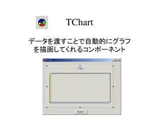
TChart データを渡すことで自動的にグラフを描画してくれるコンポーネント
TChart Tchart上で右クリック、 “チャートの編集”で設定を行う。
TChart チャート形式の選択: “チャート”タブの中の“系列”タブで新しい系列を追加する。
TChart 折れ線を選択すると、系列タブに追加される。
TChart 複数のグラフを同時に表示するには、 系列を追加していく。
TChart グラフの描画方法 プロパティ Series TChartでは、系列を扱うプロパティSeriesにプロットするデータの座標を追加することで、自動的にグラフが描画されます。 例:Chart1がTChartのインスタンス(変数)の場合、 Series1は Chart1->Series[0]、 Series2は Chart1->Series[1] と表記します。
TChart for (x = 0;x <= 10;x += 0.5){ y = x*x + 2*x + 3; Chart1->Series[0]->AddXY(x,y,"",clTeeColor); y = 2*x + 3; Chart1->Series[1]->AddXY(x,y,"",xlTeeColor); } y=x^2+2*x+3とy=2*x+3のグラフを表示するには、二つのデータ系列が必要になります。 Xの範囲が0-10の場合は次のようになります。
TChart メンバ関数 AddXY( ) 新しいポイントを系列に挿入します。 Clear( ) 一旦読み込んだデータを消去 新しいグラフを描くために消すことが必要
TChart Series1またはSeries2を選択した状態で ”タイトル”ボタンを押す Chart1を選択し、右クリックより “チャートの編集”を選ぶ。 系列タイトルの変更
TChart ”タイトル”タブを押す ”3次元表示”タブを選択し、”3次元”のチェックをはずす。 青で表示された”TChart”の部分を変更 Chartタイトルの変更