1 / 8
80 likes | 98 Views
Now that day is over when computers were required to visit a website. Even when mobile phones became an important component of the humanu2019s life a few years ago, many webmasters havenu2019t realized the importance of creating mobile friendly websites. They should have created a single responsive website instead of its two separate versions i.e., mobile version and desktop version. Read more on https://bit.ly/2uKJ0Y0

E N D
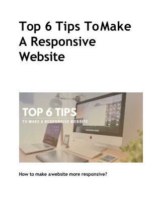
Top 6 Tips ToMake AResponsive Website How to make awebsite more responsive?
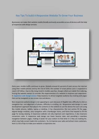
Nowthatdayisoverwhencomputerswererequiredtovisitawebsite.Even when mobile phones became an important component of the human’s life a few years ago, many webmasters haven’t realized the importance of creating mobile friendly websites. They should have created a single responsive website instead of its two separate versions i.e., mobile version and desktop version. But these days, it is important to have a responsive website for every company, especially those involved in internet marketing activities. It is now a must-have feature for all types of online store or business because it allows your users to access your website through various platforms (such as PCs, smartphones, and iPads). Moreover, Google considers this as an influential factor in ranking the websites in the search engine results. Having a mobile-friendly website for any business is an advantage for entrepreneurs, if they want to rank their website on the first page ofSERP. Ranking your website on the first page of Google is very important if your aim is to drive high traffic to your website. When some traffic comes to your website, they become your visitors and when visitors purchase something on your site, they become your customers. It means you will have to fit your website in this buying cycle if you want to boost your sales. And, you can do that by making good use of your internet connection to find an ideal web design company. Check out a few details of their company, such as how many projects they have delivered, how many positive reviews they have got and how they solve their customers' problems. Based on that, hire a good company or visit the official website of SFWPExperts - a innovative web design Los Angelescompany. We have an award-winning team for web design and digital marketing services that is committed to grow your B2C or B2B businesses at the local and internationallevel.
Now, let’s have a look at the top 6 tips for making a responsive website for yourbusiness: Avoid the Use ofFlash While you are creating a new website for your business, you need to avoid the use of any such content in your website that requires Adobe’s Flash Player to play. This is because the Flash is not supported by some of the tablets and mobile devices like Apple, Samsung and others. In addition to videocontents,itisalsorequiredtoavoidtheuseofslideshowsandimage rotators on your website if it requires the Flashsupport to function properly. Eliminate the Need of ZoomingContent Design your website in such a way that visitors should be able to read and understand your content without zooming it. When your website visitors needs to zoom in or zoom out your content on a mobile device, that might not be able to produce accurate results every time. It can be a very annoyingsituationforthemwhentheywillnotbeabletoperformaspecific task on your website. To deal with such a situation, one of the best things you can do is to make the texts and icons large enough on your page so that your visitors can see it clearly. You also need to consider the limited screen size of mobile phones and tablets to display the content you are wishingtoputonyourlandingpage.
Do you know that the readable size of content on your website enhances youruser’sexperience?Manytimesithasbeenseenthatwhenvisitorsfind any content difficult to read on a website, they abandon that page and switch to other sites. And, if it starts happening frequently on your website, the bounce rate of your site will increase and you will start losing your business. For this reason, it is important for you to look for a market-leading web design company in Los Angeles that can create responsive designs for your mobile, tablet, and iPad users. But, if you don't trust a random company to meet your web design needs, allow us to work on your project. We guarantee you to reduce the bounce rate and increase theconversionrateofyourwebsitejustwithin30days. Leave SomeSpace Between Two Different Links It is not necessary that everyone who use smartphones for visiting your website has small hands. For this reason, you should not make the texts too small that can’t be read by anyone and also avoid putting the clickable items at the top of the page. Most of the time the users get annoyed when they accidentally click on the wrong button and they have to hit the back button continuously to cancel their request. So, you should eliminate these kinds of problems from your website so that your visitors can click on anythingeasily. Use the Right ScalingStyle Make sure while designing a website that it should automatically get compressed on a mobile device to fit the size of the screen. Besides it, neither Google nor users likes the ideaof horizontal scrolling and so your
site should adopt to vertical scrolling. Although, the vertical scrolling style looks fine in your website, you will still need to place the most important informationatthetopofyourwebpagesothatitlookshighlighted. However, determining the right position for the right content on your website is an important aspect of web design, you should consider this factor seriously while designing your site. It plays a major role in attracting, engaging and converting your occasional visitors into your potential customers. As speaking the right thing at the right moment matters, similarly displaying the right information at the right place also matters. If you imagine yourself as a normal mobile user, you will come to know that moving your fingers vertically on a smartphone is easier than moving horizontally. So, if you want to have an effective website for your business, find the contact information of a trusted web design company in Los Angeles that can create your fully responsive website in the shortest possible time. Even our company can provide you website building services including online marketing that will bring your business on the first page of search engineresults. Use CSSStyles Your website willbe given more priority than mobile-friendly websites in the search engine rankings if you have a responsive web design. This is because a responsive web design is supported by all kinds of devices, no matter what is its screen size and what it is accessed through. Many web designers use CSS @media queries and other proven techniques to make a responsive website for their clients. When CSS @media queries is applied correctly for creating a website, it becomes easy to change the style of a webpage based on the configuration of the different devices. These configurations may differ from the display type to resolution and signal strength of a particulardevice.
Thus, the purpose of creating a responsive design for a website is that it (to)supports all kinds of devices. There are so many mobiles, tablets, and iPads available in the market but it doesn’t necessarily mean that every device has the same configuration. So, when you create a responsive website for your business, make sure it can be accessed by any user using any platform. For creating a responsive website for your business, you might have come across many web design companies in Los Angeles that claims to create it just within a week. But, you need to check with them whether the responsive websites designed by them opens properly on a mobile device or not. If you are not satisfied by the performance of their site, it is better to partner with our company. We are helping hundreds of businesses to achieve their online goals by creating excellent web designs for them and optimizing it for search engines. Now, it’s your turn to have a responsivewebsiteforyourbusinessthatincreasesyouronlinesales. Test Your Website For MobileFriendliness For some time, Google is offering a “mobile friendly” test for all the webmasters where they can check their URL. What you need to do in a “mobile friendly” test is that you enter a URL and get it tested to know whether it meets the Google’s criteria for responsive web page or not. By participating in this test, you get a brief idea about what changes you shouldmaketoyourwebsiteinordertomakeitmoreresponsive. In addition to this, you should keep another thing in mind that it is not necessary to optimize every single page of your website for responsiveness. This is because there might be some pages in your website that would not be worth the time and investment. Since, mobile friendliness is assumed as one of the biggest factors in decidingthe
search engine ranking of a website, still there are some factors that also affects itsranking. • Do you know what are the other factors that affects the website ranking? Therankingofawebsitedependsonmanyfactorssuchas: • Quality ofcontent • Websitetraffic • Mobilefriendliness • Userexperience • On-sitenavigation • So, as there are less number of innovative & professionalWordpress website design companiesthat can assure you of integrating these features in your website, you can trust us to meet your web design needs. We have a well-trained team in our company that practices a wide skill set of web design and marketing tasks. They are potentially able to create a responsivewebsiteforyourbusinessandestablishitasatopbrandamong your targetaudience. ContactDetails: 213-277-9177 la@sfwpexperts.com Visit Reference ProfileWebsite: http://bit.ly/2Hps9wF
http://bit.ly/36gmymd http://bit.ly/2GkhUck http://bit.ly/38DiH4w http://bit.ly/2umLZ8J http://bit.ly/35UKQD7 http://bit.ly/2ORGxC0 http://bit.ly/2MwbGJX http://bit.ly/38jQnnP http://bit.ly/2uLsl6H http://bit.ly/2s9HsWn http://bit.ly/2uIrEuj http://bit.ly/34ScaAl http://bit.ly/39u0kPI http://bit.ly/38qUazT