1 / 10
100 likes | 153 Views
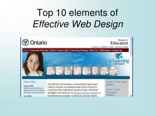
The visual hierarchy can be defined as an arrangement of different elements on a web page in which users perceive the given information easily. Such arrangements are done by creating visual contrast between different elements where the elements having higher contrast than others are recognized first by visitors. There are many websites on the internet that looks beautiful but it is not necessary that their elements are arr anged according to visual hierarchy. Read more on https://bit.ly/37MXQe7

E N D
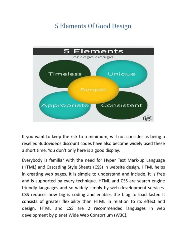
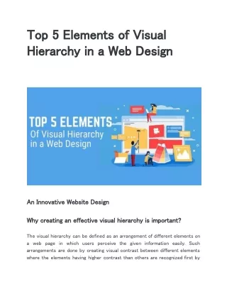
Top 5 Elements of Visual Hierarchy in a Web Design An Innovative Website Design Why creating an effective visual hierarchy is important? The visual hierarchy can be defined as an arrangement of different elements on a web page in which users perceive the given information easily. Such arrangements are done by creating visual contrast between different elements where the elements having higher contrast than others are recognized first by
visitors. There are many websites on the internet that looks beautiful but it is not necessary that their elements are arr anged according to visual hierarchy. The visual hierarchy plays an important role in affecting the interaction behaviour of users as well as their decision making ability. There are other reasons as well to use visual hierarchy in your website design but enhancing the user experience is the most important of those. Let’s see what are the other benefits of using visual hierarchy in your website design: - Promotes the specific content of your website. - Entice visitors to click call to action button. - Encourages users to sign up on your website. However there is no magic formula to build an effective hierarchy for a website, so designers must invent something new to engage the visitors on a site. They can also set right the existing applications and platforms to achieve the web design goals. Since some hierarchies are simple and some are complex to understand from the user’s point of view, you need to look for the right visual hierarchy for your website. Some of the visual hierarchy principles that you need to keep in mind while considering your web design are determining the: - Size and scale of elements - Color and contrast - Typography - Spacing - Proximity - Negative Space - Alignment - Rule of odds
- Repetition - Perspective These are the working principles of visual hierarchy that will enhance the look of your website. You need to understand one thing that if your visitors fails to understand the layout, content and call to action of you website, they might not want to work with you. You will have to portray the different elements on your web page in visually appealing way so that they can easily understand what they are seeing. It is not very difficult to do if you contact a professional web design Los Angeles company to create an effective visual hierarchy for your website. Choosing SFWP Experts would be intellectually-minded designers and developers who can create an engaging visual hierarchy for your website. When you rely on them, it is 100% sure that your call to action buttons will be clicked more number of times and the conversion rate will increase. As an award-winning web design company in Los Angeles, our aim is to build gorgeous looking websites for your business that will draw your potential customer’s attention and encourage them to do business with you. Now let’s have a look at the top 5 elements of visual hierarchy in a website design: Size From a common perspective, the most important element on a page should look larger in size so designers always consider the size factor before making any decision. For example, a common thought keep running in designer’s mind that the objects needed to be clicked by visitors should be made big enough so that they can click or tap them easily. This idea is true for call to action buttons that are placed on the homepage or landing page. The call to action buttons should not look 10 times bigger than other elements on the page as you might want to use some indirect methods to convey your message. However in some a smarter choice as they have
cases neither catchy sentences nor attractive designs are required to engage users with certain element or product. It’s because the images itself describe everything and work as an effective call to action. Size affects the different elements of the page including title, subheading and the body of content. While determining the size of different elements on the page you also need to consider their contrast and appearance. In some cases the font size of the content on the page should be kept smaller in size so that your visitors stay focused on the key visuals and not distracted from it. When you build a professional website to engage your visitors, you need to keep all the elements on the page in a balanced manner. To do this you should work on the visual hierarchy of your website and analyze the proper position, color and size of the elements. While trying to make your website more engaging you should not make something too large, and something too small. You should determine carefully the size of fonts, call to action buttons and images. If you don’t want to do it yourself and need someone experienced to create a visual hierarchy for your website, look for the highest rated web design company in the US. They will create balanced website for your business that will boost your conversion rate. However you can also fulfil your website needs through our company as we offer the best web design and development services. You can expect from our company to avail the quality services at a fraction of the cost that other big agencies charge. Layout The layout of a website also plays a major role in enhancing or worsening the visual hierarchy of that site. It affects the usability of visitors when they try to do something on your website. There are a few principles of visual hierarchy that you can work on to make a big impact on your users. It includes Fitts law and Hicks law where the former one is about taking advantage of the element’s
position on a page that can be easily reached by the visitors. For example, the corner and border of the screen is the place where a mouse can easily reach as compared to a fixed point in the center of the page. Whereas the latter explains that the more options a user would have, the longer they will take in making a decision. So it is good to not give too many options to your users and not restrict them too much in taking some action. To understand better take an example of a well-designed website and a poorly-designed website. Whom do you like to do business? It’s obvious you are going to like the former one and not the latter one. Why? Because everything you see on their page is placed at the right position and you do not need to scroll the page too much to find the useful features or elements. It’s also easy to navigate their page as you can understand well what you are required to do after landing on their website. The catchy lines, attractive images and visually appealing fonts make things clear where the CTA button is located. If you also dream to have a well-planned layout for your website, you will have to wait no longer for it anymore. There are many good web design companies in Los Angeles that can provide you the perfect layout for your website. One among them is SFWP Experts that can create the best website layout for you and it would be a valuable addition to your visual hierarchy. On top of that, our team of designers and developers are excellent in creating the best custom web design and that too at the best prices. This way we make small businesses capable of competing with the bigger brands that have a strong online presence. Colour & Contrast It’s no secret that people make emotional connections with colors when it is used individually or with other colors. You can enhance or eliminate the psychological effects of colors by making use of the contrast. When you contrast some colors against different colors, it draws more attention of the visitors when they land on your page. For example, a yellow call to action
button or font might look more impressive when it will be placed on a page with blue background. These types of color combinations will help you decide what can impress your visitors more than any other combination for your CTA. The whole internet is filled with multiple color options to choose for your website. Now it’s up to you what color you like to use for your CTA or the background of the page. When different colors are used in designing the layout of a website, the designers should make sure they work on the contrast part very well to differentiate between the key visuals and other visuals. Also they need to make sure whatever colors they are using in the website should not be hard on the eyes of visitors. The color combination that highlights the CTA on your page is considered to be good for visual hierarchy. You can also have a beautiful website for your business if you work with a good web design company. The designers at our company make good use of color palette to decide the right color for different elements of your web page. We work with the latest technologies and softwares to ensure the best web design is delivered to you in the shortest possible time. The websites designed by us are so responsive that it can be accessed by your visitors through all devices including desktop, tablet, and mobiles. Style You can enhance the design of your website by adding a touch of your own personality to it with the help of graphics, images and textures. It also affects the visual hierarchy of your page and when you use the texture correctly, it benefits you in the same way as the right color and size. For instance when you place the non-textured element in the foreground and textured one in the background, your design will stand out from other designs. But don’t do it excessively otherwise it will ruin the overall look of your page.
For using the graphics and images on your web page, it is better to make creative logos, unique icons and beautiful photos that will be displayed on your website. The idea behind going through this process is to create an aesthetically pleasing design that draws the attention of your visitors instantly. Remember a visual hierarchy is formed by the arrangement of a variety of elements on a web page such as texts, images, and graphics. If these elements are placed at the right positions on the page then it’s well and good and if not then you will have to place it correctly. When everything will be placed at the right positions, your users can find the desired features and elements easily by moving their mouse pointer. Sometimes when you browse the internet you will come across many gorgeous looking websites but not all of them have a visual hierarchy that enhances the user experience. So it is not necessary that all gorgeous looking websites provide great user experience. When you start looking for the top web design companies on the internet, not all of them have the ability to design an ideal visual hierarchy for your website. But you can trust us to create a visual hierarchy for your website if you want to increase your conversion rate. We use our several years of experience of working in the web design and development field to achieve surprising results for your band. Spacing & Proximity According to Gestalt principles, the users tend to perceive elements as a similar function when they are placed together. However the elements that are related to the central image of the page are placed just below it and the navigation options for the content of the website are placed usually at the right side. In a web design white space also plays an important role in enhancing the look of the website apart from other elements. One of the common mistakes that some inexperienced designers make while designing a website is adding unnecessary elements to the white space to fill it out instead of leaving it. They
hardly understand that white space should be used as a design tool to enhance the readability and visibility of the website content. To make the key visuals of your website easily noticeable, the sufficient amount of white space should be left between the important elements of the page. This way you can make those elements the center of attention for all the visitors landing on your page. You can also improve the comprehension of the texts by making good use of white space in margins and between paragraphs. Including white space in your web design is so important that it acts as a factor in engaging or disengaging your visitors with your web content. For this reason the designers consider white space as an important element of the visual hierarchy. Now when you know the top 5 elements of visual hierarchy in web design, you should keep it in mind while designing a customized website for your business. But if you don’t have technical knowledge of CSS and HTML languages you might not be able to create an effective website for your business. In that case you should talk to the designers of web design companies whether they will be able to build a conversion-focused website for you. If they agree you should discuss the charges and if they don’t you should get in touch with SFWPExperts - a innovative Wordpress website design company. We have been designing visual hierarchy for several websites for a long time so we think our designers are fully capable of creating engaging visual hierarchy for your website. You can also communicate with us through emails, phones or chats and we promise to respond to your query within a few minutes. Rest assured that our web designers will answer any of your questions that you might have related to your website. Contact Details: 213-277-9177
la@sfwpexperts.com Visit Reference Profile Websites: http://bit.ly/2P7Y3lA http://bit.ly/2vIdKJs http://bit.ly/2rWqU43 http://bit.ly/374jiLw http://bit.ly/32bV6pw http://bit.ly/38GE3ye http://bit.ly/3atUEXb http://bit.ly/38doihy http://bit.ly/37wO2Vk http://bit.ly/2vEfpPV http://bit.ly/2MzYweZ http://bit.ly/2sMF7k5 http://bit.ly/2ttK0i0
http://bit.ly/2HGvcAM http://bit.ly/2ECUjTs