1 / 7
70 likes | 93 Views
Presenting comparative information to viewers in a way that they can easily understand is perhaps a challenge every shopping or blog site wants to conquer. Being a customer-centric Wordpress website design company we always find ways to make our website as user-friendly as possible. In that pursuit, we create strategies to display two or more products' information in a way that facilitates the decision-making process of viewers. Read more on https://bit.ly/2YuzCnn

E N D
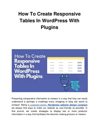
How ToCreateResponsive Tables In WordPress With Plugins Presenting comparative information to viewers in a way that they can easily understand is perhaps a challenge every shopping or blog site wants to conquer. Being acustomer-centric Wordpress website design company we always find ways to make our website as user-friendly as possible. In that pursuit, we create strategies to display two or more products' information in a way that facilitates the decision-making process ofviewers
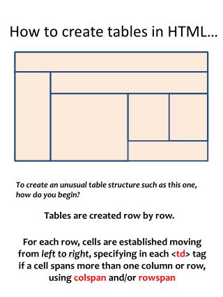
when they are considering making a purchase. You might have ignored this idea a long time back when someone shared this with you, doubting the effectiveness, but when you have noticed your sales are not touching higher marks in the graph, you found creating responsive tables worth considering. Now the question arises how to create responsive tables in WordPress websites? Well, there are more than one ways to do this but here we’ll address the easiest one here. It’s not that we’ll directly dive into it because introducing you to a ROI-focused web design company in Los Angeles is crucially important. Located in the heart of California, SFWP Expertsis a tried-and-trusted firm you can partner with to leverage a wide range of IT and marketing services such as website design, web development, and internetmarketing. Keeping that on hold for a moment, let’s jump right into how to create a responsive table in WordPress without breaking asweat. Before that, here is a brief description about WordPress tables. Have a look: What WordPress Table Is AllAbout? Inserting tables in WordPress websites is an easy task if you become familiar with The Block Editor. This comprises a Table block that you can put on any page or post youwant. When you get started with the table creation in WordPress, this editor asks you the number of rows and columns you want to have in yourtable. Don’t worry about the changes, you can edit your entries later if you want to. Once your table is generated, you can type the details you want toadd.
Not only this, you can also modify the text if you wish, just like a standard paragraphblock. However the appearance of tables becomes a bit ugly when you access your site from a mobile phone. Remember the larger your website is, the higher the chances is their information won’t fit properly to the screensize. If you are considering having a mobile-friendly design for your site, there is no better time than now to get it done. Mobile design experts at our Los Angeles web design company are looking for another opportunity to delight clients like you who want to receive high traffic from smartphoneusers. Taking a U-turn to the ongoing discussion, we’ll now make you understand the appearance of WordPress tables through an example. We have picked just normal content for instance that is packed in a handful of rows. Because more information your table contains, greater the chances for it to render inappropriately on being viewed on smallerscreens. Though this might not be a concern for some people, it matters if you want your tables to be more engaging and attention-grabbing. One more thing you need to have in your mind is that we are discussing everything about HTML tables and there are a few themes that comprises completely differentstyles. In our previous example we have used the Twenty Twenty theme that’s available by default, however, this time we have utilized Astra to display the same table on the same mobilescreen. Get a lookyourself: As far as I could anticipate, you won’t want to change themes for the perfect display unless your site consists of a lot of tables. A gooddecision
would be to change your current table style only if your present theme looksgood. In case you want to hire someone for your theme design, do let us know about it since we have most experience in the design and development department. Up until today, ourWordpress developer experts teamhas churned out over thousands of themes that met the expectation of our clients. Getting ahead to the point, now we’ll see how to create fully responsive tables for WordPress websites usingplugins. How To Make Responsive Tables In WordPress By InstallingPlugins? As I have made it clear earlier that there are many ways to create responsive tables that properly displays on all devices, but we’ll let you know about the easiest method in this blogpost: Using A Simple Plugin To Build ResponsiveTables However, there are many plugins available to shape responsive tables in WordPress, we will proceed with Ninja Tables in the next section of this blog. In addition to the common one, Ninja Tables lets you access advanced features for showcasing tables on mobile devices such as stacking table’s columns, hiding specific ones, and a whole lot more. For this reason we’ve chosen Ninja tables for this blog and wanted to make you aware of how it works. First of all, download the Ninja Tables tool, install it next, and then make it active. Once you have done that, head over Ninja Tables > All tables and create a newtable.
In the table editor you will find a button to Add Columns, click on that and then you can start the process of column creation. Be mindful, for each column you create, you can use the option to hide the whole column on various devices like desktop, laptop or mobilephone. Once you are done with all columns creation, click on the Add Data button now to create rows for your table. After this is over, go to Table Design Tab and here you can see how your data will look on different devices including mobile, tablet, and desktop. All you have to do to get a glimpse of it is to click on the buttons present just above your table naming Desktop, Tablet, andMobile. If this is not enough, you can also create stackable mobile displays by checking the box saying Enable Stackable Table and specifying which device you would like to apply this featureon. Now you can finally publish your table utilizing the Ninja Tables block found in the BlockEditor. Now that you know how to create responsive tables with Ninja Tables, it’s time to leverage it without any further delay. Aside from this, ensure to make us informed if you run into any unexpected problem while editing the content or specifications of your table. You can approach our Los Angeles web design company for multiple reasons other than this such as eCommerce web design, web development, mobile app development, copywriting, content marketing,search engine optimization, and soforth. Use AndRecommend Going through this article you would have got an idea that responsive table creation is not that tough as you might have thought. However, I wouldlike
to add that if you have extreme usage of tables to display loads of data on your site, choosing the above method will be the perfect solution for you. At the same time, I would also like to inform you that before you publish the desired table on your site, make sure it opens nicely on all devices and is quiteeffective. Once you are familiarized with this practice of responsive table creation, I doubt you will look any further to the above plugin. Despite that if you want to opt for custom responsive tables, don’t forget we are readily available to help you out. Characterized by highest customer satisfaction and project deliveries, SFWP Experts is definitely thebest Los Angeles web design companyyou should collaborate to take advantage of services like WordPress web design, web development, website hosting, social media promotion, online marketing, PPC, and SEO amongothers. Read MoreArticles: What Is A Lead Magnet? Explained With 13 Best Lead Magnet Ideas 2020 Google Launches A New AI-Powered Platform“Keen” ContactDetails: 213-277-9177 la@sfwpexperts.com Visit Reference ProfileWebsites: https://bit.ly/2B516am https://bit.ly/3dv8ZmI
https://bit.ly/2Z71QUl https://bit.ly/2CCMP53 https://bit.ly/3eEuB1q https://bit.ly/381v1wa https://bit.ly/3fU5o39 https://bit.ly/2YubocS https://bit.ly/3fW9rfd https://bit.ly/2YtVTlkh ttps://bit.ly/3eyLQkr https://bit.ly/3dzX86N https://bit.ly/3i2Lp4c https://bit.ly/2Zba0Lg https://bit.ly/3dx6KiA https://bit.ly/2Z5Dxq0 https://bit.ly/3i33vmH