Download
1 / 3
0 likes | 14 Views
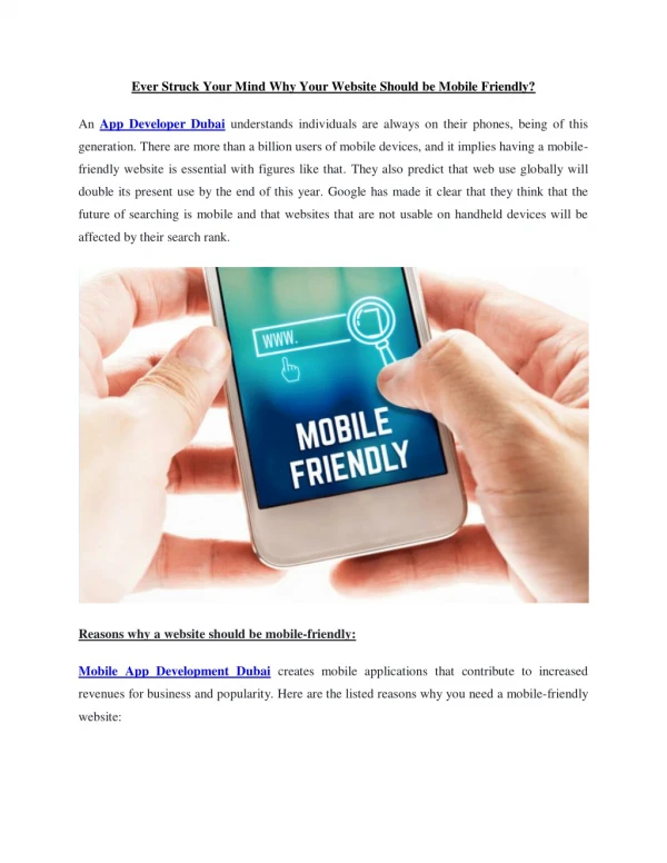
In the digital era, having a strong online presence is crucial for businesses of all sizes. With the majority of internet users accessing content through mobile devices, optimizing your website for mobile users is no longer optional; it's a necessity.

E N D
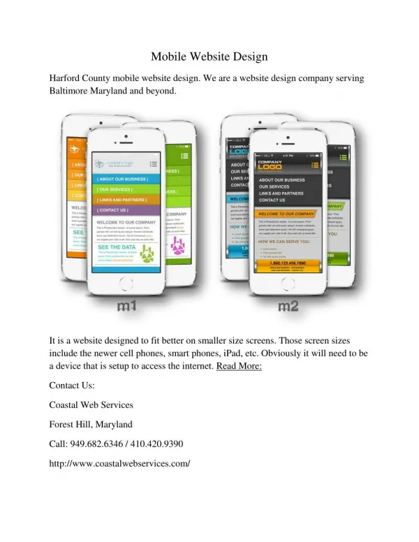
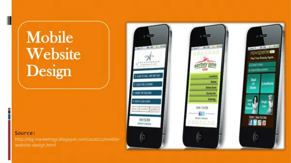
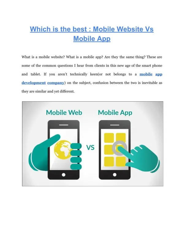
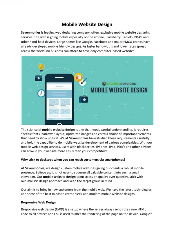
Mobile-Compatible Website vs Mobile-Optimized Website Introduction: In the digital era, having a strong online presence is crucial for businesses of all sizes. With the majority of internet users accessing content through mobile devices, optimizing your website for mobile users is no longer optional; it's a necessity. However, when it comes to mobile optimization, there are two primary approaches: mobile-compatible websites and mobile-optimized websites. In this blog post, we'll explore the differences between these two approaches and help you determine which is best for your needs. Mobile-Compatible Websites: Mobile-compatible websites are designed to work on a variety of devices, including smartphones and tablets, without the need for separate mobile-specific designs. These websites use responsive design techniques to ensure that content adjusts dynamically based on the screen size and orientation of the device being used.
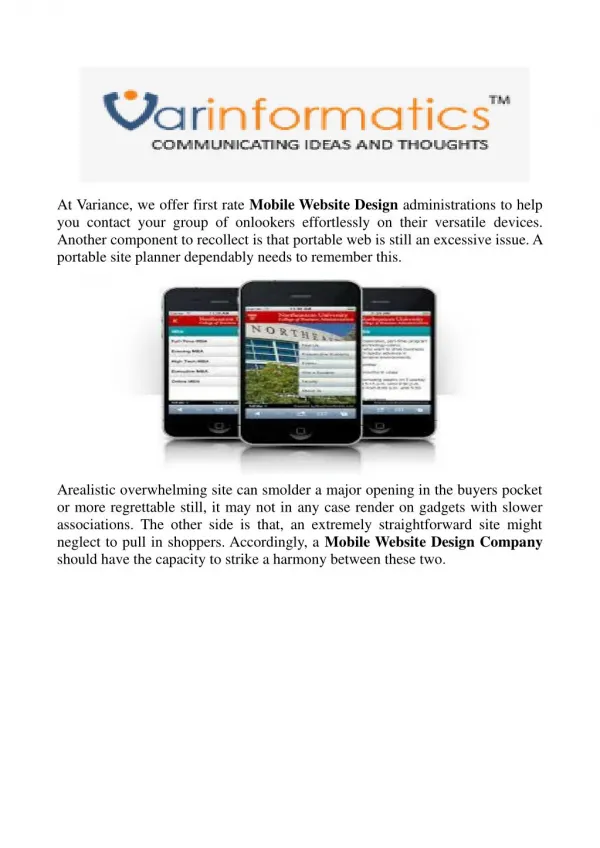
Pros of Mobile-Compatible Websites: Cost-Effective: Developing a mobile-compatible website typically requires less time and resources compared to building a separate mobile-specific version. Consistent User Experience: Since the same website is served to all users regardless of device, there is consistency in the user experience. Easier Maintenance: With a single website to manage, updates and maintenance tasks are streamlined. Cons of Mobile-Compatible Websites: Limited Optimization: While mobile-compatible websites adapt to different screen sizes, they may not provide the most optimized experience for mobile users. Slower Load Times: Mobile-compatible websites may load slower on mobile devices compared to mobile-optimized counterparts, especially on slower connections. Mobile-Optimised Websites: Mobile-optimized websites are specifically designed to provide the best possible user experience on mobile devices. These websites often feature simplified navigation, faster load times, and optimised layouts tailored to the needs and behaviours of mobile users. Pros of Mobile-Optimized Websites: Enhanced User Experience: Mobile-optimized websites prioritize mobile users, providing faster load times, intuitive navigation, and optimized layouts. Improved SEO Performance: Google and other search engines prioritize mobile- optimized websites in mobile search results, leading to better visibility and higher rankings.Higher Conversion Rates: A seamless mobile experience can lead to higher conversion rates and increased customer satisfaction. Cons of Mobile-Optimized Websites: Higher Development Costs: Building a mobile-optimized website requires additional time and resources compared to a mobile-compatible website. Maintenance Challenges: Managing separate desktop and mobile versions of a website can be more complex and time-consuming. Which is Best for You? The decision between a mobile-compatible website and a mobile-optimized website ultimately depends on your specific goals, budget, and target audience. If you're looking for a cost-effective solution that provides a consistent user experience across all devices, a mobile-compatible website may be the way to go.
However, if you prioritize providing the best possible experience for mobile users and are willing to invest in a more robust solution, a mobile-optimized website is likely the better choice. Conclusion: In today's mobile-centric world, having a website that caters to mobile users is essential for success. Whether you opt for a mobile-compatible website or a mobile-optimized website, prioritizing mobile responsiveness will help you reach and engage with your target audience more effectively. Evaluate your specific needs and resources to determine which approach is best suited for your business. Website: https://fin-node.com/ Email: finnode.softwaresolutions@gmail.com Phone: +971 52 755 6707


![Mobile app & Mobile website [Infographic]](https://cdn5.slideserve.com/10152860/slide1-dt.jpg)