Download
1 / 23
230 likes | 351 Views
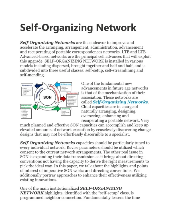
Self-Organising Networks. This is a lecture for week 10 of Biologically Inspired Computing; about Kohonen’s SOM, what it’s useful for, and some applications.

E N D
Self-Organising Networks This is a lecture for week 10 of Biologically Inspired Computing; about Kohonen’s SOM, what it’s useful for, and some applications.
(it may output ‘dog’, in which case we make certain changes to the classifier to avoid that response for this pattern, or it may output `cat’, and we may still change it a bit to get a stronger output next time). Classifier in training cat Supervised vs Unsupervised Learning Most work with pattern recognition / classification is concerned with solving supervised learning problems. In supervised learning, you have a Classifier (e.g. a neural network, or a decision tree, or a rule, or a set of rules) that makes predictions. During the training process, we provide an example pattern and we provide the correct prediction: In Unsupervised learning, the difference is that we do not provide the correct answer (or any answer) during training. An Unsupervised learning method is something that receives lots of inputs, and tries to organise them in some way, to try to understand the world it seems to be inhabiting. Does that remind you of anything?
Supervised Learning 2-slide explanation Some of you may not need this (e.g. if you did the Data Mining module, or otherwise know about NNs, but in case not …) Let M be a model (neural network, decision tree, whatever …) Given many lines of data like this (say): age=50, dependents = 5, salary = 32, homeowner = Y age = 42, dependents = 1, salaray=10, homeowner = N … We want to fix the parameters of M so that it reads the first three attributes in a line of data and correctly predicts homeowner status In supervised learning, this is done in the following sort of way:
Supervised Learning 2-slide explanation by simple example • Initialise M (maybe with random parameters) • Evaluate M – find the overall accuracy of its predictions on • all of the training data 3. Repeat the below over and over again until M’s performance stops improving. 3.1. Make a slight change to M’s parameters. 3.2 Re-evaluate M (as in step 2). If the new M is better, keep the change, otherwise revert to previous M. This is just hillclimbing using M’s performance as the fitness function. It is supervised learning because, in steps 2 and 3.2 we make use of the known targets for prediction (e.g. the known homeowner status in the training data), so that we can evaluate M’s performance. In unsupervised learning, this doesn’t happen – we just `learn’, without knowing how `good’ our model is.
Some Notes on Unsupervised Learning • UL is often used to discover underlying structure in data; it is very similar to an area also called cluster analysis • Animals (brains) mainly learn by a form of unsupervised learning in their formative years. • The main product of an unsupervised learning method is some kind of structuring of the data that has been fed in. • This structuring then may become useful for: • Prediction: A new pattern comes along, the learner finds where • it goes in the `structure’, and predicts that the new thing will • behave like the things close to it in the learned structure. • Mapping: organisms’ learning a map of their environment is • usually an achievement of UL • Visualisation: This is the main practical benefit of certain bio-inspired UL • methods. High-dimensional complex datasets can be visualised in 2D or 3D after doing some unsupervised learning.
Why we need visualisation/clustering Consider the following data: these might be patterns indicating the preponderance of different blood proteins in a set of patients. 3.2 5.7 1.3 6.2 4.0 5.7 8.2 2.1 7.7 3.2 4.9 7.5 1.5 7.7 11.0 4.2 9.2 3.1 How many clusters are there? Can you distinguish types of patients?
In many applications (usually the interesting and new ones), we start off unaware of what structure and patterns are in the data. • Visualisation is (obviously) helpful to see any structure that might be present. • Notice what’s going on here: visualisation is a way of transforming the data in a way that means we can input it into a very powerful pattern recognition device – what device? • By visualisation, we can identify groups or clusters in the data; this means we start to understand what we are dealing with; in commerce, for example, these clusters might be market segments. In medicine, these clusters might correspond to different brain chemistries; and so on. • But we can’t easily visualise data if it is not 2D or 3D – e.g. it might be 1000-dimensional or more … • But what about automated clustering to identify groups?
An aside on clustering algorithms Clustering is a way of doing precisely what we get from visualisation; (automatic) identification of groupings in the data. It is a hard problem There are several fast algorithms for it, while we can also do it with EAs, which are slower but generally better. A good clustering is one which minimises a function like the following: mean distance between points in the same cluster ----------------------------------------------------------- mean distance between points in different clusters
E.g. suppose we are clustering these 11 items … 4 1 2 3 5 6 7 9 8 10 11 We could use the straightforward `bin-packing’ encoding
The chromosome 1 2 1 1 2 1 3 3 2 1 2 represents this clustering: 4 1 2 3 5 6 7 9 8 10 11 Which scores pretty badly on the fitness function of the previous slide; e.g. there are many examples of points in the same cluster that are further from each other than points in different clusters.
The chromosome 1 1 2 2 2 1 1 1 2 2 2 represents this clustering: 4 1 2 3 5 6 7 9 8 10 11 Which scores much better on the fitness function; is this the best clustering of these items?
The chromosome 1 1 2 2 2 1 1 1 3 3 3 represents this clustering: 4 1 2 3 5 6 7 9 8 10 11 This one is pretty good too. Very often it is not clear at all what the `correct’ clustering is, and how many clusters there should be in the first place. But clustering algorithms face even bigger problems …
Here, it is easy to see what the best way is to cluster these data into two groups. All clustering algorithms will find this result. Here, it is also easy to see the two groups; But almost all clustering algorithms will fail to find them. This is because the standard fitness function doesn’t work in this case. importantly, no fitness function will work for all cases. Also, with large complex datasets, we often have no idea in advance about how many clusters there might be, or what `shape’ they may take (which, if we knew, could guide choice of fitness function). This is why visualisation methods are very useful
Here is part of a 2D visualisation of some very high-D vectors, which are encodings of www pages. So, this is a map of part of the WWW; the labels identify the most common word in documents in that part of the map. Colour represents number of docs in the area. What kinds of documents might be on the border between movies and music? This map is produced by a self-organising map (SOM) algorithm, invented by Teuvo Kohonen, and now very commonly used for visualisation.
The SOM algorithm (along with others in the neural computing literature, using “winner takes all” learning methods) is loosely inspired by the way the brain organises its own structure in early years. The brain essentially builds 2D and 3D maps of its experiences. More basic than that, we can consider the sensory and motor maps on the right
Kohonen’s SOM; The basic idea The basis of the map is a (usually) 2-dimensional array of nodes. If the data are k-dimensional (k-element) vectors, then each node has a vector of k weights associated with it.
Kohonen’s SOM; The basic idea • Suppose k = 5. An input data pattern comes along, say: (5, 2, 1, 7, 8) • The algorithm finds the best matching node. Suppose this is the red one. Next: two things happen: • The weight vectors of nodes in the neighbourhood of the red one (and the red one itself), get changed to move a little closer to the input vector. • The neighbourhood parameter is altered slightly, so that the neighbourhood is possibly smaller next time.
Kohonen’s SOM; The basic idea Illustrating points in the neighbourhood of the BM node moving closer in their vectors to that of the input pattern (and hence also becoming more similar to the BM node)
An example where: The data are simply 2D grid points – a good test, to see if a SOM can appropriately organise something, when we already know what the organisation should be. But with a twist: points from the central area were presented to it 20 times more often than points out of centre. The plots are made by simply plotting the nodes’ weight vectors (initially random and small), with lines connecting nearest neighbours. The numbers give numbers of patterns presented.
Kohonen SOM Pseudocode Naturally there are variations, but the following is common: • Parameters: initialise neighbourhood parameter r and learning rate alpha. Initialise topology (usually a grid) on which the SOM vectors sit, so that the neighbours of a vector are those within r steps on this grid. • Randomly choose an input pattern x . Find its distance d_i from each of the SOM vectors i. Let b be the SOM vector that is closest, breaking ties randomly. • Decide which vectors are in the neighbourhood of b (those within r steps). • Each of the SOM vectors in the neighbourhood of b, including b itself, is updated as follows: vec = vec + alpha ( x – vec ) • According to some predefined function, slightly reduce r • Until r is 0, or some other suitable criterion, return to 1.
Example Application: World Poverty Map Data: World Bank statistics of countries in 1992. Altogether 39 indicators describing various quality-of-life factors, such as state of health, nutrition, educational services, etc. “The complex joint effect of these factors can can be visualized by organizing the countries using the self-organizing map.” Countries that had similar values of the indicators found a place near each other on the map. The different clusters on the map were automatically encoded with different bright colors, nevertheless so that colors change smoothly on the map display. As a result of this process, each country was in fact automatically assigned a color describing its poverty type in relation to other countries. The poverty structures of the world can then be visualized in a straightforward manner: each country on the geographic map has been colored according to its poverty type.