Making PowerPoint Slides
140 likes | 302 Views
Making PowerPoint Slides. Avoiding the Pitfalls of Bad Slides. Outlines Slide Structure Fonts Colour Background Spelling and Grammar. Tips to be Covered. Outline . Make your 1 st or 2 nd slide an outline of your presentation e.g. the previous slide

Making PowerPoint Slides
E N D
Presentation Transcript
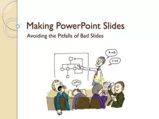
Making PowerPoint Slides Avoiding the Pitfalls of Bad Slides
Outlines Slide Structure Fonts Colour Background Spelling and Grammar Tips to be Covered
Outline • Make your 1st or 2nd slide an outline of your presentation • e.g. the previous slide • Follow the order of your outline for the rest of the presentation • Only place main points on the outline slide • e.g. use the titles of each slide as main points
Slide Structure – Good • Write in point form, not complete sentences • Avoid wordiness: use key words and phrases only
Slide Structure - Bad • This page contains too many words for a presentation slide. It is not written in point form, making it difficult for your audience to read. Although there are exactly the same number of points on this slide as the previous slide, it looks much more complicated.
Slide Structure – Good • Show one point at a time. This will: • help the audience concentrate on what you are saying • prevent the audience from reading ahead • help you keep your presentation focused
Do not use a distracting animation Do not go overboard with animations Slide Structure - Bad
Fonts - Good • Use at least an 18-point font • Use different size fonts for main points and secondary points • this font is 24-point, the main point font is 28-point, and the title font is 36-point • Use a standard font like Times New Roman or Arial
Fonts - Bad • If you use a small font, your audience won’t be able to read what you have written • CAPITALIZE ONLY WHEN NECESSARY. IT IS DIFFICULT TO READ • Don’t use a complicated font
Colour - Good • Use a font colour that contrasts sharply with the background • e.g. a blue font on white background • Use colour to reinforce the logic of your structure • e.g. a light blue title and dark blue text • Use colour to emphasize a point • but only use this occasionally
Colour - Bad • Using a font colour that does not contrast with the background colour is hard to read • Using colour for decoration is distracting and annoying. • Using a different colour for each point is unnecessary • Using a different colour for secondary points is also unnecessary • Trying tobe creativecan alsobe bad
Background - Good • Use backgrounds such as this one that are attractive but simple • Use backgrounds which are light • Use the same background consistently throughout your presentation
Background – Bad • Avoid backgrounds that are distracting or difficult to read from • Always be consistent with the background that you use
Spelling and Grammar • Check your slides for: • speling mistakes • the use of of repeated words • grammatical errors you might have make