GUI Bloopers
GUI Bloopers. Basic Principles. What is a GUI Blooper?. “Bloopers” are mistakes that software developers frequently make when designing graphical user interfaces Not just specific examples but mistakes that developers make over and over


GUI Bloopers
E N D
Presentation Transcript
GUI Bloopers Basic Principles
What is a GUI Blooper? • “Bloopers” are mistakes that software developers frequently make when designing graphical user interfaces • Not just specific examples but mistakes that developers make over and over • Goal is to give examples of mistakes AND help designers and developers learn to produce better GUIs
Basic Principle 1 • Focus on the users and their tasks, not on the technology • This means you should answer these questions: • For whom is the software being designed? • What is the software for? • What problems do the users have now? • What skills and knowledge do the users have? • How do users conceptualize the data? • What are the users’ preferred ways of working?
Basic Principle 1 • Requires collaboration with the user • “Software should be designed neither for users nor by them, but rather with them.” • We covered most of these items in the software engineering class
Basic Principle 2 • Consider function first, presentation later • We’ve said that you should make a GUI mock-up before coding, isn’t this contradictory? • No, function means determining the requirements and basic functions of the software. It doesn’t mean writing actual code functions. • Before GUI layout we must decide what data the users can create, view, or manipulate. • Conceptual Model
Basic Principle 3 • Conform to the user’s view of the task • Software user interfaces should be designed from the user’s point of view • Obviously this requires that you know what the user’s point of view is (Basic Principle 1) • Strive for naturalness • E.g. in chess, drag and drop piece or enter coordinates? • Don’t impose arbitrary restrictions • E.g. maximum of 255 entries • Use user’s vocabulary, not your own • Keep program internals inside the program • Includes error messages
Basic Principle 4 • Design for the common case • Ever create a new “object” in a program and find yourself having to change its default properties all the time? • Strive to make common tasks easy • Sensible defaults, templates or “canned” solutions, wizards, customizability
Basic Principle 5 • Don’t distract users from their goals • People are good at multi-tasking, but not for problem solving and stuff we don’t do all the time. Software shouldn’t distract users from their own tasks and goals. • E.g. hard to find functions, confusing terminology • Operate in the background, not the foreground of user’s consciousness.
Basic Principle 6 • Facilitate Learning • Software is often hard to learn, some of the blame may be from “inside-out” thinking, the idea that users will actually know how to operate the software • Clear to developers but may not be clear to users
Basic Principle 6 • Example: Graphical Ambiguity • With lots of icons it is difficult to make them meaningful • What does this mean? Antenna for a transmit function, not a martini glass with a stick
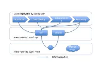
Basic Principle 7 • Deliver information, not just data • E.g. comparative chart vs. list of data values • Don’t treat the data like information, focus on the important data and extract necessary information from it
Basic Principle 7 • The screen belongs to the user • Don’t take over the screen, researchers discovered it is usually a bad idea for software to unilaterally move controls and data around on the screen • Jump or “warp” the mouse to new positions • Move something to the mouse location • Reposition windows • Automatically rearrange data for the user • Controlling the mouse for the user violates the hand-eye coordination a user has with the machine
Basic Principle 7 • Preserve “Display Inertia” • When software changes a display to show the effect of a user’s actions, it should try to minimize what it changes • Small local changes should produce small, local changes on the display • Attempt to keep as much of the display unchanged as possible • Helps the user retain context, minimizes disruption • Examples of poor display inertia: • Forcing entire page to refresh • Scrolling to a different position in the browser
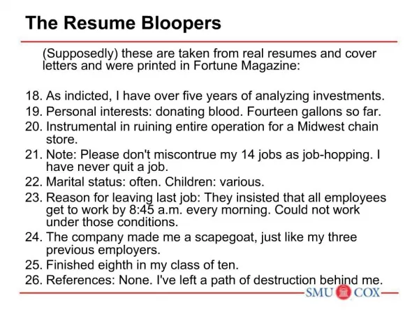
Basic Principle 8 • Design for responsiveness • A software application’s ability to keep up with users and not make them wait • The most important factor in determining user satisfaction • Users hate waiting more than anything else • Desire for speed is perceived, not actual • A responsive interface that shows progress in computing a result is perceived as faster than one that displays nothing (system pauses) until the result is done
Basic Principle 8 • Systems can be slow in terms of performance but still responsive • Might queue requests but never lock-up or force users to wait for the system to catch up • Examples of poor responsiveness • Delayed feedback for button-press or mouse click • Operations that block activity • No visual feedback as to how long a lengthy operation will take • Jerky animation Effect of response time on user productivity
Basic Principle 8 • Designing for responsiveness • Acknowledge user actions instantly, even if returning the answer will take time • Let users know when it is busy and when it isn’t • Free users to do other things while waiting for something to finish • Animate movement smoothly • Allow users to abort lengthy operations • Allow users to accurately judge how long something will take
Basic Principle 9 • Try it out on users, then fix it! • Test early and often, results may surprise even experienced designers • Schedule time to correct problems found by tests • Tests have two goals • Information on aspects of the UI that cause difficulty • Socially it convinces developers that there are design problems that need correcting. Some developers need to see users have problems for themselves.
GUI Control Bloopers • Two categories of control bloopers • Using the wrong GUI Control • Using a control incorrectly • Control bloopers harm usability and give customers an impression of a shoddy, unprofessional product
Blooper 1: Confusing checkboxes and radio buttons • Radio buttons when only one is selectable • Checkboxes when many selectable Word: Change font, effects, subscript and superscript
Blooper 1 • Diebold/Premier AccuVoteTSx operates somewhere between checkboxes and radio buttons
Avoiding Blooper 1 • Use radio buttons • When only one option may be selected • In sets of at least two • Ensure enough space is available to see all options • The number of options is fixed and small (2-8) • Consider dropdown or scrolling menus which requires less space • Checkboxes represent ON/OFF conditions that are independent of each other
Blooper 2: Checkboxes for non-ON/OFF Setting • Checkboxes should be used for on/off not for a selection of items. • Instead use radio buttons.
Blooper 3: Command Buttons as Toggles • Saves space on the screen but toggling meaning of a button can be missed by the user • Misleads users; can’t predict by looking at them how they’ll behave, have to try them • “Mystery Meat Navigation” • Use two buttons and disable the inactive one, or use a toggle switch style control
Blooper 4: Using tabs as radio buttons • Misuse of tabs is to use them as if they are radio buttons to present choices that affect what the application will do rather than just which controls are displayed • Some users will not realize the last tab selected is the one that is used – users expect tabs just for switching between panels
Tabs as Radio Buttons • Better design: Tabs should be purely navigational controls, not for settings
Blooper 5: Too Many Tabs • Intended to save space but too many uses more space – usually doesn’t scale beyond a handful • Never use dancing tabs; change position based upon which tab is selected • Unavoidable with multi-rows of tabs
Multi-Row Tabs Solutions: Widen panel, make tabs narrower, or use another control instead of tabs
Blooper 6: Using input controls for display-only data • Don’t use input controls (textboxes, radio buttons, checkboxes, etc.) to present data users cannot change. This refers to controls that are never editable, not to ones that are temporarily inactive (grayed out).
Blooper 6 Example Avoiding Blooper 6: Use labels, don’t use controls that look like they can be edited
Blooper 7 : Overusing text fields for constrained input • Text fields are too unstructured for constrained data • Dates, postal codes, volume levels, monetary amounts, etc. • Especially occurs in paper to GUI conversion • Use structured controls to allow only valid data
Database Project w/Job Titles • Contractor is trying to match up titles, but getting values like: Consiltant(Nonexempt) Consultan(Nonexempt) Consultant (Noneexempt0 Consultant (Nonexempt( Consultant (Nonexempt) Consultant(Nonexempt)
Blooper 8: Dynamic Menus • Menu item that changes depending upon the context • Might seem to help; removes commands one shouldn’t be able to execute at that time • But users end up wondering where commands went
Dynamic Menus: Better • Gray out or add entirely new menu that appears/disappears
Dynamic Menus: Better • Add and remove menus, not menu items • Exception: quick lists • E.g. recently opened files, bookmarks, opened documents
Blooper 9 : Intolerant Data Fields • To be friendly and helpful your text fields should tolerate reasonable variations in what people type • E.g. filter out spaces (common w/cut and paste), dashes, period, tab, etc.
Avoiding Blooper 9 • Match field length to data • Visible length suggests how much to type • Accept common formats • Beware of rejecting legitimate data • Make case irrelevant • Provide a pattern (e.g. draw dashes in QP-00-3412) • Structure text fields • Use pull-down menus or combo-boxes
Blooper 10 : Input fields and controls with no default • Defaults should be set up with the most likely values; users only need to scan the settings, change a few, and proceed
Blooper 10 Examples Radio buttons with no default values
Blooper 10 Examples • Drop-down menu with no default and poor labeling
Avoiding Blooper 10 • Use likely default values • Always add initial value for radio buttons, or “None” as an explicit choice
Blooper 11 : Poor Defaults • A default value that is unlikely to be what users want is more harmful than no default value
Blooper 12: Negative Checkboxes • Negative checkboxes turn a feature or attribute OFF when checked and ON when unchecked