Download
1 / 18
180 likes | 198 Views
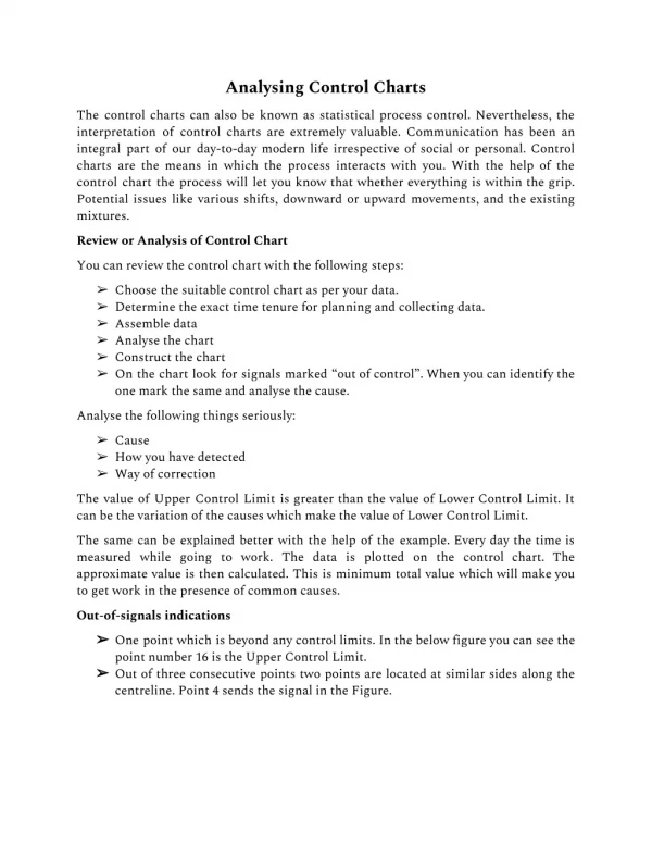
This presentation explores how to interpret data by using variation and control charts, emphasizing the importance of understanding the underlying process for effective decision-making. By adding control limits and conducting zone tests, leaders can identify special causes of variation and make informed predictions about process improvements.

E N D
Variation and Control ChartsA Leadership Perspective Please give credit to www.spcforexcel.com when using this presentation.
How Do We Look at Data? Sales (000) in Jan-10: $11,229 A number by itself has little meaning. So, we naturally want to compare it to something. But to what? Budget for Jan-10: $10,000 Sales in Jan-09: $7,997 Typical comparisons include: • This month’s result to last year’s result • This month’s result to budget • YTD result to last year’s YTD • YTD result to budget
Financial Reports First Quarter Sales: Second Quarter Sales: YTD Sales:
Variation in Metrics • The measurements we take reflect the variation in the process. • The problem with measurement systems that compare one time frame to another (like the financial report) is that the actual performance (variation) of the process is hidden – we don’t know if there are special causes or just common causes. Sales in Jan-10: $11,229 Sales in Feb-10 $10,016 Are these two numbers the same?
Measurements and the Underlying Process • Let’s return to the financial report from before – things did not look too good – especially in the second quarter. • Let’s explore another method of examining the data that reveals the “voice of the process” – the true performance.
Measurements and the Underlying Process • The table below shows the monthly data used to make the earlier tables. • What does this data tell you? • Often, it is difficult to understand the process by looking at a table of numbers.
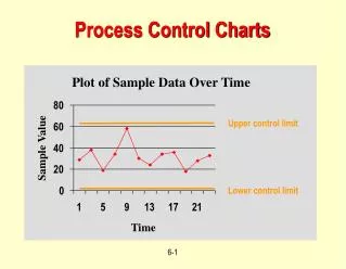
It is often better to examine the data as a time series chart. • No major change in monthly sales - some months better than others • Financial report indicated a problem (2Q 2004) • Time series tells a different story • There is a problem though – sales aren’t increasing
Adding the average line helps with interpreting the process behavior • Nine points above, nine points below • Monthly sales fairly predictable • Range from about $600,000 to about $1,200,000 • Can provide an early warning of problems
Control Limits • The time series charts can be further enhanced by adding control limits • These limits define the boundaries for common causes of variation • With common cause of variation: • The upper control limit (UCL) is the largest value you can expect • The lower control limit (LCL) is the smallest value you can expect • As long as the all the points are within the limits and there are no patterns, only common cause of variation is present • The process is said to be “in control” • To improve it, you must fundamentally change the process UCL LCL
Sales chart with control limits • Process is “in control” • Can predict what will happen in the future • It is not the limits, but the story that the chart tells • Provides feedback on whether the process is changing or staying the same
Special cause UCL Avg LCL Special cause Interpreting Time Series Charts • Points beyond the limits
UCL A B C Avg C B A LCL Zones Test • The zone tests are valuable tests for enhancing the ability of control charts to detect small shifts quickly. • The first step in using these tests is to divide the control chart into zones. • The chart is divided into six equal zones: three above the average and three below the average.
X= Out of Control Point UCL X A B C Avg C B X A LCL Test for Zone A A special cause of variation exists if there are two out of three consecutive points in zone A or beyond (on one side of the average).
X= Out of Control Point UCL A X B C Avg C B X A LCL Test for Zone B A special cause of variation exists if there are four out of five consecutive points in zone B or beyond (on one side of the average).
X = Out of Control Point UCL A B X C Avg C B A LCL Test for Zone C A special cause of variation exists if there are seven or more consecutive points in zone C or beyond (on one side of the average).
UCL UCL UCL UCL Avg Avg Avg Avg LCL LCL LCL LCL Seven Points in a Row Below the Average Seven Points in a Row Above the Average Seven Points in a Row Trending Down Seven Points in a Row Trending Up Rule of Seven Tests
Summary Special or Common?