Download

1 / 5
50 likes | 66 Views
Mobile SEO refers to the practice of optimizing a website for mobile devices, improving its visibility and user experience on smartphones and tablets. With search engines like Google placing a strong emphasis on mobile-friendly websites, implementing Mobile SEO strategies has become crucial for online success. Here are some key considerations to ensure your website is mobile-friendly.

E N D
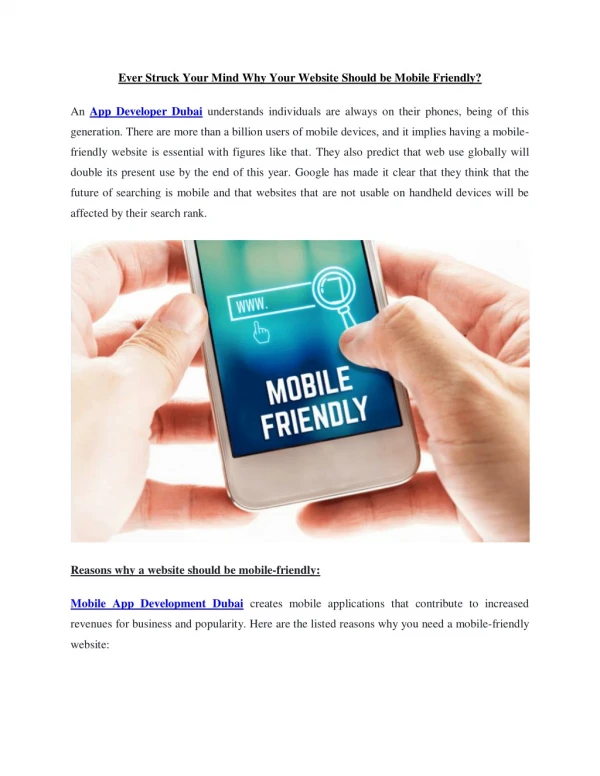
Mobile SEO: Ensuring Your Website is Mobile-Friendly In today's digital age, mobile devices have become an integral part of our lives. People are constantly on the go, relying on their smartphones and tablets to access information, make purchases, and interact with businesses. As a result, it is essential for website owners to prioritize mobile optimization and ensure their websites are mobile-friendly. This is where Mobile SEO comes into play. Mobile SEO refers to the practice of optimizing a website for mobile devices, improving its visibility and user experience on smartphones and tablets. With search engines like Google placing a strong emphasis on mobile-friendly websites, implementing Mobile SEO strategies has become crucial for online success. Here are some key considerations to ensure your website is mobile-friendly.
Responsive Web Design: A responsive web design is the foundation of a mobile-friendly website. It ensures that your website adapts and displays properly across different screen sizes and resolutions. By using flexible layouts, proportion-based grids, and media queries, a responsive design provides an optimal viewing experience on any device. This not only enhances user experience but also positively impacts your search engine rankings. Mobile-Friendly Content: When optimizing your website for mobile, it's essential to create content that is easily consumable on smaller screens. Keep paragraphs short and concise, use subheadings to break up text, and make sure the font size is legible.Users are more likely to abandon a website if it takes too long to load on their mobile devices. SEO Services implement SEO strategies on your website for making your content mobile friendly.
Mobile-Specific Keywords: Mobile searches often differ from desktop searches, so it's important to consider mobile-specific keywords when optimizing your website. Mobile users tend to search for more localized and action-oriented terms. Conduct keyword research to identify relevant mobile keywords and incorporate them into your content, meta tags, and headings. This will help improve your visibility in mobile search results. Mobile Usability Testing: In SEO regularly testing your website's mobile usability is crucial to ensure a seamless user experience. Test your website across various mobile devices and browsers to identify any issues or glitches that may hinder user interaction. Pay attention to factors such as page loading speed, button responsiveness, and overall usability. Fixing these issues promptly will enhance user satisfaction and increase your chances of ranking higher in mobile search results.
Mobile Site Speed: Mobile users expect websites to load quickly, and search engines take loading speed into account when ranking websites. SEO Services optimize your website for speed by minimizing server response time, leveraging browser caching, and enabling compression. Consider using Accelerated Mobile Pages (AMP) to deliver lightning-fast loading times and improve the overall mobile user experience. Mobile Social Media Integration: With the popularity of social media on mobile devices, it's crucial to integrate mobile-friendly social media sharing buttons and widgets into your website. This allows users to easily share your content on their social media platforms, increasing visibility and driving more traffic to your site.
Voice Search Optimization: Voice search has gained significant traction with the rise of virtual assistants like Siri, Google Assistant, and Alexa. Optimize your website for voice search by incorporating conversational and long-tail keywords. Focus on providing direct answers to frequently asked questions and structuring your content in a way that is easily digestible by voice search algorithms. Local SEO for Mobile: Mobile devices are often used for local searches, such as "restaurants near me" or "hair salons in my area." Implement local SEO strategies to improve your visibility in local search results. This includes optimizing your Google My Business listing, including your address and contact information, and encouraging customer reviews.