Download
1 / 25
250 likes | 329 Views
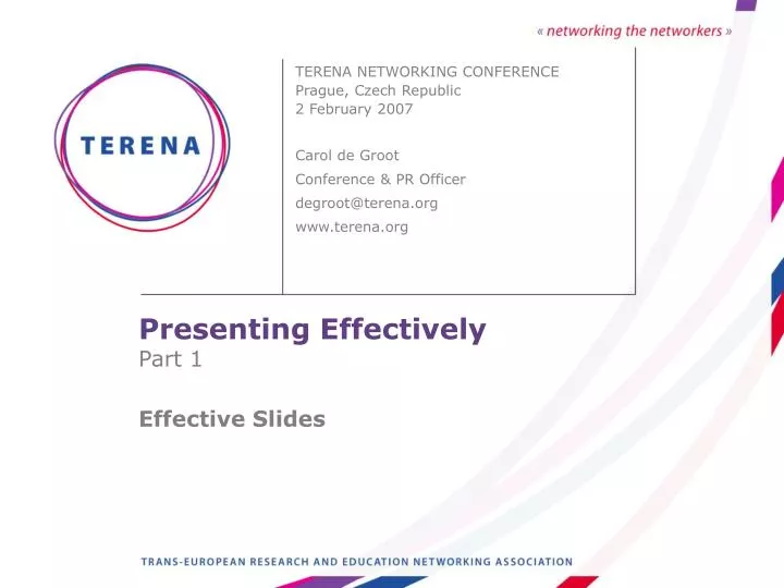
Presenting Effectively Part 1 Effective Slides. TERENA NETWORKING CONFERENCE Prague, Czech Republic 2 February 2007 Carol de Groot Conference & PR Officer degroot@terena.org www.terena.org. Outline. Structure Templates Fonts Content Colours Language Animation Sequence Summary.

E N D
Presenting EffectivelyPart 1Effective Slides TERENA NETWORKING CONFERENCEPrague, Czech Republic2 February 2007 Carol de GrootConference & PR Officer degroot@terena.orgwww.terena.org
Outline • Structure • Templates • Fonts • Content • Colours • Language • Animation • Sequence • Summary degroot@terena.org
Structure • Start with an outline of your presentation • Make you points logically and clearly • Summarise your main points • Come to a definite conclusion • Invite questions degroot@terena.org
Use a professionally designed template • Available in your slide software • Search for free resources, for example: http://www.poweredtemplates.com/free-ppt-powerpoint-templates.html • Select a clear, simple template degroot@terena.org
with enough flexibility to display different types of data joanne@terena.org
Fonts This is Verdana 12 point This is Verdana 18 pt This is Verdana 24 pt This is Verdana 30 pt This is Verdana 36 pt This is Verdana 44 pt degroot@terena.org
Step back about 2 m. from your screen to check your font size. 12 point is too small 18 point is also very small 24 point is good for text 30 point is recommended 44 point is ‘in your face’ degroot@terena.org
CAPITALISE ONLY WHEN NECESSARY. IT IS • DIFFICULT TO READ • Don’t use a complicated font • Serif fonts can look busy – be careful! • Sans serif fonts like Arial or Verdana • are clear, sharp and legible degroot@terena.org
Italics are difficult to read on screen • Normal or bold fonts are clearer • Underlines may signify hyperlinks • Instead, use colours for emphasis degroot@terena.org
Content • 1 slide for every minute or two • 4 or 5 bullet points per slide • 4 to 5 keywords per point • Don’t read your slides • Use keywords to support your talk degroot@terena.org
Colour • Using a font colour that does not • contrast with the background colour • is hard to read • Using colour for decoration is • distracting and annoying • Using a different colour for each • point is unnecessary degroot@terena.org
Trying tobe too creative can alsobe a mistake degroot@terena.org
Over 12% of men of European origin are colour blind. Avoid usingredandgreen together in your illustrations. Many in the audience will see this: Avoid usingredandgreen together in your illustrations. degroot@terena.org
Avoid using dark red shades and black in text and illustrations. Some in your audience will see this: so they won’t know what you are talking about! degroot@terena.org
Language Set the language for your talk - degroot@terena.org
and remember to run a check. degroot@terena.org
Animation Excessive animation distracts degroot@terena.org
A simple fade attracts degroot@terena.org
Sequence Use a numbered list only for points with a logical sequence: How to put an elephant in the refrigerator? Open the door Put the elephant in Close the door degroot@terena.org
Use bullets for lists of information • elephants are large • you need a big fridge • elephants don’t require refrigeration degroot@terena.org
Summary • Start with an outline • Use a professionally designed template • Make your points logically and clearly • 18 point should be the smallest font you use • Try a sans serif font like Arial or Verdana degroot@terena.org
1 slide for every minute or two • 4 or 5 points per slide • 4 to 5 keywords per point • Use contrasting colours – dark on light • Set the language and run a spelling and • grammar check degroot@terena.org
Keep animation simple • Use a numbered list only for points with • a logical sequence • Use bullets for lists of information degroot@terena.org
Conclusion • Come to a definite ending • Thank them for their attention • Invite questions degroot@terena.org