Download
1 / 12
120 likes | 220 Views
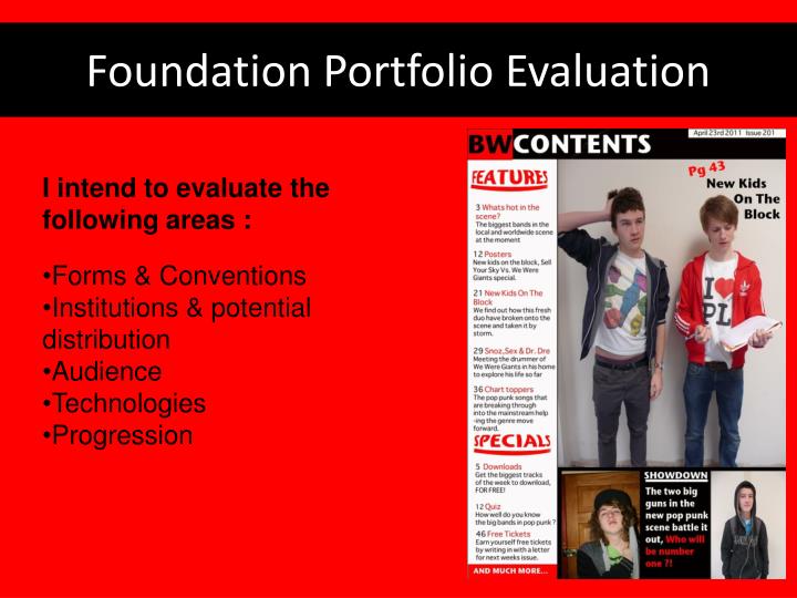
I intend to evaluate the following areas : Forms & Conventions Institutions & potential distribution Audience Technologies Progression. Foundation Portfolio Evaluation. Forms and conventions.

E N D
I intend to evaluate the following areas : • Forms & Conventions • Institutions & potential distribution • Audience • Technologies • Progression Foundation Portfolio Evaluation
Forms and conventions Brand Identity : My magazine is called Brainwashed, I chose this name because it connotes that the music inside will be catchy and get stuck in your head, the large thick font makes it instantly noticeable Tagline : “taking over the mind with music” was my chosen tagline, I chose this because it fits in with the brand identity, having this directly under the brand identity is used on many magazines, such as Q : http://static.guim.co.uk/sys-images/Media/Pix/pictures/2009/02/23/qmagazine460.jpg
Forms and conventions 2 Callout: A very helpful convention to get your magazine noticed, by standing out and catching the eye of the target audience, usually with competition details inside. Column inch: This promotes the secondary stories that are within the magazine, alternating colours between each point is frequently used on magazines of this type.
Forms and conventions 3 I have followed the layout and colour scheme of this contents page from q, I think it gives my contents page a very professional look, with personal quirky touches such as the fisheye. I have used the same ideas for the feature column and scroll at the top of the page which helps my piece look like a more conventional contents page.
Institutions • If my magazine were to be published and distributed to industry standard , it would be published by a company like IPC media . IPC media have over 60 iconic media brands, with printed publishing reaching nearly two thirds of women, and 42% of men throughout the UK. This would be a large step in distributing my magazine countrywide due to the companies expertise in this area. The ignite brand is known for its music and men's magazine publishing , this would mean that they are experts in advertising and attracting the target audiences of magazines such as Brainwashed. Different institutions have different specialties when it comes to distributing media, which is why I have chosen IPC media as they are the market leaders in advertising and distributing music magazines. IPC distribute and publish NME among other well known magazines
Audience My Brainwashed magazine has the two following audiences : Primary audience : Mid to late teens up to people in their mid twenties, with a passion for new music. Most likely to be of a low to mid socioeconomic status with a disposable income and an interest in going to see bands live. Both males and females can fit into this primary audience bracket , as they can into my secondary target audience grouping. Secondary audience : My secondary audience are both female and males who are older than the primary audience , which probably gives them a higher demographic around C1 rather than the students E demographic, this means they probably have a larger disposable income which is a positive if they are buying my magazine. More interested in going to gigs for a night out and a break from the rat race than going to see their favourite bands.
Cover Evaluation - Audience The mis-en-scene of the picture gives a sense that the model is a person who loves partying, which should attract my target audience - teenagers. The above the fold image still gives the audience a recognisable face and a bright call out which will get attention due to its bright colour, this will appeal to my audience as teenagers dream of meeting members of their favourite band. Outlining the genre of the magazine which will attract my target audience, as they will be interested in reading about music they enjoy. The image bleeding from the side of the page connotes that the featured person is larger than life in a sense that he can be looked up to by teenagers seeking role models.
Addressing the audience • Primary Audience • Semantics of the image connoting fun • Competition callout to meet feature band • Reasonable price • Genre related to young people/teenagers • Interview with featured band member • Secondary audience • Gig section for the older audiences nights out • Exclusive head to head of bands that older audiences may want to find out about.
Representation • Rob is the single figure that represents the readers of my Brainwashed magazine. His iconic pose gives the audience a representation of his brooding confidence and shows he is not afraid to show the public who he is. The slight bleeding suggests that his confidence is pushing the boundaries, in this case the page. The mis-en-scene suggests a stereotypical ‘rockstar’ lifestyle and that he is a lot of fun, making the target audience want to read about him.
What I’ve learnt • Photoshop – filters, lasso and text input. At the beginning of the course, I had used Photoshop, but not in very much detail. I have since learned to move or select an object within the frame using the lasso tool. Being able to easily outline the element of the picture I wish to change has made editing photos to look professional far easier. Also putting filters on an image to change the sharpness, light or even to add artistic flare to the image using things such as ‘Emboss’ I had only ever used Photoshop for editing photos before , and wasn’t very confident on how to input text and arrange it to look stylish and professional, which I learnt very quickly whilst making the double page article. On my front cover I also have a vertical text which I have never used before, which I think adds a unique feature to my cover that adds to its identity.
What I’ve learnt 2 Blogging : Before I started my blog in media I had no previous experience with using this sort of technology on the internet. I think I picked it up quite smoothly and quickly, by making frequent blog uploads throughout both the music , and the practice student magazine.
Development • From the making of my student magazine to my final piece, I have learnt a lot about following forms and conventions of magazines. If I were to do this front cover again I would change quite a few things. • Less edited photo with a more suitable background • Using a different font for different features such as brand identity • Add another colour to the basic scheme making the conventional 3 colours. • Add more scroll’s and more detail to column inch