Download
1 / 5
50 likes | 191 Views
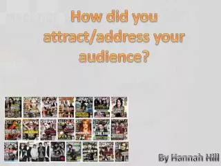
How did you attract/address your audience? . By Hannah Hill. COLOURS.

E N D
How did you attract/address your audience? By Hannah Hill
COLOURS I decided that when I was making my double page spread that I initially wanted to follow the generic convention of black, red and white which magazines like Kerrang!, NME and Q use; you will see this in some of the screen prints I have posted on my blog. However, as I produced this to the standard I was happy at, that I believed would attract the audience with as many other magazines in this genre use, I decided I wanted to change this as my edition was to be a Halloween magazine and as I began my front cover I used more orange as the connotes to Halloween. This meant I wasn’t following this typical generic conventions that we will find on most alternative and rock magazine but it was the convention for Halloween. Although I decided to attract my audience in this way I did stick with using red, black and white for the rest and as mine is a Halloween edition, the colours work well as they do still attract people as the colours make my magazine look like your ‘typical’ rock music magazine with it being dark. Another one of my key things with my colour theme is what my model was to look like. I decided from the beginning of this project I wanted a female model which broke the generic convention of the rock magazine as I could create a very unique and creative front image as I could focus on a close-up image of the make-up for the model. My final picture had powerful, dark make-up that made this image really stand out. This once again creates that dark, gloomy look that works for not only a Halloween edition magazine but also a rock magazine. I worked around her skin tone to make her look pale so the dark make-up would stand out more, meaning it kept to the rocky theme. You can see my results from my questionnaire below.
Images The images I chose to use were important in my plan as I decided to do my double page spread as a special feature for best live artists which I found the idea from a Kerrang! feature that is displayed below. I decided that as I was doing this as my feature that I needed to use live performances that I had previously been to and taken pictures of to see. This helps people link the article with a visual image. This attracts fans as they get to see live images of some of their favourite artists, persuading them to buy the magazine. Here is a link to my photo shoot/location analysis http://hannahhillmedia.wordpress.com/2013/10/29/location-and-photoshoot/ . I also held a photo shoot with my chosen female model that I wanted to feature on the main cover and the contents page. I chose the model to have striking, dark make-up that I did so that it would fit into the Halloween theme I had chosen for the magazine. This means that the cover is eye-catching as people will want to see what it is that's on the shelf. However, I was very conscious to make sure the make-up wasn’t frightening or to over-powering to make readers not want the magazine for that reason. Here is a link to my pinterest board that I used to find inspiration for my make-up and style http://www.pinterest.com/hannahhill95/music-magazine/ . I found my inspiration of a close-up focus on the model from an edition of Kerrang! Featuring lead singer from HIM; Ville Valo. Here is my original analysis of this cover I found inspiration from http://hannahhillmedia.wordpress.com/2013/10/10/image-analysis/.
MASTHEAD My masthead I used is a running theme in my magazine as I use the same theme in for my masthead as I do on the start of my contents page. My inspiration for the R on my masthead comes from Q magazine where the white Q is in a red background. I chose to do mine in a bold font with a black background to link with my colour scheme. I chose to do something similar to the iconic Q as people recognise it and know the brand as it is short and simple to remember. Here my results from one of the questions from my questionnaire which was about what colours will attract an individual to a rock magazine. This helped with my decision for what I was going to do for my masthead. Here is my brainstorm I roughly created to help put my ideas for my masthead down.
Eye-Catching Coverlines The main coverline on my front cover is about the female on the cover. This is one of the main eye-catching coverlines as the fonts change on the surname of the artist. This will help to attract people to the headline as my model is the main feature on the cover and not much writing it covering it up. This will help fans of the artist find the magazine easy as they will want to buy my magazine for the title being the main thing to feature. I found the inspiration for this from covers of Kerrang! That have the main model and a bold, main headline for them alone. Another way I wanted to attract was try and use a pun to attract the audience by making them laugh and want to read the article. I chose to use ‘Falling out, boys?’ as my pun as the band is called Fall Out Boy which I placed at the top as it’s an exclusive article for people to see. It will also be on of the first things people will see as it is at the top. This will help fans of the band will find this magazine as its a popular band, meaning they are likely to buy it for the ‘exclusive’.