Download
1 / 30
300 likes | 366 Views
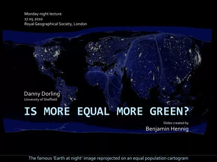
Monday night lecture 17.05.2010 Royal Geographical Society, London . Danny Dorling University of Sheffield. Slides created by Benjamin Hennig. Is more equal more green?. The famous ‘Earth at night’ image reprojected on an equal population cartogram. Global Inequality.

E N D
Monday night lecture 17.05.2010Royal Geographical Society, London Danny DorlingUniversity of Sheffield Slides created by Benjamin Hennig Is more equal more green? The famous ‘Earth at night’ image reprojected on an equal population cartogram
Global Inequality 24 of the richest countries of the world (by GDP per capita) which are home to at least two million people,they are home to 13% of the world’s population, and almost 50% of world income (GDP)
Global Population Germany UK USA Japan France Spain This is a reprojection of the population distribution, showing where most people are livingA few countries are highlighted to make it easier to read.
Global Wealth Germany UK USA France Japan Spain The world resized according to each country’s gross domestic product Source: modified and updated map from www.worldmapper .org
Inequality in Britain 2010: By wealth Britain has become more unequal that at any time since 1918. This is not least because of continuously rising income inequalities. Rising income inequalities, even after tax move the country a quarter of the way towards the position of the USA (1997-2008). Health inequalities between areas surpass the last maxima recorded in the 1930s. Sources: see http://www.sheffield.ac.uk/geography/staff/dorling_danny/papers.html
Understanding Inequality Inequality can be explained by looking at the ratio of the share of income from the richest 10% to the poorest 10% of the population. In the United Kingdom this ratio is 13∙8 ...but what does it mean? This ratio was revealed by the UNDP in their world report 2009 (table M)
Understanding Inequality For this, let us have a look at the wealth of 26 people living in our country. Let’s talk about Alfie, Benjamin, Charlotte, Danny, Emily, Finley, Grace, Harry, Isaac, Jack, Katie, Lily, Mohammed, Noah, Oliver, Phoebe, Queenie, Ruby, Sophie, Thomas, Ursula, Vernon, William, Xavier, Yugo...and Zac. These 26 people are not typical, 14 are from the poorest tenth, only 1 from the richest
£100 So there is Zac. Zac is a typical member of the richest 10% of people in Britain when all ranked by income. Let’s have a look at a small fraction of his income. Let’s have a look at £100 of his recently acquired money. Zac may earn £100 in an hour if he is one of the very best off amongst the top 10%
£50 Below Zac the next group earn much less. Yugo and Xavier look up to him, because they only gain £50 for every £100 he gains.At the same time... For everyone in Zac’s position there are two people earning half as much as him
£28 ...William, Vernon and Ursula have £28.They see that there are some people above them, having almost twice to four times as much as they do. And while they think of getting more... For everyone in Xavier’s and Yugo’s position there are three earning half again.
£14 ...Thomas, Sophie, Ruby, Queenie, Phoebe and Oliver live with £14 in their pocket and see the others above them. And this is not the end, because... And again - but still all these people are not amongst the poorest tenth
£7 ...at the same time Noah, Mohammed, Lily, Katie, Jack, Isaac, Harry, Grace, Finley, Emily, Danny, Charlotte, Benjamin and Alfie are left with £7 each. Only they all together manage to get the £100 that Zac has in his pocket. In practise the poorest tenth of people in Britain earn or receive around: £9 a day
13∙8! This is an inequality of 13∙8:1.It needs Alfie, Benjamin, Charlotte, Danny, Emily, Finley, Grace, Harry, Isaac, Jack, Katie, Lily, Mohammed and Noah of the poorest 10% of the population to earn all that money that Zac of the richest 10% has alone... In total there are as many Zacs as there are Alfies, or Benjamins, or...
Inequality in the rich world Germany 6∙9 UK 13∙8 USA 15∙9 Japan 4∙5 France 9∙1 Spain 10∙3 In most other affluent countries the lives and income of Zacs and Alfies are more similar
Super-rich Wealth inequalities are far greater than income inequalities: The richest 10% in London have wealth which is 273 times greater than that of the poorest 10%. The wealth of the 1000 richest in the UK is even greater: 359 times higher than that of the richest 10%. These super-rich own £335.5 billion, adding £77 billion to their wealth in 2009 alone. Calculated from figures provided by the Hills enquiry and Sunday Times, 2010
Effects of inequality Nobody can spend as much money as the super rich have! You might then think that there is less waste if wealth is distributed like this.Is that true? You might think this isn’t real wealth, and people aren’t really that poor. So how do inequality and a consumption correlate? Isn’t it better to have the rich as custodians of most of the national wealth?
The effects of the effects...of inequality We are going to look at Meat consumption Water consumption Waste production Number of Flights Ecological impact in each of the most affluent countries. You might think: "Surely, if a few people hold most of the wealth we all consume less?"
Inequality and meat Meat consumption in kg per year per person USA Spain France Germany UK Japan Inequality Not if you are concerned about how much meat we farm and consume
Inequality and water water in m3 per year per person USA Spain France Germany UK Japan Inequality Not if you are concerned about how much water we use (apart from the UK!)
Inequality and waste 1100 Singapore USA Spain Municipal waste collected (kg per capita per year) France UK Germany Japan Inequality Not if you are concerned about how much waste we each produce
Inequality and flights New Zealand 60 Ireland Norway annual aircraft departures per thousand people Canada USA UK Spain France Germany Italy Japan Inequality Not if you are concerned about how many flights we each take (on average)
Inequality and ecology Ecological footprint in global hectares per capita USA Spain UK Japan France Singapore Germany Inequality Not if you are concerned about how many planets we might need to exist:An Ecological Footprint of 2.1 global hectares per capita equals one-planet living
Data sources UNDP/FAO http://www.worldmapper.org/display.php?selected=126 UNDP/LPR http://www.worldmapper.org/display.php?selected=104 UNSD http://unstats.un.org/unsd/ENVIRONMENT/qindicators.htm World Bank World Development Indicators 2005 (IS.AIR.DPRT) WWF Living Planet Index 2008 More and more geographical data is becoming available, often for the first time.
Ecological impact of the rich How does this relate to the ecological impact of those 24 countries on the globe as a whole, and how do the poorer nations compare – to what extent does global inequality have an impact on a sustainable future of the planet as well as inequalities within the rich world? The poor in unequal rich countries consume more than in more equal countries
Ecological Footprint The map shows the ecological footprint (EF), a measure of the resources used per head in each country. A EF of 2.1 global hectares per capita equals one-planet living on the basis that everyone is entitled to the same amount of the planet’s natural resources. - Source: New Economics Foundation, Happy Planet Index
Ecological Footprint When we draw the same map upon the world population cartogram it may not initially appear to be so bad. The countries that consume too much contain fewer people, so not such a problem?However...This map is misleading – we need to reproject the basemap again for a fair picture
Ecological Footprint Germany UK Japan USA France Spain If we reproject the globe again so that the area of each grid cell is drawn in proportion to the ecological impact of the people who live in that area, then we see that most of the damage is being caused by the rich world and more of that (per capita) by the most unequal countries of the rich world (which China services).
Conclusion “We should … dethrone the idea that maximising the growth in measured prosperity, GDP per capita, should be an explicit objective of economic and social policy.” Adair Turner, Chair of the UK Financial Services Authority, 2007 “They want the politics of hope and not the politics of fear and that’s what we are about.” Caroline Lucas, Green Party, 2010http://www.guardian.co.uk/environment/georgemonbiot/2010/may/07/caroline-lucas-uk-first-green-mp
Conclusion To consume less, you need to feelyou have more in common with other people. If success is about having a lot of money,success is about consuming more and wasting more. Consumption by everybody is lessin countries where everyone is more equal. All affluent countries need to reduce their levels of consumption by reducing social inequalities. Through their dominance of global media and marketing the rest of the world usually looks up towards richer countries. What example are we providing?
Credits Thanks toAli, Ben, Bob, Kate, Molly, Richard, and the people at the New Economics Foundation for their contributions to this lecture! Watch the slides again at http://sasi.group.shef.ac.uk/presentations/