Download
1 / 66

E N D
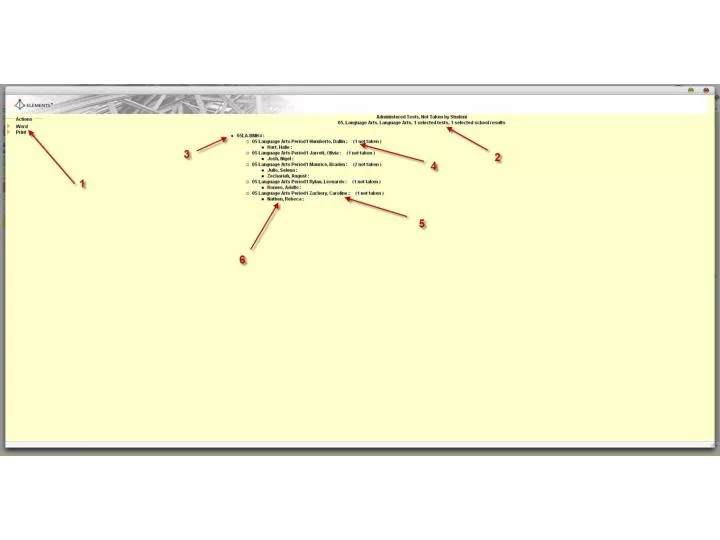
Administered Test Not Taken by StudentWithout having to go to each class dashboard to determine the students yet to take the test in the scope, this report shows you the test, the teacher, the class, the number of students within that class that have yet to take the test and the student names. This report is available through both the Teacher and Administrator Portals and the Report Engine. 1. This report can be printed or sent to Word using these buttons. 2. The report name and report criteria is recorded here. 3. Each assessment in the scope of your criteria is named here. The number of students that have yet to take the test in this class is listed here. The class teachers name is recorded here. Each student in the scope of the reports criteria is listed.
At Risk Standards by StudentThis report lists students that took the test and shows the standards for which each student did not meet expectations. There is now a definitive list of areas where each student needs additional instruction. This report is available through both the Teacher and Administrator Portals and the Report Engine. This report can be printed or sent to Word for additional formatting options. The name of the report is here. This report also has the option of printing with a page break. Each student within the scope is listed here. The number of standards of concern for each student is recapped. The standard nomenclature and text is displayed. A recap of the scope criteria and report name is here. The students overall performance for this standard is here.
At Risk Standards by Test, StudentThis report lists students that took each test and shows the standards for which each student did not meet expectation. This version of the report displays multiple tests in one At Risk report. This report is available through both the Teacher and Administrator Portals and the Report Engine. This report can be printed or sent to Word for additional formatting options. The name of the report is here. This report also has the option of printing with a page break. Each student within the scope is listed here. Each test within the scope of the criteria is listed. The number of standards of concern for each student as well as the standard name and text is recapped. A recap of the scope criteria and report name is here. The aggregated score on the test overall is listed here. The students overall performance for this standard is here.
At Risk Standards by Domain This report lists the domains on the test where the expectation was not met and shows you which students in the scope did not meet expectations for that domain. There is a good chance that the students that did not meet expectations for a given domain on this test will not meet the expectations for that domain on the state summative test either, without additional instruction. This report is available through both the Teacher and Administrator Portals and the Report Engine. This report can be printed or sent to Word for additional formatting options. The name of the report is here. Grade and Course are here. Each standard on the test is listed here along with the standard text. The number of students and the student’s name is listed. The aggregated average for the domain covered is here. A recap of the scope criteria and report name is recapped. Each student’s performance for this domain is here.
At Risk Students by StandardThis report lists the standards on the test where the expectation was not met and shows you which students in the scope did not meet expectations for that standard. Small groups are now quickly defined using this report by displaying students with similar struggles. This report is available through both the Teacher and Administrator Portals and the Report Engine. This report can be printed or sent to Word for additional formatting options. The name of the report is here. Grade and Course are here. Each standard on the test is listed here along with the standard text. The number of students and the student’s name is listed. The aggregated average for the standard covered is here. A recap of the scope criteria and report name is recapped. Each student’s performance for this standard is here.
At Risk Subgroups by StandardThis report lists each standard on the test and shows which subgroup in the class, tracked within Elements by the district, did not meet expectations for that standard. This report is available through both the Teacher and Administrator Portals and the Report Engine. This report can be printed or sent to Word for additional formatting options. The name of the report is here. Grade and Course are here. Each standard covered on the test is listed here. The demographic aggregated average for each standard covered is here. Each Demographic group being tracked by the district is listed here. A recap of the scope criteria and report name is recapped.
Averages by TestThis report lists each test within the scope of the criteria chosen and displays the overall aggregate score for the test. This is a great report for quickly recording grades into a grade book. This report is available only through the Report Engine. This report can be printed or sent to Word for additional formatting options. Each test in the scope of the criteria is displayed. A recap of the scope criteria and report name is recapped. The aggregated overall score for the test is here.
Demographics Item PerformanceThis report displays each item on the test and shows how each AYP sub-group fared on that item. This report is available only through the Report Engine. This report can be printed or sent to Word for additional formatting options. Name of the test and the overall aggregated average for all students taking the test. Each question on the test, a link to the question and the overall aggregated score for that item, for all students having taken the test, is displayed. Each demographic group being reported by the district is listed here. The standard assessed by this item and aggregated overall score for the standard is here. A recap of the scope criteria and report name is recapped. The overall aggregated score on this item for each demographic group is here.
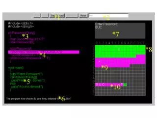
Distractor AnalysisThis report shows how every student in the scope of the criteria responded to every question on the test and whether or not their response was correct. A grey square displayed would indicate that the student skipped that question. This report is particularly helpful in determining which students need remediation in a particular area. It will also alert you to common misconceptions the class may have. This report is available through both the Teacher and Administrator Portals and the Report Engine. This report can be printed or sent to Excel for further data manipulation using these buttons. Checking or un-checking these boxes turns on and off the green color for the correct responses and the red color for the incorrect responses. This is particularly helpful when printing to a B&W laser printer. The Criteria Box recaps the title of the report and criteria you chose to build the report. It also displays the high and low score, the Median score and the Mean. By clicking on the question number hyperlink you can see the question the student saw on the test and by clicking in the grey box at the top of each column, you can sort the contents of the column from highest to lowest or lowest to highest. Clicking here will display the standard assessed for this item. Each student in the scope of the reports criteria is displayed down the left-hand side of the table along with their overall average score for the test. Each student’s distractor choice is here. Red means an incorrect choice and green means a correct choice. The overall average for all students is in this row. Each AYP sub-group tracked by your Student Information System and sent to Thinkgate will be displayed at the bottom of this report. Clicking the link narrows the students displayed in the report to just those in that category.
Item AnalysisThis report shows how a student, class, teacher, school and district performed on each item on the test. The student’s score, the class cumulative, the teacher cumulative, the school cumulative and the district cumulative is here. This allows a teacher to see how the student’s performance compares to his peer’s. The details section of the report (accessed by clicking the legend block) will show each level’s answer choices. This is particularly important information for determining common misconceptions. This report is available in both the Teacher and Administrator Portal as well as the Report Engine. This report can be printed using this button. The Criteria Box recaps the title of the report and criteria you chose to build the report. It also displays the high and low score, the Median score and the Mean. By clicking on each legend box you can access the details report which shows the answer choices for the aggregate of students in that level. By clicking on the question number hyperlink you can see the question the student saw on the test. Each bar represents the cumulative percentage of correct answers for that item on the test. You can hide the table, after viewing the details, by clicking here. By clicking on the details button in the legend (3), you can see the aggregate of correct responses for each item. The question number is a hyperlink to the question itself if this was constructed as an item bank test. Green denotes correct answer and white the distractors.
Mastery ReportsLike the At Risk reports these report lists standards, students, domains and sub-groups included within the scope of the criteria chosen, but shows which of these met or exceeded the expectation. This report is available through both the Teacher and Administrator Portals and the Report Engine. This report can be printed or sent to Word for additional formatting options. The name of the report is here. Grade and Course are here. Each AYP subgroup is listed across the top to head each column. A recap of the scope criteria and report name is recapped. There are versions of this report that will print with page-breaks after each student name. Each standard covered on the test is listed here and is a link to the standard itself. The demographic aggregated average for each standard covered is here and clicking the average will display all students within that demographic included in the aggregate.
Proficiency ReportThis report will quickly show you the percentage proficient for each of the AYP subgroups you are tracking. Proficiency is calculated by combining the levels at and above the district setting for mastery. The power of this report is the calculation is automatic and you can display proficiency rates and/or average scores. You can exclude groups that fall below the minimum number needed to count towards AYP and you can narrow the scope to include a particular domain tested. This report is available through both the Teacher and Administrator Portals and the Report Engine. This report can be printed or sent to Excel for further data manipulation using these buttons. The Criteria Box recaps the title of the report and criteria you chose to build the report. You can include all AYP sub-groups that took the test or include only those with sufficient numbers to qualify for AYP calculation. You can narrow the scope of the report to a particular domain tested. You can chose to display proficiency rate, average score, or a combination of both. Each AYP sub-group has it’s own column. There is a cumulative column as well. Each of the levels will be displayed here so that you can easily see what percentage of each group fell into each of the levels set up by the district. This is the proficiency rate for each AYP group within the scope of your criteria. Proficiency is the sum of meets and exceeds within this table. Overall student counts and score percentages are located here for each group. By clicking on the percentage score or student count it will take you to a detailed list of all included in the aggregation.
Progress Report for SchoolsThis report compares the results of two or more tests and displays those results for each of the schools in the scope of the criteria selected. Administrators can quickly determine the gains in standards mastered for each school. The legends; Performance Level Key and Performance Level Distribution can help determine what level the percentage score translates into and what percentage of students in a school met expectations and what percentage did not. This report is available in both the Teacher and Administrator Portals and through the Report Engine. This report can be printed or sent to Excel for further data manipulation using these buttons. The version of the report displaying is here. The Criteria Box recaps the title of the report and criteria you chose to build the report. It also displays the high and low score, the Median score and the Mean. Clicking the box next to Performance Level Key will toggle on and off the legend bars beneath the overall score percentage bars. Using the Performance Level Distribution and Performance Level Key will display a legend that can help you determine what percentage of students in the school met expectations and which did not. Just hover over the legend bar to display the exact percentages. Each test in the criteria scope is color-coded for easy dissemination. The cumulative score for all is displayed here. Each schools name will be displayed on the left side of the chart A quick reference legend is displayed at the bottom of this report.
Progress Report for TeachersThis report compares the results of two or more tests and displays those results for each of the teachers in the scope of the criteria selected. Administrators can quickly determine the gains in standards mastered for each teacher. The legends; Performance Level Key and Performance Level Distribution can help determine what level the percentage score translates into and what percentage of teacher’s students met expectations and what percentage did not. This report is available in both the Teacher and Administrator Portals and through the Report Engine. This report can be printed or sent to Excel for further data manipulation using these buttons. The version of the report displaying is here. The Criteria Box recaps the title of the report and criteria you chose to build the report. It also displays the high and low score, the Median score and the Mean. Clicking the box next to Performance Level Key will toggle on and off the legend bars beneath the overall score percentage bars. Using the Performance Level Distribution and Performance Level Key will display a legend that can help you determine what percentage of students in the school met expectations and which did not. Just hover over the legend bar to display the exact percentages. Each test in the criteria scope is color-coded for easy dissemination. The cumulative score for all is displayed here. Each teacher’s name will be displayed on the left side of the chart.
Progress Report for ClassesThis report compares the results of two or more tests and displays those results for each of the classes in the scope of the criteria selected. Administrators can quickly determine the gains in standards mastered for each class. The legends; Performance Level Key and Performance Level Distribution can help determine what level the percentage score translates into and what percentage of classes met expectations and what percentage did not. This report is available in both the Teacher and Administrator Portals and through the Report Engine. This report can be printed or sent to Excel for further data manipulation using these buttons. The version of the report displaying is here. The Criteria Box recaps the title of the report and criteria you chose to build the report. It also displays the high and low score, the Median score and the Mean. Clicking the box next to Performance Level Key will toggle on and off the legend bars beneath the overall score percentage bars. Using the Performance Level Distribution and Performance Level Key will display a legend that can help you determine what percentage of students in the school met expectations and which did not. Just hover over the legend bar to display the exact percentages. Each test in the criteria scope is color-coded for easy dissemination. The cumulative score for all is displayed here. Each class name will be displayed on the left side of the chart.
Progress Report for StudentsThis report compares the results of two or more tests and displays those results for each of the students in the scope of the criteria selected. Teachers can quickly determine the gains in standards mastered for each student. The legends; Performance Level Key and Performance Level Distribution can help determine what level the percentage score translates into and what percentage of students met expectations and what percentage did not. This report is available in both the Teacher and Administrator Portals and through the Report Engine. This report can be printed or sent to Excel for further data manipulation using these buttons. The version of the report displaying is here. The Criteria Box recaps the title of the report and criteria you chose to build the report. It also displays the high and low score, the Median score and the Mean. Clicking the box next to Performance Level Key will toggle on and off the legend bars beneath the overall score percentage bars. Using the Performance Level Distribution and Performance Level Key will display a legend that can help you determine what percentage of students in the school met expectations and which did not. Just hover over the legend bar to display the exact percentages. Each test in the criteria scope is color-coded for easy dissemination. The cumulative score for all is displayed here. Each student’s name will be displayed on the left side of the chart.
Progress Report for DemographicsThis report compares the results of two or more tests and displays those results for each of the tracked demographics in the scope of the criteria selected. Teachers can quickly determine the gains in standards mastered for each demographic. The legends; Performance Level Key and Performance Level Distribution can help determine what level the percentage score translates into and what percentage of each demographic met expectations and what percentage did not. This report is available in both the Teacher and Administrator Portals and through the Report Engine. This report can be printed or sent to Excel for further data manipulation using these buttons. The version of the report displaying is here. The Criteria Box recaps the title of the report and criteria you chose to build the report. It also displays the high and low score, the Median score and the Mean. Each test in the criteria scope is color-coded for easy dissemination. Clicking the box next to Performance Level Key will toggle on and off the legend bars beneath the overall score percentage bars. Using the Performance Level Distribution and Performance Level Key will display a legend that can help you determine what percentage of students in the school met expectations and which did not. Just hover over the legend bar to display the exact percentages. The cumulative score for all is displayed here. Each demographic will be displayed on the left side of the chart.
Progress Report for StandardsThis report compares the results of two or more tests and displays those results for each of the standards in the scope of the criteria selected. Teachers can quickly determine the gains in standards mastered. The legends; Performance Level Key and Performance Level Distribution can help determine what level the percentage score translates into and on what percentage of standards we met expectations and on what percentage we did not. This report is available in both the Teacher and Administrator Portals and through the Report Engine. This report can be printed or sent to Excel for further data manipulation using these buttons. The version of the report displaying is here. The Criteria Box recaps the title of the report and criteria you chose to build the report. It also displays the high and low score, the Median score and the Mean. Clicking the box next to Performance Level Key will toggle on and off the legend bars beneath the overall score percentage bars. Using the Performance Level Key will display a legend that can help you determine on what percentage of standards we met expectations and on what percentage we did not. By using the Performance Level Distribution legend you can quickly determine the percentages of students within the scope that did not meet, met and exceeded our expectations. Just hover over the legend bar to display the exact percentages. Each test in the criteria scope is color-coded for easy dissemination. The cumulative score for all is displayed here. Each standard will be displayed on the left side of the chart and is a hyperlink to the standard itself.
Report Card by Standard for SchoolsThis report displays the overall percentage scores for each standard within each school in the scope of the criteria selected. Administrators can quickly determine the overall scores on each standard for each of the schools. Each level of expectation is color-coded and can help determine whether or not the district’s expectations were met. This report is available in both the Teacher and Administrator Portals and through the Report Engine. This report can be printed or sent to Excel for further data manipulation. The display format can be changed from Vertical to Horizontal for best use of screen real estate. The version of this report displayed will appear here. The Criteria Box recaps the title of the report and criteria you chose to build the report. It also displays the high and low score, the Median score and the Mean. You can turn on and off the performance level coloring for easier printing on a laser printer. The district has total control of how these levels are set. A slider is provided in the support area of the application and district defaults can be managed there. Each school’s name will be displayed on the left side of the table. Each standard will be displayed as a column header and is a hyperlink to the standard itself. The overall percentage aggregate score for each standard is here. The school’s performance on all the standards covered on the assessment is here.
Report Card by Standard for TeachersThis report displays the overall percentage scores for each standard and each teacher in the scope of the criteria selected. Administrators can quickly determine the overall scores on each standard for each of the teachers in the scope. Each level of expectation is color-coded and can help determine whether or not the district’s expectations were met. This report can help identify which teachers are armed with a best practice or resource that the others may not have. Collaboration is key in spreading best practices. This report is available in both the Teacher and Administrator Portals and through the Report Engine. This report can be printed or sent to Excel for further data manipulation. The display format can be changed from Vertical to Horizontal for best use of screen real estate. The version of this report displayed will appear here. The Criteria Box recaps the title of the report and criteria you chose to build the report. It also displays the high and low score, the Median score and the Mean. You can turn on and off the performance level coloring for easier printing on a laser printer. The district has total control of how these levels are set. A slider is provided in the support area of the application and district defaults can be managed there. Each teacher’s name will be displayed on the left side of the table. Each standard will be displayed as a column header and is a hyperlink to the standard itself. The overall percentage aggregate score for each teacher on each standard is here. The teacher’s performance on all the standards covered on the assessment is here.
Report Card by Standard for ClassesThis report displays the overall percentage scores for each standard within each class in the scope of the criteria selected. Administrators can quickly determine the overall scores on each standard for each class. Each level of expectation is color-coded and can help determine whether or not the district’s expectations were met. This report is available in both the Teacher and Administrator Portals and through the Report Engine. This report can be printed or sent to Excel for further data manipulation. The display format can be changed from Vertical to Horizontal for best use of screen real estate. The version of this report displayed will appear here. The Criteria Box recaps the title of the report and criteria you chose to build the report. It also displays the high and low score, the Median score and the Mean. You can turn on and off the performance level coloring for easier printing on a laser printer. The district has total control of how these levels are set. A slider is provided in the support area of the application and district defaults can be managed there. Each standard will be displayed as a column header and is a hyperlink to the standard itself. Each class name will be displayed on the left side of the table. The overall percentage aggregate score for each class on each standard is here. The class performance on all the standards covered on the assessment is here.
Report Card by Standard for StudentsThis report displays the overall percentage scores for each standard within each student in the scope of the criteria selected. Administrators can quickly determine the overall scores on each standard for each student. Each level of expectation is color-coded and can help determine whether or not the district’s expectations were met. This report is only available through the Teacher Portal, Administrator Portal and the Report Engine. This report can be printed or sent to Excel for further data manipulation. The display format can be changed from Vertical to Horizontal for best use of screen real estate. The version of this report displayed will appear here. The Criteria Box recaps the title of the report and criteria you chose to build the report. It also displays the high and low score, the Median score and the Mean. You can turn on and off the performance level coloring for easier printing on a laser printer. The district has total control of how these levels are set. A slider is provided in the support area of the application and district defaults can be managed there. Each standard will be displayed as a column header and is a hyperlink to the standard itself. Each student’s name will be displayed on the left side of the table. The overall percentage aggregate score for each student on each standard is here. The student’s performance on all the standards covered on the assessment is here.
Report Card by Standard for DemographicsThis report displays the overall percentage scores for each standard for each demographic tracked by the district. Administrators can quickly determine the overall scores on each standard for each AYP sub-group. Each level of expectation is color-coded and can help determine whether or not the district’s expectations were met. This report is available in both the Teacher and Administrator Portals and through the Report Engine. This report can be printed or sent to Excel for further data manipulation. The display format can be changed from Vertical to Horizontal for best use of screen real estate. The version of this report displayed will appear here. The Criteria Box recaps the title of the report and criteria you chose to build the report. It also displays the high and low score, the Median score and the Mean. You can turn on and off the performance level coloring for easier printing on a laser printer. The district has total control of how these levels are set. A slider is provided in the support area of the application and district defaults can be managed there. Each standard will be displayed as a column header and is a hyperlink to the standard itself. Each demographic will be displayed on the left side of the table. The overall percentage aggregate score for each demographic on each standard is here. The demographic performance on all the standards covered on the assessment is here and can be sorted by clicking the grey box header.
Report Card by Test for SchoolsThis report displays the overall percentage scores for each test for each school in the scope of the criteria selected. It is a great report for a quick assessment of how each school performed on a given test. Each level of expectation is color-coded and can help determine whether or not the district’s expectations were met. This report is only available through the Report Engine. This report can be printed or sent to Excel for further data manipulation. The display format can be changed from Vertical to Horizontal for best use of screen real estate. The version of this report displayed will appear here. The Criteria Box recaps the title of the report and criteria you chose to build the report. It also displays the high and low score, the Median score and the Mean. You can turn on and off the performance level coloring for easier printing on a laser printer. This color-coding also makes for quick data dissemination. The district has total control of how these levels are set. A slider is provided in the support area of the application and district defaults can be managed there. Each school’s name will be displayed on the left side of the table. The overall percentage aggregate score for each test and each school is here.
Report Card by Test for TeachersThis report displays the overall percentage scores for each test for each teacher in the scope of the criteria selected. It is a great report for a quick assessment of how each teacher performed on a given test. Each level of expectation is color-coded and can help determine whether or not the district’s expectations were met. This report is only available through the Report Engine. This report can be printed or sent to Excel for further data manipulation. The display format can be changed from Vertical to Horizontal for best use of screen real estate. The version of this report displayed will appear here. The Criteria Box recaps the title of the report and criteria you chose to build the report. It also displays the high and low score, the Median score and the Mean. You can turn on and off the performance level coloring for easier printing on a laser printer. This color-coding also makes for quick data dissemination. The district has total control of how these levels are set. A slider is provided in the support area of the application and district defaults can be managed there. Each teacher’s name will be displayed on the left side of the table. The overall percentage aggregate score for each test and each teacher is here.