Web Usability
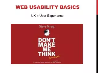
Web Usability. From Don’t Make Me Think by Steve Krug. Don’t Make Me Think. Avoid cute or clever names, marketing induced names, company-specific names and unfamiliar technical names. Don’t Make Me Think. Make it obvious what is and isn’t clickable. How People Really Use the Web. Facts:

Web Usability
E N D
Presentation Transcript
Web Usability From Don’t Make Me Think by Steve Krug
Don’t Make Me Think Avoid cute or clever names, marketing induced names, company-specific names and unfamiliar technical names.
Don’t Make Me Think Make it obvious what is and isn’t clickable.
How People Really Use the Web Facts: • We don’t read pages. We scan them. • We don’t make optimal choices. We satisfice. • We don’t figure out how things work. We muddle through.
Billboard Design 101 • Create a clear visual hierarchy. • Conventions are your friends. • Break up pages into clearly defined areas • Make it obvious what’s clickable • Keep the noise down to a dull roar http://www.mtstandard.com/ http://www.delta.com/
Numbers of Clicks • “It should never take over n clicks (3, 4, 5?) to get to any page on the site” • Really counts – not number of clicks but how hard each click is. • User’s don’t mind a lot of clicks as long as each click is painless and they have continued confidence that they’re on the right track.
Omit Needless Words Vigorous writing is concise. A sentence should contain no unnecessary words, a paragraph no unnecessary sentences, for the same reason that a drawing should have no unnecessary lines and a machine no unnecessary parts. From: Elements of Style by William Stuck and E.B. White
Omit Needless Words • Happy talk must die Introductory text that doesn’t really say anything. Content free, just a way to be sociable. • Instructions must die Nobody reads them unless they’ve repeatedly tried to muddle through and failed. Instead make everything self-explanatory or as close to it as possible.
Web Navigation 101 When using the web: • You’re usually trying to find something • You decide whether to ask first or browser first • “search dominant“ people • “link dominant” people
Web Navigation 101 Web experience misses many of the cues we’ve relied on all our lives to negotiate spaces: • No sense of scale • No sense of direction • No sense of location
Web Navigation 101 Home page, bookmarks, breadcumbs, back buttons help. Back button clicks account for between 30-40% of all links clicked.
Overlooked Purpose of Navigation • It gives us something to hold onto • It tells us where we are • It tells us how to use the site • It gives us confidence in the people who built the site
Web Navigation Conventions These emerged quickly and are mostly adapted from print conventions
Persistent Navigation Persistent navigation (navigation elements that appear on every page) Done right it says “The navigation is over here. Some parts will change a little depending on where you are, but it will always be here, and it will always work the same way.” Exceptions: • Home page is different. • Forms, my be unnecessary distraction
Site ID Site id: • Needed on every page • Place in an expected place (where? ) • Make it look like a site id (how?) http://www.mtech.edu/ http://www.delta.com/
Navigation • Sections – primary navigation (links to the main sections of the site) • Utilities – important elements of the site that aren’t really part of the content hierarchy. • Make these slightly less prominent http://www.mtech.edu/
Navigation • Always have a visible way to get home
Search Avoid: • Fancy wording • Instructions • Options – if there is any confusion about the scope, spell it out (often just avoid)
Page Names • Every page needs a name • The name needs to be in the right place • The name needs to be prominent • The name needs to match what I clicked http://www.mtech.edu/
You Are Here • These need to stand out • Breadcrumb best practices: • Put them at the top • Use > between levels • Use tiny type • Use the words “You are here.” • Boldface the last item • Don’ t use them instead of a page name. http://www.overstock.com/ http://www.nasa.gov/news/media/info/index.html
Tabs 4 benefits: • They’re self-evident • They’re hard to miss • They're slick (can add polish and serve a purpose) • They suggest a physical place
Trunk Test Say you are suddenly dumped onto a page. You should be able to answer the following without hesitation: • What site is this? • What page am I on? • What are the major sections of this site? • What are my options at this level? • Where am I in the scheme of things? • How can I search?
Trunk Test Circle: • Site ID • Page name • Sections and subsections • Local navigation • “You are here” indicator(s) • Search http://www0.epinions.com/webs-Web_Services-All-Merchants-Global_Mart http://www.amazon.com/gp/product/B007Z969H2/ref=kics_hp_dp_narration
Home Page Home page must accommodate: • Site identify & mission • Site hierarchy • Search • Teases • Timely content • Deals • Shortcuts • registration
Homepage Includes Also it needs to meet abstract criteria: • show me what I’m looking for • … and what I‘m not looking for • Show me where to start • Establish creditability and trust
Homepage Includes As quickly as possible it must answer questions: • What is this? • What do they have here? • What can I do here? • Why should I be here and not somewhere else?
Religious Debates • No average web users – they are all unique • Myth – Good design is about figuring out what people like • It isn’t one dimensional “I like pulldowns” or “I don’t like pulldowns” • It is more complex. “Does this pulldown, with these items and this wording in this context on this page crate a good experience for most people who are likely to use this site?” • Solution: Testing
Testing • Do more rounds of testing • For instance - One morning a month. Debrief during lunch.
Usability • Good will characteristics • Idiosyncratic • Situational • You can refill it • Sometimes a single mistake can empty it
Usability • Things that lower it • Hiding information that I want • Punishing me for not doing things your way • Asking me for information you don’t really need • Shucking and jiving me • Putting sizzle in my way • Your sites looks amateurish
Usability • Things that raise it • Know the main things that people want to do on your site and make them obvious and easy • Tell me what I want to know • Save me steps wherever you can • Know what questions I’m likely to have, and answer them • Provide me with creature comforts like printer-friendly pages • Make it easy to recover from errors. • When in doubt, apologize