Download
1 / 48
480 likes | 607 Views
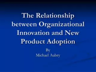
New Technologies for Understanding the Relationship between Health and Place. Lecture 1 Introduction and Overview GIS and RS in Public Health Edmund Seto, Ph.D. School of Public Health University of California, Berkeley. The Study of Health & Place. Spatial epidemiology Medical geography

E N D
New Technologies for Understanding the Relationship between Health and Place Lecture 1 Introduction and Overview GIS and RS in Public HealthEdmund Seto, Ph.D.School of Public HealthUniversity of California, Berkeley
The Study of Health & Place • Spatial epidemiology • Medical geography • Geographic pathology • Medical ecology • Geographical epidemiology • Geomedicine
Hippocrates – On Airs, Waters, and Places c. 400 BC A Historical Perspective Public Health professionals have long recognized the importance of place in health.
Population Habitat Behavior A more modern, structured view of how place influences health is provided in Meade’s Medical Geography text: Health
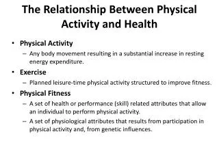
The Three Vertices • Population • Susceptibility – age, race, and genetics • Habitat • Natural – climate, vegetation, geology, hydrology • Built – buildings and patterns of settlement • Behavior • Exposure, culture, technology – how we live and interact with each other and the environment affects our health
Epidemiology • From Last’s Dictionary of Epidemiology: Epidemiology is defined as the study of the distribution and determinants of health-related states or events in specified populations. It follows then, that a Spatial Epidemiologist would be interested in the spatial distribution of health events, and the spatial relationship of associated health determinants.
A picture is worth 10,000 words • Maps are the most fundamental tool for describing the spatial distribution of data.
The earliest map? 6200 BC Ankara, Turkey excavation of Çatalhöyük site in Anatolia
History of Disease Maps • The 1700s were the golden age of mapping, and graphs in general. • Map in 1798 of cases of yellow fever in New York by Valentine Seaman. • Maps documented the spread of cholera from India to Europe in the early 1800s. • Famous John Snow Cholera map of 1855.
Spatial epidemiology has only relatively recently become popular due to advances in information technology: • Availablity of spatial data (both health and non-health data) • Desktop computing power
The Introduction of GIS • “GIS” term first used in the 1960s • Federal Geographic Data Committee (FGDC) definition: A Geographical Information System is a computer system for the input, storage, maintenance, management, retrieval, analysis, synthesis, and output of geographic or location-based information.
John Snow 1855 Cholera Outbreak of London Start
GIS Pros and Cons • The availability of GIS has greatly simplified the ability to create maps and perform exploratory spatial data analysis. • Perhaps too simple, though. • Need to critically review the quality of data that goes into mapping and the methods used in modeling spatial processes • Evaluate the analyses for potential confounders
GIScience Spatial Data Spatial Analysis Information GIS = Geographic Information Sciences
How to lie with maps • Monmonier writes, "Not only is it easy to lie with maps, it's essential...." The cartographer's paradox is that "to avoid hiding critical information in a fog of detail, the map must offer a selective, incomplete view of reality."
Thematic Maps • Thematic (or choropleth) maps are maps of polygon data, for instance county data that vary in shading or color according to a quantity associated with each county. • Thematic or choropleth maps are a model of reality. We model the data by creating legends that tell a particular story.
Choropleth Maps Natural break The story we tell depends upon how we choose to create the legend Equal ranges Equal counts
Choosing map data • If we map number of cases instead of rates: Is the disease risk in A really similar to B? Misleading because the underlying population may be much greater in A. A B
Modifiable Area Unit Problem • The scale at which we perform spatial analyses can influence the results. • The larger the unit of aggregation the more likely attributes will be correlated. • ex. Analysis at the census block level versus the census tract level. • Also by aggregating into different groups you can get different results
Small population problems • Rates based on small populations and areas and for rare diseases in particular may be unreliable. • Example: variance of the SMR is proportional to (exp deaths)-1 • Possible solutions • Present the data anyway, but with caveats. • Use smoothing procedures such as Bayesian Smoothing, and document the smoothing procedure used. • Accumulate data over years and area (but MAUP).
Breast Cancer Incidence forCape Cod 1982-94 from the Silent Springs Institute’s work
Ecological Fallacy • Also known as Aggregation bias, or Cross-level bias. • Making inferences from data collected at one scale to individuals or communities aggregated at other scales. • Example: the “hung jury” • vs Atomistic Fallacy
Some Examples Things to think about… Spatial Data Spatial Analysis Information Where’d the data come from? How was the map produced? To whom is the information useful? and How is the information being communicated?
Snail Density, risk factor schistosomiasis within a Chinese village
Drinking Water risks
Pesticide Risks
THE OCTOBER 17, 1989 LOMA PRIETA EARTHQUAKEOCTOBER 1989 Introduction At 5:04 P.M., Tuesday, October 17, 1989, as over 62,000 fans filled Candlestick Park for the third game of the World Series and the San Francisco Bay Area commute moved into its heaviest flow, a Richter magnitude 7.1 earthquake struck. It was an emergency planner's worst-case scenario. The 20-second earthquake was centered about 60 miles south of San Francisco, and was felt as far away as San Diego and western Nevada. Scientists had predicted an earthquake would hit on this section of the San Andreas Fault and considered it one of the Bay Area's most dangerous stretches of the fault.
California Flood Hazards
Toxics Release Inventory The TRI is a publicly available EPA database that contains information on toxic chemical releases and other waste management activities reported annually by certain covered industry groups as well as federal facilities. This inventory was established under the Emergency Planning and Community Right-to-Know Act of 1986 (EPCRA) and expanded by the Pollution Prevention Act of 1990.