Download
1 / 10
110 likes | 329 Views
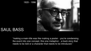
Saul Bass 1920-1996. Studied at the Art Students League in New York and Brooklyn College

E N D
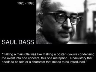
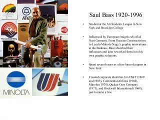
Saul Bass 1920-1996 • Studied at the Art Students League in New York and Brooklyn College • Influenced by European émigrés who fled Nazi Germany. From Russian Constructivism to Laszlo Moholy-Nagy’s graphic innovations at the Bauhaus, Bass absorbed their influences and later reworked them into his own graphic solutions. • Spent several years as a free-lance designer in New York • Created corporate identities for AT&T (1969 and 1983), Continental Airlines (1968), Minolta (1978), Quaker Oats Company (1971), and Rockwell International (1968), just to name a few.
Saul Bass 1920-1996 • Moved to Los Angeles in 1946 and founded Saul Bass & Associates. His first employee, Elaine, soon became his wife • By 1950 he was designing graphics for films • Brought his graphic design philosophy of "symbolize and summarize" to print work for film ads • Until Bass entered the scene, movie promotional art usually consisted of photographs or brightly colored pictures of the stars, but Bass took a radically different approach, preferring instead to use dramatic abstract images, often comprised of interestingly arrayed lines, deceptively simple drawings and broken type
Saul Bass 1920-1996 • Continued doing print work for film ads, until he collaborated with filmmaker Otto Preminger to design the movie poster for his film Carmen Jones (1954). • First title sequence design for Carmen Jones (1954) • Saw the opportunity to create something more than a title sequence, but to create something which would ultimately enhance the experience of the audience and contribute to the mood and the theme of the movie within the opening moments.
Saul Bass 1920-1996 • He was one of the first to realize the creative potential of opening and closing credits. • Created Movies within movies. • Most prominent techniques: cutout animation, montage, live action • Employed hand-drawn type and cutout construction paper shapes in early work. • Unified several techniques to exploit his visual metaphors, with photography, photomontage, split-screen wipes, and animation. Later he grasped video and digital technology and live action to explore the layering of type and image in a seamless environment. • Held idea that graphic design and film design are closely related disciplines
Saul Bass 1920-1996 • In Vertigo (1958) Bass combined live action, typography, and advanced optical effects that compete with the capabilities of computer technology almost 40 years later. • For Vertigo he worked together with John Whitney, one of the earliest pioneers in computer animation who, together with his brother James build their own technical equipment to create animations • During his 40-year career he worked for Alfred Hitchcock, Otto Preminger, Stanley Kubrick and Martin Scorsese. • Was first to receive open credit for his title sequences • In 1964 started directing his own films including The Searching Eye (1964), From Here to There (1964), and Why Man Creates (1968-Academy Award).
Film Title Origin • The earliest titles originated with title cards, specifically in the silent film are, where type was handwritten or printed on a card, and then directly filmed into the camera. The cards gave the dialogue and set the time, place and action of the scenes, sometimes giving the audience polite commands like “Would the ladies please remove their hats?” • Over a period of time, titles became frillier when they were displayed on silk, satin or wallpaper, or on boxes that opened, or on calendars whose pages blew away one by one.
Saul Bass 1920-1996 "My initial thoughts about what a title can do was to set mood and the prime underlying core of the film's story, to express the story in some metaphorical way. I saw the title as a way of conditioning the audience, so that when the film actually began, viewers would already have an emotional resonance with it.” -Saul Bass
1950’s 1959 – North by Northwest (A.Hitchcock) 1959 – Anatomy of a murder (Otto Preminger) 1958 – The Big Country (William Wyler) 1958 – Vertigo (A.Hitchcock) 1957 – Saint Joan (Otto Preminger) 1957 – The Young Stranger (J. Frankenheimer) 1956 – Around the world in 80 days (Michael Anderson) 1956 – Attack (Robert Aldrich) 1955 – The Man with the golden arm (O.Preminger) 1955 – The Big Knife (R.Aldrich) 1955 – The 7 Year Itch (Billy Wilder) 1955 – The Racers (Henry Hathaway) 1954 – Carmen Jones (O.Preminger)
1960’s 1966 – Grand Prix (John Frankenheimer) 1966 – Seconds (J.Frankenheimer) 1963 – The Cardinal (Otto Preminger) 1963 – It’s a Mad Mad Mad World (Stanley Kramer) 1962 – Walk on the Wild Side (Edward Dmytryk) 1961 – West Side Story (R.Wise & J.Robbins) 1960 – Exodus (Otto Preminger) 1960 – Spartacus (Stanley Kubrick) 1960 – Psycho (Alfred Hitchcock)
1990’s 1995 – Casino (Martin Scorsese) 1993 – The Age of Innocence (Martin Scorsese) 1991 – Cape Fear, (Martin Scorsese) 1990 – Goodfellas, (Martin Scorsese) 1980’s 1989 – The War of the Roses (Danny de Vito) 1988 – Big (Penny Marshall) 1987 – Broadcast News (James L.Brooks) 1970’s 1979 – The Human Factor (Otto Preminger) 1976 – That's Entertainment, Part II (Gene Kelly) 1975 – Rosebud (Otto Preminger) 1974 – Phase IV (Saul Bass) Title Stills: http://www.notcoming.com/saulbass/index2.php