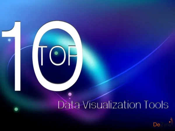
Exploring Data Analytics Tools for Data Visualization
In the modern business landscape, the ability to turn data into insights isnu2019t just a competitive edgeu2014itu2019s a necessity. The right data analytics tools for data visualization can help organizations of any size discover trends, drive smarter decisions, and communicate findings more effectively.<br>


Exploring Data Analytics Tools for Data Visualization
E N D
Presentation Transcript
Exploring Data Analytics Tools for Data Visualization Choosing the right data analytics tools for data visualization can make all the difference when it comes to unlocking insights from your data. Whether you're presenting key metrics to stakeholders, tracking real-time performance, or uncovering trends, these tools allow you to transform complex datasets into clear, interactive, and actionable visuals. With so many options available today, it’s essential to explore tools that not only meet your technical needs but also align with your business goals. In this article, we’ll walk through some of the most powerful and user-friendly data visualization platforms available in 2025, what makes them effective, and how to choose the right one for your needs.
Why Data Visualization Matters In a digital world overflowing with information, data visualization plays a critical role in simplifying complex data and making it understandable at a glance. It helps teams: ● Identify patterns and trends ● Communicate insights clearly ● Support data-driven decisions ● Save time and reduce analysis errors ● Engage stakeholders with impactful visual reports Key Features to Look For in a Data Visualization Tool When evaluating data visualization and analytics tools, keep an eye out for these essential features: ● Interactive dashboards and reports ● Ease of use with drag-and-drop functionality ● Real-time data updates ● Custom visuals and templates ● Cloud integration and data source connectivity ● Mobile accessibility and sharing options Top Data Analytics Tools for Data Visualization Here are some of the most trusted and widely used data visualization tools for individuals, teams, and enterprises.
1. Tableau Tableau stands out as one of the most advanced and flexible tools for data visualization. With its intuitive interface and dynamic dashboards, users can connect to a wide range of data sources and create interactive visual reports in minutes. Features: ● Drag-and-drop dashboard builder ● Real-time analytics and data blending ● AI-powered recommendations ● Extensive community and support Best For: Data analysts and enterprise teams needing rich, interactive visuals. 2. Microsoft Power BI Power BI is a robust business analytics tool from Microsoft that offers interactive data visualizations and deep integration with Excel, SharePoint, and Azure. Features: ● Real-time dashboard updates ● Custom visualization libraries ● Advanced data modeling tools ● Mobile-friendly design Best For: Teams within the Microsoft ecosystem or companies using Office 365.
3. Google Looker Studio (formerly Data Studio) A free and accessible tool from Google, Looker Studio enables users to turn raw data into customizable, shareable dashboards and reports with ease. Features: ● Integrates with Google Analytics, Ads, and Sheets ● Live collaboration and editing ● Pre-designed templates ● Cloud-based with no setup required Best For: Digital marketers, freelancers, and small businesses. 4. Qlik Sense Qlik Sense provides a self-service data visualization platform with a powerful associative data engine that allows users to explore their data freely. Features: ● Smart visualizations ● AI-generated insights ● Flexible deployment (cloud or on-premises) ● Drag-and-drop analytics Best For: Enterprises needing deep, governed data analysis.
5. Domo Domo is a cloud-native platform offering end-to-end business intelligence solutions from data ingestion to visualization. Features: ● 1,000+ data connectors ● Real-time notifications and alerts ● Custom app development ● Mobile-first dashboards Best For: Large organizations with distributed teams. Data Visualization Trends to Watch in 2025 The world of data analytics and visualization is evolving fast. Some key trends to follow include: ● AI-powered storytelling ● Real-time and predictive dashboards ● Self-service BI for non-technical users ● Natural language processing (NLP) in reporting ● Embedded analytics inside customer-facing applications Upskilling with Data Analytics Courses As the demand for skilled professionals grows, many learners are turning to professional certification programs. If you're looking to build a career in this field, enrolling in a Data Analytics Course in Noida, Delhi, Lucknow, Nagpur, and other parts of India can be a smart step forward. These programs often cover essential tools like Power BI, Tableau, SQL, and Python, offering both theoretical knowledge and hands-on project experience to prepare you for the real-world job market.
How to Choose the Right Tool for Your Business Here are some quick tips to help you pick the best data visualization tool: Define your data goals and use cases Match the tool’s complexity with your team’s skills Check integration capabilities with your current tech stack Take advantage of free trials and demos Evaluate pricing and scalability Final Thoughts In the modern business landscape, the ability to turn data into insights isn’t just a competitive edge—it’s a necessity. The right data analytics tools for data visualization can help organizations of any size discover trends, drive smarter decisions, and communicate findings more effectively. Whether you're a startup using Google Looker Studio, an enterprise leveraging Tableau or Qlik, or someone looking to upskill with a data analytics course, the path to data literacy starts with choosing the right tools and resources. FAQs Q1: Which tool is easiest for beginners? A: Power BI and Google Looker Studio are perfect for beginners due to their user-friendly interfaces and available learning resources. Q2: Are free tools reliable for business use? A: Yes, especially for small teams or startups. Many free tools offer robust features with scalable upgrade options. Q3: Is coding required to use data visualization tools? A: No, most modern tools offer no-code or low-code environments for easy use. Source url: