Top 10 Web Design Mistakes Impacting Usability in 2003
Explore the critical web design mistakes outlined by Jakob Nielsen that hinder usability in 2003. This presentation breaks down each of the top ten design errors, such as unclear statements of purpose and improper URL management for archived content. It includes examples and provides guidance for enhancing web design practice. View this presentation to gain insights into how these mistakes can adversely affect user experience, and learn to implement better practices by following links to relevant websites.

Top 10 Web Design Mistakes Impacting Usability in 2003
E N D
Presentation Transcript
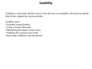
Usability Presentation Presentation by Alan Christensen, INST 5240, October 2004 Top 10 Web Design Mistakes of 2003
How to view this presentation This presentation contains ten sections. Each section corresponds to one of the top 10 design mistakes of 2003. Each section begins with an introductory statement from the article upon which this presentation is based. Additional graphics, screenshots, lists, and other text used to illustrate key points will also appear in this box.
How to view this presentation • A simple narrative, points of additional interest, and links to further sources of information will appear in this sidebar.
How to view this presentation Early in the presentation you will see an Overview slide (pictured at left). If you wish to view only certain sections of the presentation or to view the ten sections out of order, simply click on the section (1 thru 10) from the Overview slide.
INDEX How to view this presentation Click here, from any slide in the presentation to return to the Overview slide, so that you may use the index. To to advance one slide at a time viewing the slides in their given order, simply click anywhere on the screen.
Jakob Nielson Nileson’s Web Site Jakob Nielson, called the King of Usability by Internet Magazine, has compiled a list of the Top 10 Web Design Mistakes of 2003. This presentation illustrates how these design mistakes impact usability. Much of the text in this presentation is taken directly from Nielson’s article. RelatedArticles ~ The 10Very Worst ~UsabilityGuidelines~MostViolatedHomepageGuidelines
Overview • This presentation will illustrate each of these 10 design mistakes. • To get the most out of the presentation please follow links to websites and experience for yourself the examples of both good and bad design. Top 10 Web Design Mistakes of 2003 • Unclear Statement of Purpose • New URLs for Archived Content • Undated Content • Small Thumbnail Images of Big,Detailed photos • Overly detailed ALT Text • No "What-If" Support • Long Lists that Can't Be Winnowed by Attributes • Products Sorted Only by Brand • Overly Restrictive Form Entry • Pages That Link to Themselves
INDEX #1. Unclear Statement of Purpose A strong mental model can grow from small seeds, as each additional design element adds to the user's existing understanding of a site. However, many sites create blurry mental models in users' minds because they fail to offer the one hard fact that users need to place other facts in their proper context.
INDEX #1. Unclear Statement of Purpose Here is an example of vague, difficult to understand language used to describe services. This problem seems to be most prevalent in high-tech industries.
INDEX #1. Unclear Statement of Purpose • Still being uncertain of this company’s purpose, I clicked on “About Us.” • Can you tell what the heck they do?
INDEX #1. Unclear Statement of Purpose • I still wasn’t sure what Chaos by Design offered, so I clicked on their “Services” link. Huh?
INDEX #1. Unclear Statement of Purpose • O.K., O.K., I suppose it isn’t fair to compare a page that is not hi-tech with one that is. Nor is it right to use a page of my own design for the “good” example. But, what the heck.
INDEX #2. New URLs for Archived Content Although more and more sites are archiving old content, most sites still fail to maintain good archives. Some sites treat archives as a separate site area, assigning pages new URLs when they move them from the main area into the archive.
INDEX #2. New URLs for Archived Content • The problem with changing URLs is that it creates linkrot. • Ironically, this example comes from Jakob Nielson’s own website.
INDEX #2. New URLs for Archived Content • Apparently Internet Magazine changed the URL for this article when they archived it.
INDEX #2. New URLs for Archived Content • Deseret News Archives • ProQuest • SBA.gov It is not difficult to find sites that do archive well. Most reputable news organizations, electronic libraries and other organizations who are in the business of disseminating information archive articles without changing URLs.
INDEX #3. Undated Content Some facts and recommendations are strongly date-dependent. For such material, if readers can't see the date, they won't know whether they may trust the material or not.
INDEX #3. Undated Content • Without dates on articles, press releases, and other content, users have no idea whether the information is current or obsolete. Types of Content for which Undated Material may be a Major Problem. Reviews of products or services Information about programs that are time sensitive Investment counsel Market research Statistically heavy articles
INDEX #4. Small Thumbnail Imagesof Big, Detailed Photos Many websites are now decreasing download time without a loss of information richness by using smaller pictures. It is good when sites link small pictures, commonly called thumbnails, to bigger pictures, so users have the option of seeing the image in more detail. The problem is that websites typically produce small images by simply scaling down bigger images. If an original photo has a lot of intricate detail, the thumbnail is often incomprehensible.
INDEX #4. Small Thumbnail Imagesof Big, Detailed Photos • A thumbnail picture is a small graphical rep-resentation of a larger picture. verses The left photo is from the whitehouse.gov site. It shows the U.S. President, the Secretary of the Interior, and the Director of the National Park Service walking in the Santa Monica mountains. If I hadn't told you that, you wouldn't have known by looking at the thumbnail. The right photo is from cnn.com, which usually does a great job with small images on the homepage. This photo illustrated a story about flooding; in this case, you can clearly see what's going on, even though the image is only 65 x 49 pixels.
INDEX #4. Small Thumbnail Imagesof Big, Detailed Photos • A thumbnail picture is a small graphical rep-resentation of a larger picture. • When using photos on the Web: • Include fewer people and objects, in less complicated settings than you would for photos intended for print • Emphasize close-up shots with clean backgrounds • Use relevance-enhanced image reduction when preparing small photos from big ones. Don't just resize; first crop the image to focus on a salient and simple element
INDEX #4. Small Thumbnail Imagesof Big, Detailed Photos • This illustration is taken from an article which shows three different ways of making thumbnails. • Relevance-Enhanced Image Reduction is the preferred method. Which thumbnail (small photos at the right) would you use to link to the larger photo and/or article if you wanted to help the viewer see what was relevant at a glance?
INDEX #5. Overly Detailed ALT Text Many sites have begun paying attention to users with disabilities and are following accessibility guidelines, such as including ALT texts for images. Unfortunately, some sites don't realize that ALT text is a user interface element, not a statement of political correctness.
INDEX #5. Overly Detailed ALT Text • Adding ALT text, text that may be read in place of graphics, is one of many techniques which enhance accessibility for blind users and others who can’t see images. • ~Accessibility Guidelines I searched in vain for examples of this problem. However, I will share the author’s example: I came across a site that used the following ALT text for its logo: "Link to home page using the IDEAS logo: two swooshes surround ideas and a sun is rising in the background." It might be reasonable to have a textual description of the logo design somewhere on the site for blind users who are curious about how it looks, but there is no reason… to announce the number of swooshes in the logo on every single page view. It takes a screen reader a long time to read out nineteen words … Short is good when writing for the Web; it's even better when writing for screen readers.
INDEX #6. No “What-if” Support Comparing and choosing between alternatives is the basis for most critical Web tasks, yet most websites don't support users who want to consider alternatives.
INDEX #6. No “What-if” Support • This site allows custom design and pricing of a steel building. • However, once the first six spe-cification options are selected you are unable to go back and change them without starting over. • These are the initial specification options: • Drawing type & shipping • Endwall width • Sidewall length • Eve height • Number of bays • Roof Pitch No “What-if” Support
INDEX #6. No “What-if” Support • I’ve completed the first six specifications and now use the tabs across the top to select and edit options such as doors, insulation, colors, etc. These can selected and changed without starting over (good), but what if I wish to change the roof pitch? I have to begin all over (bad).
INDEX #6. No “What-if” Support • This website allows any item to by changed independent of any other item. This is a good example of “What-if” support. • Try the link to see how convenient quality “What-if” support is. • www.utahrealestate.com
INDEX #7. Long Lists that Can't Be Winnowed by Attributes It is common to find sites with thousands (or even millions) of items. One of the main usability guidelines for category pages is to let users winnow items according to attributes of interest.
INDEX #7. Long Lists that Can't Be Winnowed by Attributes • Interestingly, the same sight that is used as a good example of having “What-if” support is also an example of long lists that cannot be winnowed by attributes. • For example, I cannot sort these homes by number of rooms, acreage, etc. I simply must view them in the order they appear.
INDEX #7. Long Lists that Can't Be Winnowed by Attributes • At the time this presentation was prepared, there were 970 flashlights on e-bay. Fortunately these can be winnowed by attributes that are somewhat important to bidders. But, say I only want flash-lights that use AA batteries. I still cannot winnow to that extent.
INDEX #8. Products Sorted by Brand Many sites only let users sort items by brand. To support sorting by attributes of interest to users, the obvious first question is "What attributes do users value?” For some users brand name may be important, but for many the color, size, etc. of the product is more important.
INDEX #8. Products Sorted by Brand • Even sites as advanced as Overstock.com are guilty of this usability mistake. • Sorting by brand is O.K., but allowing sorting only by brand is not good enough for those who are shopping for functionality not for a name.
INDEX #9. Overly Restrictive Form Entry Any text entry field that requires users to type information in a specific way rather than allow the natural variations that humans prefer can be irritating. Put the burden on the computer, not the human. Let users enter data in the format they prefer.
INDEX #9. Overly Restrictive Form Entry • Splitting what users see as a single piece of information into multiple fields means that users must waste time moving the cursor around. Users typically view things like their name or their phone number as one piece of information.
INDEX #10. Pages that Link to Themselves If they click it, a link leading to the current page is an utter waste of users' time. Worse, such links cause users to doubt whether they're really at the location they think they're at.
INDEX #10. Pages that Link to Themselves • I guess it is only fair since I awarded a blue ribbon to my own site for point #1 to also use this site to illustrate non compliance with point #10.
INDEX #10. Pages that Link to Themselves • Since these four buttons appear on every page on the site there are at least four pages that link to themselves. This is a common problem - especially with homepages.
INDEX Summary • This is Jakob Nielson’s summary of the Top 10 Design Mistakes. Many of this year's top design mistakes actually indicate a happy phenomenon: we are making progress in Web usability. Now that sites are doing certain things correctly, we get hit by second-order phenomena that only cause problems because users have progressed past the first-order issues. For example, the question of good or bad ALT text only arises for sites that care enough about accessibility to have any ALT text. Other top mistakes this year derive from sites that target fast downloads by reducing image size, that maintain good archives, or that have a broad product selection. All are positive design directions, but attention to details is required to achieve optimum usability impact.