Download
1 / 10

E N D
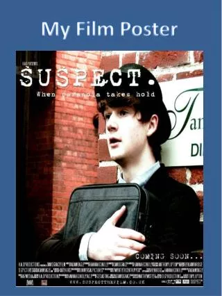
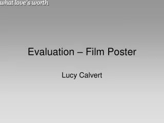
Film Poster Evaluation In connection with my film production coursework where my group and I have filmed and put together a film trailer, I have completed a number of post production texts to accompany it. Ahead you will see my main campaign poster designed to mirror the common conventions of generic film posters. By Naya Kanani
Research & Planning Throughout the construction of my poster, I made sure that I had completed the appropriate research into film posters to accompany my own poster. I wanted it to mirror a generic film poster such as ‘Titanic’ for example. The main campaign poster for the film “Twilight” was also a great influence as we wanted to portray our characters within an embrace and very close to each other. A majority of the main conventions that we discovered were taken from the film “The Notebook”. We focused on the idea of a serious romance film rather then a typical romantic comedy as we felt we could challenge particular stereotypes within the romance genre and portray them accurately.
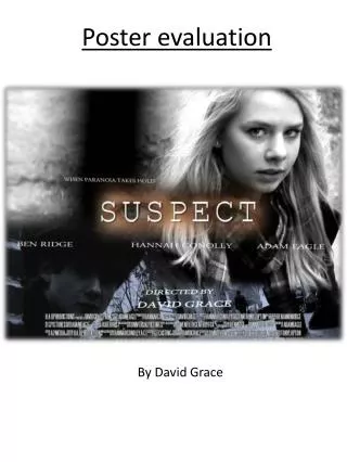
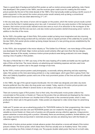
The Image The image I used is one that would be taken from the footage of the film/film trailer. It shows the lead actor and actress in a loving and warm environment displaying affection towards each other. The female character’s body language is suggestive of shyness as she looks downwards rather then in eyes however we sense that she is teasing him and wants to get closer to him as she plays with his necklace. Notice she is dressed smartly in a black suit which is suggestive of her career or background. The male character is very casually in a patterned shirt with jewellery and styles a very bohemian haircut which gives a very relaxed impression. He is looking directly at her and is showing deep interest what she has to say. At a first instance, appearance wise, they are both very different characters. The image dominates the page and only contains two of the characters as they are the most important ones within the film and it is about them.
The Title The positioning of the title takes place just below half way. I arranged it as this to coincide with the background image so as not to take away from the featured characters, however I still wanted it to stand out so it looked natural to be positioned below the faces of the two main characters. I made the font quite large as it is important for the film’s name to stand out and become recognisable as well as giving it a golden yellow tone with a red border to create an almost vintage effect. What Love's Worth
Positive Quote & Previous Credits A quotation from ‘The Times’ and ‘The Guardian’ would indicate that the film is of a serious genre. Those particular newspapers are of a high quality and I felt that they would enhance the films reputation having been given ratings. The stars given by ‘The Times’ are in a typically bright yellow colour to attract immediate attention to the very positive rating that has been given. Highlighting previous credits of writers and directors is a poster convention that ensures a certain type of expectation from an audience once they are aware that is associated with another successful film they’ve enjoyed. It is also an indication of genre.
Colour Saturation The sepia tones that I have added to the background and the image are to create a softer and more romantic tone. I wanted to soften the picture as I felt that if it was in a neutral colours it would appear very harsh. The idea of a more romantic and glowing image would be suggestive of the tone of the film and the genre as well. The brick wall background indicates a meeting outside of some kind in an almost secretive nature. This may suggest that their meeting is secretive or not conventional.
Credits The posters credits and age certification are there to provide information to the audience and recommend what age range of people are allowed to see the film classed by the BBFC (British Board of Film Classification). The ‘15’ certification also indicates that the film may include some moderate violence, scenes of a sexual nature or inappropriate language. The film’s credits placed at the bottom of the poster are another typical film convention. It provides all the necessary information about actors, directors and editors who are part of the production team behind the film. The credits are small and faded as well as being placed on the bottom of the poster. It is placed here as it is not dominant of the poster and does not need to attract too much attention. NEW LINE CINEMA PRESENTS AN NK JOOK PRODUCTION WILLIAM DENNARD ALEXANDRA ROBSON “WHAT LOVE’S WORTH” LUCINDA SCOTT JESS PURSGLOVE ELLIE HALFORD WITH LUKE JAMES AND NICHOLAS EVANS COSTUME DESIGNER STEFAN DEMOSTHENOS MUSIC BY WILLIAM DENNARD AND THE TBSHS MUSIC DEPARTMENT EDITORS NAYA KANANI NATASHA REYNOLDS PRODUCED BY ANTONY LUPTON SCREEN PLAY BY DOMINIC SOMERSET DIRECTED BY ROSELISE HODGE www.whatlovesworth.co.uk COMING THIS SPRING
Digital Technology Concerning digital technology, I was able to use editing software such as Picasa 3 and Paint. I wanted to edit the pictures I had taken for my film poster and alter the tone of then as well as make a few size and texture edits.
Creativity During the construction of my poster, I feel I have experimented more with colouring and editing software. I feel I have become more creative through making my poster look as generic and professional as possible. I also believe that I have creatively used the genre to changed the dominant character in the film; and in turn, the poster too. This was very experimental and has worked very well. It is portrayed that stereotyping barriers have been broken down through the strong female character taking the lead and the male taking a ‘back seat’.