Download
1 / 13
130 likes | 221 Views
Explore the implementation and outcomes of the ADAPS visual interpretation methodology in geoscience, showcasing advanced faulting techniques. Comparison of diverse interpretations reveals hidden complexities. Engage in a comprehensive fault analysis for enhanced seismic solutions. Delve into strategies to overcome interpretational challenges and optimize data visualization. Grasp the significance of lateral fault movement and its impact on trap formation and oil exploration. Witness the evolution of fault patterns through meticulously developed slides. Dive into stratigraphic insights and fault details to enhance your geological understanding.

E N D
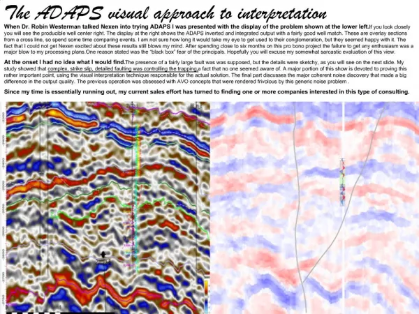
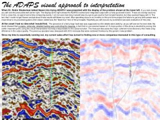
The ADAPS visual approach to interpretation When Dr. Robin Westerman talked Nexen into trying ADAPS I was presented with the display of the problem shown at the lower left. If you look closely you will see the producible well center right. The display at the right shows the ADAPS inverted and integrated output with a fairly good well match. These are overlay sections from a cross line, so spend some time comparing events. I am not sure how long it would take my eye to get used to their conglomeration, but they seemed happy with it. The fact that I could not get Nexen excited about these results still blows my mind. After spending close to six months on this pro bono project the failure to get any enthusiasm was a major blow to my processing plans.One reason stated was the “black box” fear of the principals. Hopefully you will excuse my somewhat sarcastic evaluation of this view. At the onset I had no idea what I would find. The presence of a fairly large fault was was supposed, but the details were sketchy, as you will see on the next slide. My study showed that complex, strike slip, detailed faulting was controlling the trapping, a fact that no one seemed aware of. A major portion of this show is devoted to proving this rather important point, using the visual interpretation technique responsible for the actual solution. The final part discusses the major coherent noise discovery that made a big difference in the output quality. The previous operation was obsessed with AVO concepts that were rendered frivolous by this generic noise problem . Since my time is essentially running out, my current sales effort has turned to finding one or more companies interested in this type of consulting.
Their picture vs mine – Of course this is a map vs section comparison, but the orientation is correct. The green fault at the right is my suggested major strike slip event, which essentially splits the stratigraphy due to its lateral movement. The red question mark on the map segment roughly corresponds with this fault position. Of course I plan to prove my fault hypothesis later, but for now please concentrate on the differences in basic interpretation. To start, I find no believable continuity across the main fault, where they show smooth contours, Also I show several trapping faults between their upper black line and the producible zone at the bottom of the well. Since their offset thinking was based on this rather simple interpretation I submit some attention should have been paid to my evidence. ? Because strike slip faults shear laterally, they can wander all around a 2D section. Accordingly it is very difficult to establish dependable fault patterns. The following slides show a series of in-lines that lead to this one, containing the subject well. Since PowerPoint provides a nice set of graphical tools, I built fancy picture taking capabilities into ADAPS early on. Snaps are taken at crucial points in the optimization cycle, providing a bank of pictures to choose from. The fault pattern you will see was determined by iterating through these individual slides, picking fault tracks then comparing them laterally for consistency. Once the individual faults could be duplicated slide to slide my confidence grew. Such consistency is often the logical proof one uses in non-linear approaches. Believing what you see is not a bad approach. This type of effort brings the interpreter close to the data.. Note the series of stars as we move along. If you go back to the well match on the previous slide you will not the strong blue event just above the target sand(s). This is a known marker shale that apparently can be depended upon. The stars identify my correlations to this marker. At the beginning of the series this shale seams continuous. As we move towards the well, you will see it being broken by very believable strike slip ancillary faults. While the details might not be perfect, the overall three dimensional evidence is strong. Slide transitions are timed, so just watch the pattern changing. At the series end there is a return for repetition. Deep plate movement is undoubtedly the cause of the lateral faulting. The vertical throw seems to increase greatly with depth. All in all the exercise provides a fascinating insight into the stratigraphy. You will see individual bright spots show up in trapping situations. These amplitude changes provide good fault detail as well.
This is the first in-line. I show it here to set the stage for the series. It is repeated in the timed series. Notice the marker shale (with stars). Here the continuity is quite obvious. After considerable study I determined the green fault to be the major element of the system. While there is good cross fault correlation on the ancillary faults, none is evident to me across this main green one. To keep this exercise simple I have not tried to include faults to the right of the major one. At the risk of redundancy let me point out that this type of fault clarity was completely absent before ADAPS. As far as I know they still have not taken it into account. Once again please notice the amplitude standouts. As we approach the well you will see there are more attractive spots to drill. Associated with these hydrocarbon clues the important thing is that these smaller faults appear to be trapping. The timing starts next. Pay close attention to the marker shale.
. Repeat the timed series by clicking arrow until you get bored by the detail. Else press right arrow to proceed.
I repeat the well with the match. You might notice a better place to drill a pair of faults to the right. . The more I look at it the better it appears to me. Once again the interpretation before ADAPS.
This is a 200+ trace, pre migration, Blackbird gather. The strong event marked with the yellow arrow is undoubtedly the chalk. Very early it is cloning into a reverberating refraction. Energy from this phenomenon can be seen making its way back to the inside. In any case all the outside traces are essentially garbage. One can spend hours studying the various noise ramifications here. This whole subject is discussed fully in the main series. The point here is that the fact that ADAPS treated this generic problem on a pre-stack basis was one factor behind the remarkable improvement. Before ADAPS no one was looking at gathers, and all attention was on “near, middle and far trace stacks”. My “industry icon” certainly fits here. Then there is the general information display problem. This presentation visually displays the results of my interpretation effort. Passing the final ADAPS product to today’s automated mapping tools completely loses most of the important information that has been developed. One of my biggest arguments with Ikon Science (during development days) was their disregard of the importance of PowerPoint like reports in client presentations. Clients would come back with relatively meaningless time or horizon slices, missing the point of the enhanced lithology. In this project, where the potential reservoirs are split into fault blocks, trying to map reservoirs automatically (without a lot of preliminary analysis) is a big problem. This show is a essentially a subset of the original. Its main purpose is to illustrate how the powerful de-tuning capabilities of ADAPS were utilized in a comprehensive interpretation effort. Of course this is the product I am touting. Click here to start over - Click here to see the original Nexen show. Or here to go to the associated noise show. Or here to go to the ADAPS router. Remember these are PowerPoints and are slow to load!