Download
1 / 43
450 likes | 593 Views
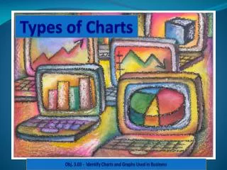
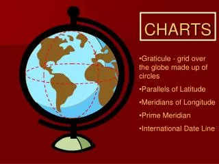
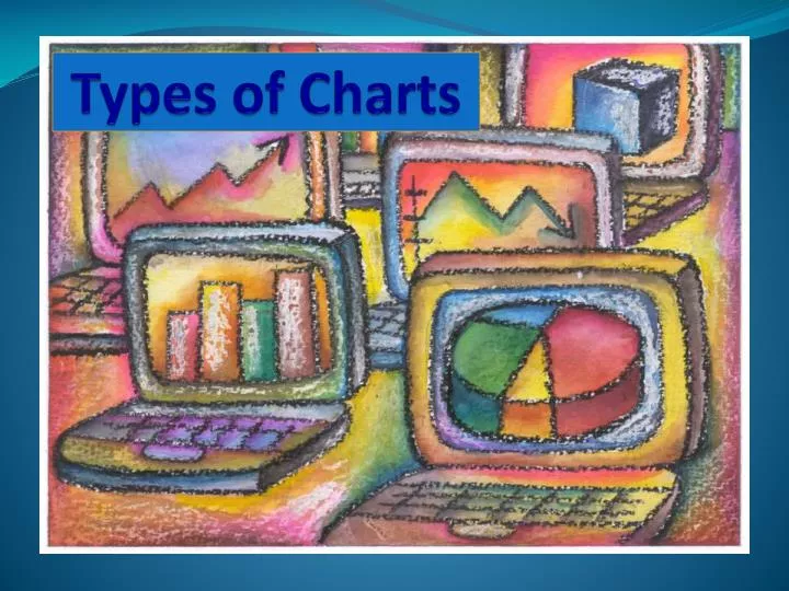
Types of Charts. How do you know which chart to use ?. In this PowerPoint, each chart will be defined and described with an example of the data it is most appropriately suited to represent . How are charts used in other classes? Are charts used in Algebra? Why?

E N D
How do you know which chart to use? In this PowerPoint, each chart will be defined and described with an example of the datait is most appropriately suited to represent. How are charts used in other classes? • Are charts used in Algebra? Why? • Are charts used in Social Studies? Why? • Are charts used in English? Why? 4.02 Understand charts/graphs used in business.
What you need to know You need to know: • The six common charts used in business. • The object is to understand how each chart is used to communicate information. • For example, if you are trying to compare the sales of Honda Civics to the sales of Nissan Altimas, what chart will best explain the data? • Why is one chart preferred over another? • Which chart will best communicate the data? 4.02 Understand charts/graphs used in business.
6 Common types of charts • Column Chart • Stacked Bar Chart • Line Chart • XY Scatter Chart • Pie Chart • Exploded Pie Chart 4.02 Understand charts/graphs used in business.
Column Chart A Column Chart is used to make comparisons and generalizations about groups of data. • such as, to compare the number of students from each class (Sophomores, Juniors, and Seniors) and their attendance and school spirit at assemblies. A Column Chartis a series of verticalchart columns, each representative of a data series. 4.02 Understand charts/graphs used in business.
Column Chart This chart compares the attendance rates/school spirit of Seniors, Juniors, and Sophomores at assemblies over a period of four months. School Spirit at Assemblies Which group has the most consistent school spirit? The Sophomores have the most consistent attendance/school spirit, as evidenced by the green bars. 4.02 Understand charts/graphs used in business.
Compare 4.02 Understand charts/graphs used in business.
Stacked Bar This chart focuses more on each group’s contribution to the whole for any given month. 4.02 Understand charts/graphs used in business.
Line This chart would be okay if we were analyzing trends in attendance rates, but it does not provide a good side-by-side comparison. 4.02 Understand charts/graphs used in business.
XY Scatter This chart is trying to determine if there is a correlation between the month and the attendance rate. 4.02 Understand charts/graphs used in business.
Pie Finally, this chart is useless for representing the data because it only allows for one data series. 4.02 Understand charts/graphs used in business.
Stacked Bar Chart A Stacked Bar Chart is used to represent the sum of more than one value and compare the contribution of individuals to the whole. • such as, to compare the total sales for three components/departments to the whole sales for a store. A Bar or a Stacked Bar Chart is a series of horizontal bars, each representative of a data series. • Each bar is divided into two or more parts • The length of the stacked bar represents a total. 4.02 Understand charts/graphs used in business.
AnotherStacked Bar Chart example: Question: The CTE Dept. has received test scores for the first semester. The Dept. chair wants to see how each area (Business, Marketing, Technology) contributed to the combined score. What is the best chart type to use? Answer: Stacked Bar Chart 4.02 Understand charts/graphs used in business.
Stacked Bar This example shows the contributions of three components--Computers, Printers, and Monitors--to total sales during each quarter (three-month period). 4.02 Understand charts/graphs used in business.
Compare 4.02 Understand charts/graphs used in business.
Column This chart does not accurately represent the contributions of each part to the whole and is instead comparing them against each other. 4.02 Understand charts/graphs used in business.
Line What about this chart? Can you clearly identify each component’s contribution to the whole? 4.02 Understand charts/graphs used in business.
XY Scatter Why does this chart not work? 4.02 Understand charts/graphs used in business.
Pie This chart only looks at onedepartment. 4.02 Understand charts/graphs used in business.
Line Chart A Line Chart is used to show trends or changes in data over time. • such as, growth in sales over several quarters. A Line Chart is a series of data points connected by horizontal lines, each representing a series of data. 4.02 Understand charts/graphs used in business.
Another Line Chart example Question: The CTE Dept. Chair is reviewing test scores and wants to see the trends of the scores of students in these 3 areas (Business, Marketing, Technology) for the past 5 years. What is the best chart type to use? Answer: Line Chart 4.02 Understand charts/graphs used in business.
Line Chart • Which department showed the most growth? • Which department showed a steady increase in sales? • Which department showed a decline in sales? 4.02 Understand charts/graphs used in business.
Compare 4.02 Understand charts/graphs used in business.
Column • To analyze the trends in this chart, the reader must read each data series separately and then make comparisons and generalizations. • However, in the previous Line Chart, trends were clearly and quickly analyzed just by looking at the lines. 4.02 Understand charts/graphs used in business.
Stacked Bar Does this chart describe trends? 4.02 Understand charts/graphs used in business.
Pie The pie chart fails to present all of the data. 4.02 Understand charts/graphs used in business.
XY Scatter AnXY Scatter Chart is used to indicate the correlation of two or more sets of data. • such as, the correlation between stress rates and wait time in a doctor’s office. • or the correlation between pulse rates and wait time in the principal’s office. • A business example of an XY Chart is one that represents the effect (if any) of caffeine on worker productivity. 4.02 Understand charts/graphs used in business.
XY Scatter What effect did the wait time in the principal’s office have on pulse rate? What effect did the wait time in the doctor’s office have on pulse rate? This data is fictional. 4.02 Understand charts/graphs used in business.
Compare 4.02 Understand charts/graphs used in business.
Column As you can see, if this chart is used, the data is confusing and not easily interpreted. 4.02 Understand charts/graphs used in business.
Stacked Bar This chart is also hard to interpret. 4.02 Understand charts/graphs used in business.
Pie The pie chart, once again, is clearly not the preferred chart for representing and communicating the data! 4.02 Understand charts/graphs used in business.
Pie Chart A Pie Chartis used to represent only one series of data. APie Chart shows the contribution of each componentof one series of data to the whole. • such as, the percentage (%)of each expenditure to the total budget • the % of each investment type in a portfolio It answers the question, “What is the percentage of each part to the whole?” 4.02 Understand charts/graphs used in business.
Pie Chart Which item contributed the most percent to total sales? 4.02 Understand charts/graphs used in business.
Exploded Pie Chart An Exploded Pie Chartis a pie chart in which the individual components are enhanced. It is used to emphasize one or more portions of the data (one piece of the pie is enhanced). 4.02 Understand charts/graphs used in business.
Exploded Pie Chart 4.02 Understand charts/graphs used in business.
Review: Can you identify the charts? • Represents the contribution of individual items to the whole • Indicates trends in data • Makescomparisons about groups of data • Emphasizes one or more portions of the data • Represents only one series of data • Indicates a correlation 4.02 Understand charts/graphs used in business.
Stacked Bar 4.02 Understand charts/graphs used in business.
XY Scatter 4.02 Understand charts/graphs used in business.
Column Chart 4.02 Understand charts/graphs used in business.
Exploded Pie 4.02 Understand charts/graphs used in business.
Pie 4.02 Understand charts/graphs used in business.
Line 4.02 Understand charts/graphs used in business.