Analyzing Preferences Through Circle Graphs
This guide showcases how to interpret circle graphs with real-life examples, such as teenagers' opinions on roller coasters and preferences in frozen yogurt flavors. By understanding how to read the segments of a circle graph, one can derive valuable conclusions about the surveyed population. The text provides clear steps to calculate specific data points, including how many individuals prefer certain options, making it an essential tool for analyzing data clearly. Engage with practice questions to enhance your skills in data interpretation.

Analyzing Preferences Through Circle Graphs
E N D
Presentation Transcript
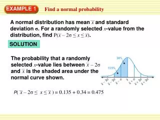
EXAMPLE 1 Interpreting a Circle Graph
EXAMPLE 1 Interpreting a Circle Graph Roller Coasters
EXAMPLE 1 Interpreting a Circle Graph Roller Coasters A group of teenagers are asked what they think about roller coasters. Their answers are shown in the circle graph at the right. How many of them think roller coasters are great? A circle graph is a graph that represents data as parts of a circle. The entire circle represents all of the data. You can make conclusions about the data in a circle graph based on the size of each section.
EXAMPLE 1 Interpreting a Circle Graph Use the circle graph above. • To find out how many of the teenagers think roller coasters are great, find the data value in the section labeled “Great.”
EXAMPLE 1 Interpreting a Circle Graph Use the circle graph above. • To find out how many of the teenagers think roller coasters are great, find the data value in the section labeled “Great.” ANSWER The number who think roller coasters are great is 78.
EXAMPLE 1 Interpreting a Circle Graph Use the circle graph above. • To find out how many of the teenagers think roller coasters are great, find the data value in the section labeled “Great.” ANSWER The number who think roller coasters are great is 78. • To find out how many of the teenagers do not think roller coasters are great, add the values in the “OK” and the “Not fun” sections: 15 + 7 = 22.
EXAMPLE 1 Interpreting a Circle Graph Use the circle graph above. • To find out how many of the teenagers think roller coasters are great, find the data value in the section labeled “Great.” ANSWER The number who think roller coasters are great is 78. • To find out how many of the teenagers do not think roller coasters are great, add the values in the “OK” and the “Not fun” sections: 15 + 7 = 22. ANSWER The number who do not think roller coasters are great is 22.
for Example 1 GUIDED PRACTICE The circle graph shows how many people out of 100 prefer each of four types of shoes.
for Example 1 GUIDED PRACTICE The circle graph shows how many people out of 100 prefer each of four types of shoes. • Which type of shoe is least popular?
for Example 1 GUIDED PRACTICE The circle graph shows how many people out of 100 prefer each of four types of shoes. • Which type of shoe is least popular? Sandals ANSWER
for Example 1 GUIDED PRACTICE The circle graph shows how many people out of 100 prefer each of four types of shoes. • Which type of shoe is least popular? Sandals ANSWER • How many of the people do not prefer loafers?
for Example 1 GUIDED PRACTICE The circle graph shows how many people out of 100 prefer each of four types of shoes. • Which type of shoe is least popular? Sandals ANSWER • How many of the people do not prefer loafers? ANSWER 78
for Example 1 GUIDED PRACTICE The circle graph shows how many people out of 100 prefer each of four types of shoes. • Is it reasonable to say that “sneakers” is the most popular choice? Explain.
for Example 1 GUIDED PRACTICE The circle graph shows how many people out of 100 prefer each of four types of shoes. • Is it reasonable to say that “sneakers” is the most popular choice? Explain. ANSWER Yes, sneakers has the highest total.
EXAMPLE 2 Using a Graph
EXAMPLE 2 Using a Graph Frozen Yogurt The circle graph shows the favorite frozen yogurt flavors of 100 students. About 300 students will attend a party. Predict how many students will ask for vanilla frozen yogurt.
EXAMPLE 2 Using a Graph SOLUTION Find the relationship between the number of the students surveyed and the number of students at party: 100 3 = 300.
EXAMPLE 2 EXAMPLE 2 Using a Graph Using a Graph SOLUTION Find the relationship between the number of the students surveyed and the number of students at party: 100 3 = 300. Multiply the number of students who prefer vanilla by 3 to predict the number of students who will ask for vanilla at the party: 38 ×3 = 114.
EXAMPLE 2 Using a Graph SOLUTION Find the relationship between the number of the students surveyed and the number of students at party: 100 3 = 300. Multiply the number of students who prefer vanilla by 3 to predict the number of students who will ask for vanilla at the party: 38 3 = 114. ANSWER About 114 students will ask for vanilla frozen yogurt at the party.
GUIDED PRACTICE for Example 2
GUIDED PRACTICE for Example 2 • What If? Use the graph above. Suppose only 200 students attend the party. Predict how many students will ask for strawberry frozen yogurt.
GUIDED PRACTICE for Example 2 • What If? Use the graph above. Suppose only 200 students attend the party. Predict how many students will ask for strawberry frozen yogurt. ANSWER About 44 students will ask for strawberry frozen yogurt at the party.