Choosing the Right Graph for Descriptive Statistics: A Guide to Data Visualization
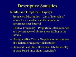
This comprehensive guide discusses various types of graphs used to summarize data in descriptive statistics, focusing on how to choose the right one based on data type and illustration goals. It covers bar charts for categorical data, histograms for measurement data, dot plots, stem-and-leaf plots, box plots for displaying quartiles and identifying outliers, and scatter plots for examining relationships between two variables. Each graph type is explained with its appropriate use cases, ensuring effective communication of statistical information.

Choosing the Right Graph for Descriptive Statistics: A Guide to Data Visualization
E N D
Presentation Transcript
Descriptive Statistics Summarizing data using graphs
Which graph to use? • Depends on type of data • Depends on what you want to illustrate • Depends on available statistical software
Bar Chart • Summarizes categorical data. • Horizontal axis represents categories, while vertical axis represents either counts (“frequencies”) or percentages (“relative frequencies”). • Used to illustrate the differences in percentages (or counts) between categories.
Analogy Bar chart is to categorical data as histogram is to ... measurement data.
Histogram • Divide measurement up into equal-sized categories. • Determine number (or percentage) of measurements falling into each category. • Draw a bar for each category so bars’ heights represent number (or percent) falling into the categories. • Label and title appropriately.
Histogram Use common sense in determining number of categories to use. (Trial-and-error works fine, too.)
Dot Plot • Summarizes measurement data. • Horizontal axis represents measurement scale. • Plot one dot for each data point.
Stem-and-Leaf Plot Stem-and-leaf of Shoes N = 139 Leaf Unit = 1.0 12 0 223334444444 63 0 555555555555566666666677777778888888888888999999999 (33) 1 000000000000011112222233333333444 43 1 555555556667777888 25 2 0000000000023 12 2 5557 8 3 0023 4 3 4 4 00 2 4 2 5 0 1 5 1 6 1 6 1 7 1 7 5
Stem-and-Leaf Plot • Summarizes measurement data. • Each data point is broken down into a “stem” and a “leaf.” • First, “stems” are aligned in a column. • Then, “leaves” are attached to the stems.
Box Plot • Summarizes measurement data. • Vertical (or horizontal) axis represents measurement scale. • Lines in box represent the 25th percentile (“first quartile”), the 50th percentile (“median”), and the 75th percentile (“third quartile”), respectively.
An aside... • Roughly speaking: • The “25th percentile” is the number such that 25% of the data points fall below the number. • The “median” or “50th percentile” is the number such that half of the data points fall below the number. • The “75th percentile” is the number such that 75% of the data points fall below the number.
Box Plot (cont’d) • “Whiskers” are drawn to the most extreme data points that are not more than 1.5 times the length of the box beyond either quartile. • Whiskers are useful for identifying outliers. • “Outliers,” or extreme observations, are denoted by asterisks. • Generally, data points falling beyond the whiskers are considered outliers.
Which graph to use when? • Stem-and-leaf plots and dotplots are good for small data sets, while histograms and box plots are good for large data sets. • Boxplots and dotplots are good for comparing two groups. • Boxplots are good for identifying outliers. • Histograms and boxplots are good for identifying “shape” of data.
Scatter Plots • Summarizes the relationship between two measurement variables. • Horizontal axis represents one variable and vertical axis represents second variable. • Plot one point for each pair of measurements.
Closing comments • Many possible types of graphs. • Use common sense in reading graphs. • When creating graphs, don’t summarize your data too much or too little. • When creating graphs, label everything for others. Remember you are trying to communicate something to others!