Download
1 / 18
180 likes | 340 Views
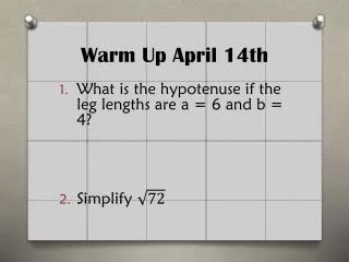
Warm-up April 2, 2014. The number of games won by a famous basketball team each year from the year 1991 to the year 2000 are 25, 30, 25, 50, 40, 75, 40, 50, 35, and 40. Do you know how to construct the box-and-whisker plot of the data. CCGPS Coordinate Algebra.

E N D
Warm-up April 2, 2014 The number of games won by a famous basketball team each year from the year 1991 to the year 2000 are 25, 30, 25, 50, 40, 75, 40, 50, 35, and 40. Do you know how to construct the box-and-whisker plot of the data.
CCGPS Coordinate Algebra UNIT QUESTION: How can I represent, compare, and interpret sets of data? Standard: MCC9-12.S.ID.1-3, 5-9, SP.5 Today’s Question: How do I graphically represent data? Standard: MCC9-12.S.ID.1
Unit 4Vocabulary Standards MCC6.SP.5c, MCC9-12.S.ID.1, MCC9-12.S.1D.2 and MCC9-12.S.ID.3
Box Plot A plot showing the minimum, maximum, first quartile, median, and third quartile of a data set; the middle 50% of the data is indicated by a box. Example:
Box Plot: Pros and Cons Advantages: • Shows 5-point summary and outliers • Easily compares two or more data sets • Handles extremely large data sets easily Disadvantages: • Not as visually appealing as other graphs • Exact values not retained
Dot Plot A frequency plot that shows the number of times a response occurred in a data set, where each data value is represented by a dot. Example:
Dot Plot: Pros and Cons Advantages: • Simple to make • Shows each individual data point Disadvantages: • Can be time consuming with lots of data points to make • Have to count to get exact total. Fractions of units are hard to display.
Histogram A frequency plot that shows the number of times a response or range of responses occurred in a data set. Example:
Histogram: Pros and Cons Advantages: • Visually strong • Good for determining the shape of the data Disadvantages: • Cannot read exact values because data is grouped into categories • More difficult to compare two data sets
Mean The average value of a data set, found by summing all values and dividing by the number of data points Example: 5 + 4 + 2 + 6 + 3 = 20 The Mean is 4
Median The middle-most value of a data set; 50% of the data is less than this value, and 50% is greater than it Example:
First Quartile The value that identifies the lower 25% of the data; the median of the lower half of the data set; written as Example:
Third Quartile Value that identifies the upper 25% of the data; the median of the upper half of the data set; 75% of all data is less than this value; written as Example:
Interquartile Range The difference between the third and first quartiles; 50% of the data is contained within this range Example: Subtract Third Quartile ( ) – First Quartile ( ) = IQR
Outlier A data value that is much greater than or much less than the rest of the data in a data set; mathematically, any data less than or greater than is an outlier Example:
Interquartile Range The numbers below represent the number of homeruns hit by players of the Hillgrove baseball team. 2, 3, 5, 7, 8, 10, 14, 18, 19, 21, 25, 28 Q1 = 6 Q3 = 20 Interquartile Range: 20 – 6 = 14 Do the same for Harrison: 4, 5, 6, 8, 9, 11, 12, 15, 15, 16, 18, 19, 20
Box and Whisker Plot The numbers below represent the number of homeruns hit by players of the Hillgrove baseball team. 2, 3, 5, 7, 8, 10, 14, 18, 19, 21, 25, 28 Q1 = 6 Q3 = 20 Interquartile Range: 20 – 6 = 14 6 12 20
Creating a box plot • Video 1 http://learnzillion.com/lessons/2961-create-a-box-plot • Code LZ2961(Learzillion) • Video 2 http://learnzillion.com/lessons/3878-create-a-box-plot • Code LZ3878 (Learnzillion)