Data Analysis: Measures and Plots
Learn about measures of central tendency including mode, median, mean, and how to create box-and-whisker plots. Understand dispersion measures, distribution tables, and histograms. Explore grouped data analysis with modal class, median, and mean calculations. Get insights into samples and sampling methods. Prepared by C. Cichanowicz, March 2011.

Data Analysis: Measures and Plots
E N D
Presentation Transcript
Statistics Prepared by: C.Cichanowicz, March 2011
Ungrouped Data Measures of Central Tendency Prepared by: C.Cichanowicz, March 2011
Mode (MOD) • The data value with the largest frequency (the one that appears the most often). • A data distribution can have more than one mode, one mode, ore no mode. • The mode is representative of the data when there is a data value with a large frequency. Prepared by: C.Cichanowicz, March 2011
Median (MED) • The data value in the middle of the distribution. • Arrange the data in increasing order. • Odd # of data: the median is the value in the middle. • Even # of data: there will be 2 values in the middle, take their average. • The median is representative of the data when the data values are far from each other. Prepared by: C.Cichanowicz, March 2011
Mean • The average of the data. • Add all the data values together and divide the sum by the total number of values in the distribution. • The mean is representative when the data values are close together Prepared by: C.Cichanowicz, March 2011
Box-and-Whisker Plots Prepared by: C.Cichanowicz, March 2011
Box-and-Whisker Plots • A box-and-whisker plot is made up of 5 values. • The minimum • The maximum • 3 quartiles • Q2: median of the distribution • Q1 :median of the first half of the distribution • Q3 :median of the second half of the distribution Prepared by: C.Cichanowicz, March 2011
Box-and-Whisker Plots • Procedure • Arrange the data in increasing order. • Determine the median (Q2). • Determine the median of the first half of the data (Q1). • Determine the median of the second half of the data (Q3). • Draw a number line, with even spacing between numbers. Remember to consider the range of your data. • Mark with vertical lines the 5 values. (min, Q1, Q2, Q3, max) • Draw a box that connects Q1, Q2, and Q3. • Draw a line that connects min to Q1 and Q3 to max (these are the whiskers) Prepared by: C.Cichanowicz, March 2011
Box-and-Whisker Plots • Example: 40, 86, 32, 66, 87, 76, 32, 45 • 32, 32, 40, 45, 66, 76, 86, 87 Q2 Q1 Q3 Q1 Q2 Q3 min max Prepared by: C.Cichanowicz, March 2011
Box-and-Whisker Plots • The box-and-whisker plot separates the data into 4 equal parts (quartiles) ... There is 25% of the data in each part, even though it may not look like it 25% of data 25% of data 25% of data 25% of data Q1 Q2 Q3 min max Prepared by: C.Cichanowicz, March 2011
Measures of Dispersion • Range = max – min • Interquartile Range = Q3 – Q1 • Outliers: data values that are numerically distant from the others. • There is an outlier if a whisker is 1.5 times the length of a box (in the box-and-whisker plot). Prepared by: C.Cichanowicz, March 2011
Distribution Tables andHistograms Prepared by: C.Cichanowicz, March 2011
Distribution Tables • Vocabulary: • Range of a distribution = max value – min value • Frequency of a class = the number of data that belong to that class • Relative frequency = ratio of the frequency of a class to the total number of data (percentage) Prepared by: C.Cichanowicz, March 2011
Distribution Tables • To make a distribution table: • Determine the range of the data. • Divide the range into the desired number of classes (5-10, depending on the size of the data). • Each class must be the same size. • Classes must cover entire range without overlapping. • Fill in the table, with the classes in order, and determine the number of data in each class. Prepared by: C.Cichanowicz, March 2011
Histograms • Use the distribution table you make to prepare a histogram. 5 10 15 25 30 20 Prepared by: C.Cichanowicz, March 2011
Grouped Data Measures of Central Tendency Prepared by: C.Cichanowicz, March 2011
Modal Class • The modal class is the class with the largest frequency. • The mode is the middle value of the modal class. The class with the highest frequency or relative frequency is [70, 80[, so that is the modal class. The mode is 75. Prepared by: C.Cichanowicz, March 2011
Median • The median is in the class where 50% of the data falls. The median is the middle value of that class. • Add a separate column to the distribution table...the cumulative frequency. 50% of the data lies in the class [70, 80[, so the median is 75. Prepared by: C.Cichanowicz, March 2011
Mean • Determine the middle of each class. • Multiply the middle value of each class by the frequency of that class. • Calculate the sum. • Divide the sum by the total number of data values. • Determine the middle of each class. • Multiply the middle of each by the relative frequency (the percentage turned into a decimal). • Add up the values obtained, they will total the mean. Method 1 Using frequency Method 2 Using relative frequency Prepared by: C.Cichanowicz, March 2011
Mean Prepared by: C.Cichanowicz, March 2011
Samples and Sampling Methods Prepared by: C.Cichanowicz, March 2011
Choosing a representative Sample • Is the sample representative or not? • The sample must be representative of a target population. It must have as many characteristics as possible found in the target population. • Depends on the sample size and sampling method • Sources of bias • Sampling method used. • Sample not representative of the population. • A poorly formulated question. • Attitude of person conducting the survey. • Inadequate representation of the results. • Rejecting to large a portion of the sample. Prepared by: C.Cichanowicz, March 2011
Sampling Methods • Random Sampling • Each element is chosen at random. • Each element has an equal chance of being chosen. • Good when the population is homogeneous (elements have the same characteristics). Prepared by: C.Cichanowicz, March 2011
Sampling Methods • Systematic Sampling • Need a list of elements. • Each element is chosen at regular intervals Prepared by: C.Cichanowicz, March 2011
Sampling Methods • Stratified Sampling • Split population into subgroups (strata), made up of groups with the same characteristics. • Determine the percentage of the elements of each subgroup in relation to the total population (ex. 20% French, 75% English, 5% Spanish). • Elements are chosen at random from each subgroup, keeping in mind the percentages that were determined for each subgroup (ex. If a total of 20 people are to be chosen, take 4 French, 15 English, and 1 Spanish). Prepared by: C.Cichanowicz, March 2011
Sampling Methods • Cluster Sampling • It’s the subgroups of a population that are studied. • Subgroups are chosen at random (clusters). • All elements within the clusters make up the sample. Prepared by: C.Cichanowicz, March 2011
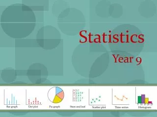
Statistical Graphs Prepared by: C.Cichanowicz, March 2011
Qualitative Data • Bar graph • Vertical or horizontal bars • Used to compare qualities • Circle Graph • Each sector represents a category • Displays percentages of a whole Prepared by: C.Cichanowicz, March 2011
Quantitative Data • Broken-line graph • Used to represent chronological data, data that changes over time. • Scatter plot • Used to see if there is a link between two aspects of a population. • Each point represents a element. Prepared by: C.Cichanowicz, March 2011
Quantitative Data • Histogram • Represents distributions of continuous data, grouped data. • Provides an overview of the distribution. • Box-and-whisker plot • Provides an overview of a distribution. • 4 groups with 25% of the data in each group. • We can see if data is symmetrical. Prepared by: C.Cichanowicz, March 2011