Download
1 / 19
190 likes | 561 Views
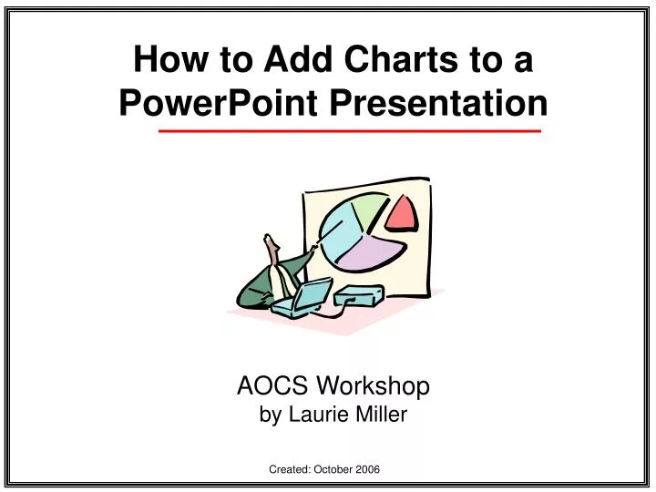
How to Add Charts to a PowerPoint Presentation AOCS Workshop by Laurie Miller Created: October 2006 First Steps Open Your PowerPoint Presentation Open PowerPoint Open your presentation file, or start a new one Adding a Chart Slide You can do this in one of two ways:

E N D
How to Add Charts to a PowerPoint Presentation AOCS Workshop by Laurie Miller Created: October 2006
First Steps • Open Your PowerPoint Presentation • Open PowerPoint • Open your presentation file, or start a new one
Adding a Chart Slide • You can do this in one of two ways: • Move your mouse to the Insert Menu, click New Slide once … a new slide will appear • Move your mouse to toolbar at the top of your PowerPoint Window and click the New Slide button once … a new slide will appear
Open the Layout Task Pane 1) Move your mouse to the Format menu and choose Slide Layout once; the Slide Layout Task Pane will open on the right side of your window
Choose the Chart Layout Move your mouse to the Taskbar on the right side of your PowerPoint Window and click the Title and Content button once … a new slide will appear
Insert a Chart 1) Move your mouse to the icon in the middle of the new slide and click on the Insert Chart icon once … the slide will now open up a: 2) Datasheet 3) Chart Preview
Datasheet & Chart Preview • Datasheet • Chart Preview
Adding Your Data – Step 1 Erase “demo” data • Move your mouse to the cell in the datasheet that has number 2 in and click your mouse once … keep the mouse button down • Drag your mouse across the datasheet to highlight all the cells from which you want the demo data removed (see above) • Once the data to be removed is highlighted, press the Delete key on your keyboard once.
Adding Your Data – Step 2 Erase “demo” data • Move your mouse to the cell in the datasheet that has East in and click your mouse once • Press the Delete key on your keyboard once.
Adding Your Data – Step 3 Add Your Data • Move your mouse to the cell in the datasheet that says 1st Qtr in it and click your mouse once • Type in your first data title for our Mason Oscar project, this will be the name of the first actor for which your group collected data.
Adding Your Data – Step 4 Keeping Adding Your Data • Move your mouse to other cells and add your data
The Formatting the Chart • Click on the part of the window that is simply the slide (not the datasheet or the preview chart) • The datasheet will close and only the chart will be visible. • Add a title in the rectangle where the slide asks you to click and add a title
The Formatting the Chart – Step 1 • Move your mouse on top of the chart and press the right mouse button once to bring up a menu • Choose Chart Object • Choose Edit
The Formatting the Chart – Step 2 • Move your mouse on top of the chart and press the right mouse button once to bring up a menu • Choose Format Walls • Pick the colors and style you want
The Formatting the Chart – Step 3 • Move your mouse on top of one of the bars in the the chart and press the right mouse button once to bring up a menu • Choose Format Walls • Pick the colors and style you want
The Formatting the Chart – Step 4 • Move your mouse on top of one of names in the axis on the lower part of the chart and press the right mouse button once to bring up a menu • Choose Format Axis… • Use the Format Axis dialog box the choose the font style you want
Advice • You can “open” a chart to edit it two ways: • Move your mouse on top of the chart, • Click your right mouse button once • Choose Chart Object • Choose Edit • Double click (with your left mouse button) the chart the chart will open and you can edit it
More Advice • There is a great deal more you can do with charts in PowerPoint! • Experiment and see what happens • Visit on-line websites with PowerPoint chart advice • http://techweb.ecisd.net/pdf/pptchart%20cwk.pdf • http://www.microsoft.com/office/previous/xp/columns/column09.asp