Download
1 / 21
210 likes | 246 Views
Explore global trade imbalances, telephone traffic patterns, foreign aid flows, migration trends, and more in visual maps showcasing economic relationships and networks worldwide.

E N D
Global Economy Maps Week 1
World trade imbalance web for the years 1960 and 2000. Directed network of merchandise trade imbalances between world countries. Each country appears as a node and the direction of the arrow follows that of the net flow of money. (Serrano et al 2007). http://rs.resalliance.org/category/tools/networks/
Map of international phone-call traffic in 2005, from Telegeography. The map shows the disproportionate centrality of the USA in international telephone traffic. http://rs.resalliance.org/category/tools/networks/
Structure of world trade of between 28 OECD countries in 1992. The size of the nodes gives the volume of flows in dollars (imports and exports) for each country . The size of the links stands for the volume of trade between any two countries. Colors give the regional respectively memberships in different trade organisations: EC countries (yellow), EFTA countries (green), USA and Canada (blue), Japan (red), East Asian Countries (pink), Oceania (Australia , New Zealand) (black). From Max Planck Institute for the Study of Societies. http://rs.resalliance.org/category/tools/networks/
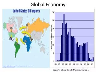
http://bigpicture.typepad.com/comments/images/2007/12/26/oil_movement.pnghttp://bigpicture.typepad.com/comments/images/2007/12/26/oil_movement.png
Northern Ireland Tourism http://www.bbc.co.uk/northernireland/schools/11_16/ks3geography/nonswf/tourism/arrivals1.shtml
http://personalpages.manchester.ac.uk/staff/m.dodge/cybergeography/atlas/census.htmlhttp://personalpages.manchester.ac.uk/staff/m.dodge/cybergeography/atlas/census.html
http://media.artdiamondblog.com/images2/RemittancesPerCountry.jpghttp://media.artdiamondblog.com/images2/RemittancesPerCountry.jpg
Flows of Foreign AidThicker lines drawn from capital to capital indicate aid flow in excess of $66 million per year. Thinner lines represent the $20 million to $66 million bracket. Smaller amounts have generally been ignored unless they represent a significant portion of the donor country’s budget (OECD November 2004). http://www.ifc.org/ifcext/50thanniversary.nsf/Content/Globes
Countries in red expected to suffer biggest trade balance losses from higher food prices; countries in blue expected to show biggest gains. http://www.imf.org/external/pubs/ft/survey/so/2008/new041008a.htm
Annual flow of benefits from forests in selected countries http://maps.grida.no/go/graphic/annual-flow-of-benefits-from-forests-in-selected-countries
Global production, prices, and undernourishment http://maps.grida.no/go/graphic/global-production-prices-and-undernourishment
Organized Crime in South Africa http://www.stratfor.com/analysis/organized_crime_south_africa
Snapshot of Global Demographic Trends http://images.google.com/imgres?imgurl=http://www.nrc-cnrc.gc.ca/images/photos/ren/graph_p_1-450.jpg&imgrefurl=http://www.nrc-cnrc.gc.ca/aboutUs/ren/nrc-foresight_10_e.html&usg=__ZA3V1HN-TOeMsQRqXfDUVPDYExI=&h=439&w=450&sz=35&hl=en&start=98&tbnid=CnFLqtEnKJS5aM:&tbnh=124&tbnw=127&prev=/images%3Fq%3Dsouth%2Bamerica%2Btrade%2Bflows%26start%3D80%26gbv%3D2%26ndsp%3D20%26hl%3Den%26sa%3DN
http://www.pophealth.wisc.edu/newsdoc/images/Wash%20Post%20maps.gifhttp://www.pophealth.wisc.edu/newsdoc/images/Wash%20Post%20maps.gif
Map of World’s Grain Trade http://tkcollier.wordpress.com/2008/05/