Download
1 / 41
410 likes | 561 Views
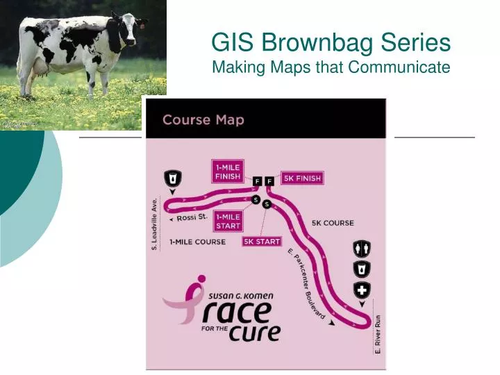
GIS Brownbag Series Making Maps that Communicate. Making Maps that Communicate. Most important question: communicate what?. Primary goal:. Share information Highlight patterns and processes Illustrate results Planning. Secondary goal:. Create an interesting and visually pleasing picture.

E N D
Making Maps that Communicate Most important question: communicate what? Primary goal: • Share information • Highlight patterns and processes • Illustrate results • Planning Secondary goal: • Create an interesting and visually pleasing picture
Making Maps that Communicate Drawbacks of maps: Maps can lie Warning: “map creator is very much the arbiter and architect of what the map portrays”
Making Maps that Communicate • Key points: • Maps convey information • Maps must be easy to use – easy to interpret • Maps must be transportable • Large number of people must be able to use those maps In this context, what are the advantages of a GIS over traditional paper maps?
A good map is a map that communicates well • A good map… • .. Looks good • .. Is simple and elegant • .. Is fit for intended purpose Which of those three is the most important?
What you map will look like is determined by.. • Purpose • Reality (e.g. shape of a country may determine the layout of the map) • Available data (Is the data in raster format? Are your rivers polygons or lines?) • Map scale (Determines how much area is covered on a map) • Audience (How much knowledge do they have? Do they want summaries?) • Conditions where the map is used (light levels of areas where map is being used) • Technical limits (paper map? Paper size? Internet browser constraints?)
Map elements • Main focus • If comparing maps, there could be two map bodies
Area of interest in more detail or • Location of Map Body in smaller scale map Map elements
Scale bar: Scale text: Map elements: scales
A good map is a map that communicates well • Key point for making a good map: • Purpose of the map • Show a location? Directions? Trend? • Every map should have only 1 purpose
Purpose • Audience Key points for making a good map: Audience • Who will read your map? Why is this important to consider? • Target the person least prepared to understand you map’s message • Include enough information so that this hypothetical person can understand the map • Is anybody in the audience color blind? About 1 out of every 20 people is colorblind.
Purpose • Audience • Size and scale Handheld maps • Handheld maps (roadmaps) • Smallest font is six points six points • Can support complex and detailed symbology
Purpose • Audience • Size and scale Tiny Maps • Keep content simple • Use simple symbols
Large Maps • Keep it simple • Simple symbology Why, given this is a large-scale map? Viewed from large distances
A good map is a map that communicates well • You want to direct your audience to your message Message: Ada county has the largest population in Idaho
A good map is a map that communicates well • Focus • Where does the map reader look first? • Position …. • Experiment: write down the first number that you see...
17 41 33 62 11 21 19 27 14 12 22 31
62 11 21 19 27 14 12 22 31 17 41 33
62 11 21 19 27 14 12 22 31 17 41 17
Better map: Use colors to get your message across How could you make this map better?
How to make a visually pleasing map… Balance: placement of the title
How to make a visually pleasing map… Tip: Place the title slightly closer to the elements on the map than the top of the page
Too much white space • Object of interest is so small that it is hard to read • Scale is in awkward numbers • Legend has too much unimportant information
Black and White Maps What do you think of the legend? • Some classes have identical coloring • Not intuitive: color for medium burn is most intense…
Very good use of patterns Round numbers for the scale
Symbology: Conventions • Rules about: • Colors (e.g. water is blue) • How certain features are abstracted • Symbols that are universally recognized Part of a 7.5-minute topo-graphic map at 1:24,000 scale produced by the USGS
Sticking with Conventions at IDWR You can find layer (.lyr) files on the X: drive that contain symbolization
ArcGIS let’s you choose from many symbols Pick a symbol that makes sense
Symbolizing points: Quantities Symbols should be intuitive Earthquakes What can you tell about this map even without the legend?
Symbolizing points: Categories Use different symbols to symbolize categories
Tips for selecting colors • Most People can only distinguish 7 classes • For 4-5 classes uses shades of the same color • People interpret darker colors as “more” or “greater” • It is easier to distinguish shades of blue or purple • Use common sense: bright green may be lush vegetation, brown is desert, bright red is hazard
Next Brown Bag Lunch: Wednesday July 15 CCleaner –presented by Glen Gardiner Interested in a specific topic for future lecture? Contact Wilma 287-4830


![Making maps, many maps! [What is GIS?]](https://cdn1.slideserve.com/3592384/making-maps-many-maps-what-is-gis-dt.jpg)