Download
1 / 3
30 likes | 45 Views
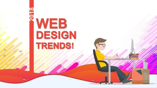
Nate Wang talks about the coming trends in webdesign for the next year.

E N D
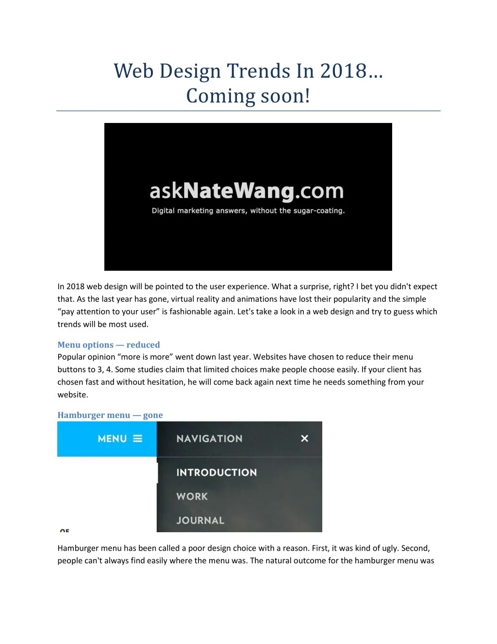
Web Design Trends In 2018… Coming soon! In 2018 web design will be pointed to the user experience. What a surprise, right? I bet you didn't expect that. As the last year has gone, virtual reality and animations have lost their popularity and the simple “pay attention to your user” is fashionable again. Let's take a look in a web design and try to guess which trends will be most used. Menu options — reduced Popular opinion “more is more” went down last year. Websites have chosen to reduce their menu buttons to 3, 4. Some studies claim that limited choices make people choose easily. If your client has chosen fast and without hesitation, he will come back again next time he needs something from your website. Hamburger menu — gone Hamburger menu has been called a poor design choice with a reason. First, it was kind of ugly. Second, people can't always find easily where the menu was. The natural outcome for the hamburger menu was
retirement. Spotify, for example, has removed it from their app menu so others will follow the example soon. Duotones trend will stay If you don't know what is this, just Google it. Websites use this technique to maximize the attention on their headings or menus and to minimize it on their imagery. It is suitable for websites that are visited by a lot of people who are focused on a clear goal and don't want distractions. As you may guess, a proper web design trend can be created after you get to know your clients and their goals. Material design Google loves it. It includes shapes and edges and colors and all good stuff from the flat design. Graphic shapes are not going to vanish soon so you should be prepared for a year full of squares and triangles. We believe these designs have a motto and it is “Simple is more”! Parallax scrolling This is one of the things that should go in 2018. This design is rather confusing than creative. A lot of people feel irritated by the scrolling and its unevenness. Unfortunately, background like this can't move properly with the scroller only and the effect is not favorable to many. In addition, loading time is higher which is a not good for a website's SEO. A motion should be meaningful Although we will see how parallax movement will be retired, we will be witnesses to the coming back of the motion but different kind of motion. Transitions should be coherent, like in Android's website. Valuable stock imagery Let's say goodbye to the old stock imagery. High-quality photos are here to stay, and we will see it like a trend in 2018. Unrepresentative imagery will drive away modern clients so every business owner should pay attention to digital opportunities. Of course, this doesn't mean that imagery will be the most important thing but it will be one of the most important.
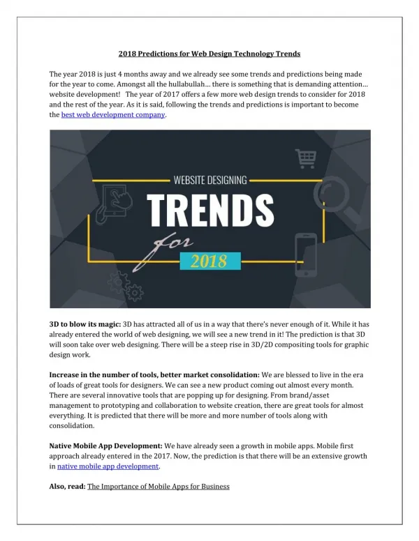
PWAs will still develop Progressive web apps use HTML5 browser technology. They will develop as long as people use their mobile devices to browse on internet — yes, it is still the beginning of this era. Offline functionality, home screen icon and push notifications are just a few of the benefits. Fonts created by Google Most things Google has created become a trend so their fonts followed the example. Google Fonts service is showing fonts easily and quickly. Font manager allows you to convert them and highlights featured ones. Minimalism Minimalism combines several elements — uncluttered UX, speed etc. As you may have expected, mobile devices are again in the center of the events. We can't rely on too much information in our responsive designs because the client will get confused. Another thing we should avoid is sticking a lot of content above the fold. Bad practice is not using enough space and contrast, too. http://www.asknatewang.com/