Download
1 / 8
0 likes | 3 Views
Running a business in Jacksonville? Your exterior sign isnu2019t just du00e9cor u2014 itu2019s a landmark. Whether you run a boutique, a cafu00e9, or a dental office, people notice your signage first. It sets expectations before they walk in the door. Thatu2019s why choosing the right outdoor business signs is crucial. You want durability, visibility, and a style that reflects your brand. Jacksonville Sign and Graphics works with businesses like yours to design signs that balance beauty with purpose. Thinking about upgrading your storefront? Get started today: https://jacksonvillesignsandgraphics.com/outdoor-signs/

E N D
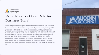
What Makes a Great Exterior Business Sign? In the competitive landscape of modern business, an exterior sign is far more than just a marker; it's a critical component of your marketing strategy. This presentation delves into the key factors that distinguish a good sign from a great one, exploring how high-impact signage not only captures attention but also directly contributes to business growth and brand recognition. We will uncover why these silent sentinels are essential for driving foot traffic, enhancing customer awareness, and setting your business apart from the competition. Join us as we outline the expert best practices for 2024-2025, providing actionable insights to ensure your exterior sign works as hard as you do.
The Role of Exterior Signs for Business Exterior signs serve as invaluable assets for any business, operating as 24/7 branding and advertising tools. Unlike traditional advertising, they provide continuous visibility, capturing the attention of passersby day and night. A well-designed sign acts as a constant beacon, significantly increasing walk-in traffic and customer awareness by making your presence known to a broader audience. Moreover, in a crowded marketplace, a distinctive exterior sign is crucial for distinguishing businesses from competitors. It communicates your unique identity, values, and offerings at a glance, helping potential customers easily locate and remember your establishment. Think of it as your silent salesperson, working tirelessly to attract and inform.
Visibility: The 5-Second Rule Swift Comprehension Concise Messaging Bold Communication The core message of your sign must be understood in under 5 seconds. In our fast-paced world, people are constantly in motion, whether driving or walking. Your sign needs to convey its purpose almost instantaneously to grab and retain attention. To ensure rapid comprehension, limit your main message to 7 words or less. This forces clarity and conciseness, cutting through any unnecessary clutter. Each word should be impactful and directly relate to what your business offers. Employ bold designs for fast, clear communication. This includes large, distinct lettering, strong color contrasts, and uncluttered layouts. A sign's boldness is not just about size, but about its ability to convey information effectively at a glance. The "5-Second Rule" is paramount in signage design, emphasizing that your message must be absorbed and understood almost instantly by a moving audience. This principle dictates that simplicity and directness are key.
Readability and Contrast High-Contrast Colors The foundation of a readable sign lies in its color scheme. Always use high-contrast colors, such as classic black on white or dark blue on light gray. This ensures maximum visibility from a distance, making your message pop against its background, even in varying light conditions. Bold, Simple Fonts Font choice is critical for distance readability. Opt for bold, simple fonts that are easy to distinguish at a glance. Avoid ornate or overly thin typefaces that can blur or become indecipherable from afar. Sans-serif fonts are often preferred for their clean lines. Optimal Letter Height A crucial guideline for legibility is ensuring at least 1-inch letter height per 10 feet of viewing distance. For example, if your sign is primarily viewed from 100 feet away, letters should be a minimum of 10 inches tall. This formula guarantees that your message remains clear and legible to its target audience. Achieving optimal readability for your exterior sign is paramount, as it directly impacts how effectively your message is received. This hinges on strategic choices in color and typography.
Compelling Graphic Elements Beyond text, the judicious inclusion of compelling graphic elements can dramatically enhance your sign's impact and memorability. These visual cues serve as powerful shortcuts for communication. Recognizable Icons Use easy-to-recognize icons or images that instantly convey your business's core offering. A coffee cup for a cafe, a gear for a repair shop, or a house for real estate – these visual shorthands are universally understood and transcend language barriers. Adding Context Visually Graphics should add context without increasing word count. They complement the text, providing visual reinforcement and making the message more engaging. A picture, indeed, can be worth a thousand words, especially on a sign. Mnemonic Devices Consider incorporating mnemonic devices like rhyme, repetition, or alliteration into your text elements, where appropriate. While less about graphics, these linguistic tools can make your brand name or slogan catchier and more memorable when combined with strong visuals.
Brand Consistency Matters Distinct Identity Reinforce Personality Build Trust Ensure your exterior sign incorporates your distinct logo, colors, and identity. This means using the exact shades from your brand guide, the official logo design, and consistent typography that aligns with your overall brand aesthetic. A consistent sign reinforces your business personality at a glance. Whether your brand is playful, serious, elegant, or modern, the sign should visually communicate these traits, creating an immediate emotional connection with potential customers. Ultimately, brand consistency builds brand trust and recognition. When customers see a consistent visual identity across all touchpoints—from your website to your social media, and especially your physical sign—it fosters a sense of reliability and professionalism, making them more likely to engage with your business. One of the most critical aspects of an effective exterior business sign is its seamless integration with your overall brand identity. Consistency is not merely about aesthetics; it's a powerful tool for building trust and recognition.
Materials and Durability Investing in Longevity The choice of materials for your exterior sign is paramount, directly impacting its longevity, appearance, and the protection of your investment. Outdoor signs face constant exposure to the elements, demanding robust and weather-resistant solutions. Weather-Resistant Materials Prioritize weather-resistant materials such as high-grade acrylic, durable aluminum, and industrial-strength vinyl. These materials are designed to withstand UV radiation, extreme temperatures, moisture, and wind without fading, cracking, or deteriorating over time. Outdoor-Rated Lighting If your sign is illuminated, ensure LEDs and lighting components are outdoor-rated. This means they are sealed against moisture and dust, and designed to operate reliably in varying outdoor conditions. High-quality LED lighting not only enhances visibility but also offers energy efficiency and a longer lifespan. Protecting Your Investment Investing in superior materials protects your investment and maintains the sign's appearance over many years. A sign that fades or degrades quickly will reflect poorly on your business, whereas a well-maintained, durable sign projects professionalism and stability.
Connect With Us! Services • Indoor Signs • Outdoor Signs • Vehicle Wraps • Custom Signs • Sign Installation Contact Us • Address: 9556 Historic Kings Road South Unit 312 Jacksonville, FL 32257 • Phone: 904-644-1844 • E-mail: sales@jacksonvillesignsandgraphics.com Follow us on