Delightful Treats: A Cupcake Haven in South Kensington
Discover the world-class cupcakes and baked goods at a renowned bakery in London, with a chic design and delectable treats loved by celebrities and young adults. Explore the simple yet sophisticated theme that makes this bakery a sweet success.

Delightful Treats: A Cupcake Haven in South Kensington
E N D
Presentation Transcript
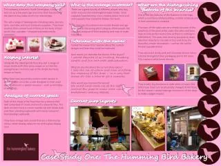
Who is the average customer? What does the company sell? What are the distinguishing features of the business? There are a great variety of different people who buy, order and use the Hummingbird recipe books. Since cupcakes have become a fun, creative piece more and more people have started to follow the trend. The majority of customers are mostly female and age wise land in the young adult category. Most people like cupcakes because of their simplicity and easy to make individual. The company is based in South Kensington, London. It was set up a few years ago and since then has become the place to buy cakes and to try new recipes. The sell a range of baked goods including cakes, biscuits, tarts, crumbles and most famously cupcakes. They have reached their current level of fame on the back of their world class cupcakes – enjoyed and endorsed by celebrities. One of the key features of the business is their logo which is used around the building, on their products and in their promotional material. The cases of the cakes are very simple, because of the simplicity of the plain white cases the cakes and buns have to look perfect every time as there is nothing to hide behind. The cases also serve to purpose to draw attention directly to the cake or bun and show the beautiful, simple decorations – such as the vanilla frosted cupcake below. They also use a dusky pink and chocolate brown colour scheme throughout their packaging and in the store. This creates a solid brand identity. Interview with the owner: I asked the owner their opinion about the current designs and how they could be improved. How would you describe the theme of the layout? I would describe it as inviting, tempting, simple and fun but with sophistication. What do you like about the current shop layout? I like the use of colour and how it reflects the meaning of the shop – in a way that shows it’s like a treat to get a cupcake. How would you improve the layout? We could have more use of the logo around the shop or make more use of traditional looking objects. Keeping interest: Alongside the baked goods they also sell a range of recipe books with their prize recipes in so that the average buyer can have a go at the simple but tasty recipes at home. They have now launched a custom order service in which people can order a cake designed to their exact specifications for a special occasion – such as birthdays or weddings. They usually buy locations in older parts of town, this limits how much can be physically changed at the front, for this reason I would redesign the interior of the shop to make a bigger impact. Analysis of current space: Current shop layouts: Each of the shops in the franchise has a mosaic tiled wall comprised of cream and mocha coloured tiles. The desk counters have a cream marble top with dusky dark pink floor standing cupboards with cream coloured freestanding cupboards. They have vintage cake stands that are a dark bronze colour, which display cakes on top of the glass display case. Case Study One: The Humming Bird Bakery
What is the company? What is the company? Current ride entrances: The company Alton Towers is a theme park based in the town of Alton in Staffordshire. They are known for creating worlds first rollercoasters pushing the boundaries of modern roller coaster designs and is seen as one of the best theme parks in the world rivalling even the American big parks. They make their money through the sales of park tickets, hotel stays, food and drink through out the park, souvenirs and mini games through out the park. Nearly every year the park has a new ride that will interest and bring in new customers. This gives me the opportunity to design a ride entrance. The company Alton Towers is a theme park based in the town of Alton in Staffordshire. They are known for creating worlds first rollercoasters pushing the boundaries of modern roller coaster designs and is seen as one of the best theme parks in the world rivalling even the American big parks. They make their money through the sales of park tickets, hotel stays, food and drink through out the park, souvenirs and mini games through out the park. Nearly every year the park has a new ride that will interest and bring in new customers. This gives me the opportunity to design a ride entrance. Current ride entrance analysis: They have built up the scene by using features of the ride right at the start – such as the cloaked figures and the zombie coffin. Duel is meant to be more light hearted and as such the zombie pops out of the coffin with smoke and one of the duel guns. Th13teen is meant to be creepier and as such has no gimmicks but as you walk around a child sings children's songs and starts to count to thirteen as low, threatening music starts to get louder and clearer, finally when she gets to thirteen a loud scream echoes through the forest queue path and the lights flicker. In duel you begin to walk through the house and see all sorts of “possessed” items – including a self rocking horse. Interview with the owner I had the opportunity to talk directly to the owner of the park to get some information on the new rides. What is your favourite ride theming in the park? So far my favourite is the theming around the Dark Forest. There are clear links and hints to the meaning of the rides, as soon as you enter that section people have a sense of what to expect but they still want to know more. What in particular theming objects make it so good? The abandoned buildings at little clues around the area – attention to detail – like the VW that has been taken into the “swamp” and covered in vines. What would you like to see more of? I’d like to see more bold theming, clear story lines and features that get the interest of the user from the start. What kind of themes are more appreciated at Alton Towers? I think the darker edge seems to work best with the customers – this more so because we also have a free plot in between Gloomy Woods and Dark Forest which would be perfect for another dark themed ride. Who is the target market? What are the key features? The target market for the entire park is quite broad – with areas for younger children with gentle rides and some areas (X-Sector) aimed at older thrill seekers. The new ride to be built is a high speed, big thrill ride aimed at late teens, young adults and adults. Therefore it would need to be considered about how to put off younger audiences. A recurring theme in the park is the colour purple and the story of the park – that the land owner of Alton was visited by a witch seeking shelter – he refused and so she laid a curse on the tree and said whenever a branch falls a member of his family would die – this prophecy appeared to be true and so he chained up the tree so no other branches could fall. While excavating to build the park a chain bound tree was found in the foundations.
Who is the target market? The River Island Target market is aimed at young adults and teenagers. They are fashion conscious and influenced by current trends. The market for River island has been predominantly female but over the last 5 years and the introduction of a male section the store now has a growing number of male customers. River Island is seen as a higher spend high street shop – along side brands such as Zara and Top Shop, they have a minimalist approach to design and store layout which further reinforces and justifies the higher price tag and quality of the clothes compared to other high street competitors. Current Shop Layout What does the company do? The company sells it’s own brand of fashion, this includes; dresses, tops, skirts, trousers, shirts, shorts and occasionally suits. They also sell their own fashion accessories – mostly costume jewellery, including; watches, necklaces, bracelets, earrings, sun glasses, reading glasses, bags, belts, purses and scarves. Recently they have launched River Island Kids – which sells clothes for babies up to young children (12-13 age). They also sell a range of footwear. They have recently started to bring in new concessions – the most recent is Chelsea Girl which is themed on London vintage designs and has now spread to all stores after it’s success in some of the London based stores. To compete with online shops they have also now partnered with ASOS.com and sell some of their stock through that website. INTERVIEW WITH OWNER I had an opportunity to interview the owner of the London store and ask her opinions on her store layout. Which parts of the layout do you like? I like the contrast of colours – shiny steel, matt and shiny black and white. What areas could be improved? We don’t really have good display facilities for new outfits – most of the floor space is taken by stock. It would be nice to display whole outfits rather than just show it as stock or leave it to the window display. How functional are the till points? At the moment we don’t make enough of them – we have a few things stored there like last minute items that people might just pick up but they could be a lot more interesting and inviting. Key features The layout of the shop varies on the current trends. They use high contrast features such as black and white and make use of their simplified logo in a lot of their clothes. A lot of the carrier bags continue the contrast theme by using bold, vibrant colours against black serif fonts, this makes the logo easily recognisable to the other shoppers where that bag is from. River island tend to follow trends and as such the key features vary from year to year – such as the use of different materials – including leather or silk. Analysis of Layout The shops all feature the contrasting logo – against a black background or darkened glass. The frontages are mostly glass with some bright decorations on the inside. This links with what the owner of the London branch told me – most of the display is on the front of the shop. However is this being used to good enough effect – do people just see the sign and walk in not looking at the clothes on display? Inside a few of the stores there is further contrast theming – the shiny black pillars are then contrasted with feature walls coloured in a nearly neon pink and lime green. The lighting and hanging systems are all very simple.