Download
1 / 29
290 likes | 437 Views
Descriptive Statistics. What a Data Set Tells Us. Organizing and Visualizing Data. 14.1. Understand the difference between a sample and a population. Organize data in a frequency table. Organizing and Visualizing Data. 14.1. Use a variety of methods to represent data visually.

E N D
Descriptive Statistics What a Data Set Tells Us
Organizing and Visualizing Data 14.1 • Understand the difference between a sample and a population. • Organize data in a frequency table.
Organizing and Visualizing Data 14.1 • Use a variety of methods to represent data visually. • Use stem-and-leaf displays to compare data.
Populations and Samples Statistics is an area of mathematics in which we are interested in gathering, organizing, analyzing, and making predictions from numerical information called data. The set of all items under consideration is called the population. Often only a sample or subset of the population is considered. We will describe a sample as biasedif it does not accurately reflect the population as a whole with regard to the data that we are gathering.
Populations and Samples • Bias could occur because of the way in which we decide how to choose the people to participate in the survey. This is called selection bias. • Another issue that can affect the reliability of a survey is the way we ask the questions, which is called leading-question bias.
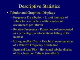
Frequency Tables We show the percent of the time that each item occurs in a frequency distribution using a relative frequency distribution. We often present a frequency distribution as a frequency table where we list the values in one column and the frequencies of the values in another column.
Frequency Tables • Example: 25 viewers evaluated the latest episode of CSI. The possible evaluations are • (E)xcellent, (A)bove average, a(V)erage, (B)elow average, (P)oor. • After the show, the 25 evaluations were as follows: • A, V, V, B, P, E, A, E, V, V, A, E, P, B, V, V, A, A, A, E, B, V, A, B, V • Construct a frequency table and a relative frequency table for this list of evaluations. (continued on next slide)
Frequency Tables • Solution: We organize the data in the frequency table shown below. (continued on next slide)
Frequency Tables We construct a relative frequency distribution for these data by dividing each frequency in the table by 25. For example, the relative frequency of E is .
Frequency Tables • Example: Suppose 40 health care workers take an AIDS awareness test and earn the following scores: • 79, 62, 87, 84, 53, 76, 67, 73, 82, 68, • 82, 79, 61, 51, 66, 77, 78, 66, 86, 70, • 76, 64, 87, 82, 61, 59, 77, 88, 80, 58, • 56, 64, 83, 71, 74, 79, 67, 79, 84, 68 • Construct a frequency table and a relative frequency table for these data. (continued on next slide)
Frequency Tables • Solution: Because there are so many different scores in this list, the data is grouped in ranges. (continued on next slide)
Frequency Tables We divide each count in the frequency column by 40. For example, in the row labeled 55–59, we divide 3 by 40 to get 0.075 in the third column.
Representing Data Visually A bar graphis one way to visualize a frequency distribution. In drawing a bar graph, we specify the classes on the horizontal axis and the frequencies on the vertical axis. If we are graphing a relative frequency distribution, then the heights of the bars correspond to the size of the relative frequencies. Graphing the relative frequencies, rather than the actual values in data sets, allows us to compare the distributions.
Representing Data Visually • Example: Draw a bar graph of the frequency distribution of viewers’ responses to an episode of CSI. (continued on next slide)
Representing Data Visually • Solution: The bar graph is shown below.
Representing Data Visually • Example: Draw a bar graph of the relative frequency distribution of viewers’ responses to an episode of CSI. (continued on next slide)
Representing Data Visually • Solution: The bar graph for the relative frequency is shown below.
Representing Data Visually A variable quantity that cannot take on arbitrary values is called discrete. Other quantities, called continuousvariables, can take on arbitrary values. The number of children in a family is an example of a discrete variable. Weight is an example of a continuous variable. We use a special type of bar graph called a histogramto graph a frequency distribution when we are dealing with a continuous variable quantity or a variable quantity that is discrete, but has a very large number of different possible values.
Representing Data Visually • Example: A clinic has the following data regarding the weight lost by its clients over the past 6 months. Draw a histogram for the relative frequency distribution for these data. (continued on next slide)
Representing Data Visually • Solution: We first find the relative frequency distribution. (continued on next slide)
Representing Data Visually Draw the histogram exactly like a bar graph except that we do not allow spaces between the bars.
Representing Data Visually • Example: The bar graph shows the number of Atlantic hurricanes over a period of years. Answer the questions on the slides that follow. (continued on next slide)
Representing Data Visually a) • What was the smallest number of hurricanes in a year during this period? What was the largest? • Solution: The smallest number of hurricanes in any year during this time period was 4. The largest number was 19. (continued on next slide)
Representing Data Visually b) • What number of hurricanes per year occurred most frequently? • Solution: We look for the tallest bar, which appears over the number 11. Therefore, 11 hurricanes occurred in 10 different years. (continued on next slide)
Representing Data Visually c) • How many years were the hurricanes counted? • Solution: • We add the heights of all of the bars to get • 1 + 1 + 6 + 6 + 9 + 4 + 6 + 10 + 5 + 5 + 3 + 1 + 1 = 58 years. (continued on next slide)
Representing Data Visually In what percentage of the years were there more than 10 hurricanes? d) • Solution: We count the number of years in which there were more than 10 hurricanes and add the heights of the bars above these values: 10 + 5 + 5 + 3 + 1 + 1 = 25. There are 58 years of data, so .
Stem and Leaf Display • Example: The following are the number of home runs hit by the home run champions in the National League for the years 1975 to 1989 and for 1993 to 2007. • 1975–1989: 38, 38, 52, 40, 48, 48, 31, 37, 40, 36, 37, 37, 49, 39, 47 • 1993–2007: 46, 43, 40, 47, 49, 70, 65, 50, 73, 49, 47, 48, 51, 58, 50 • Compare these home run records using a stem-and-leaf display. (continued on next slide)
Stem and Leaf Display • Solution: In constructing a stem-and- leaf display, we view each number as having two parts. The left digit is considered the stem and the right digit the leaf. For example, 38 has a stem of 3 and a leaf of 8. 1975 to 1989 1993 to 2007 (continued on next slide)
Stem and Leaf Display We can compare these data by placing these two displays side by side as shown below. Some call this display a back-to-back stem-and-leaf display. It is clear that the home run champions hit significantly more home runs from 1993 to 2007 than from 1975 to 1989.