Download
1 / 3
0 likes | 22 Views
Learn the essential techniques to optimize your Squarespace website for mobile devices and understand why it's crucial for your online success. In our guide, we'll walk you through practical steps to ensure your site looks and functions seamlessly on smartphones and tablets. Don't miss out on a significant portion of your audience u2013 make your Squarespace site mobile-friendly and enhance user experience today.<br>

E N D
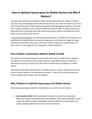
How to Optimize Squarespace for Mobile Devices and Why It Matters? Everyone values their time very highly in today’s fast-paced environment. Without a doubt, if you stay on top of technology and consider the ease of your users, they will enjoy it. Do you not have the impression that mobile devices are gradually replacing desktop computers in our daily lives? Indeed, smartphone users account for 69% of all Internet traffic. It makes perfect sense, given that we can accomplish many tasks while moving about, thanks to portable devices with nearly universal access to the Internet. In Squarespace development, each and every Squarespace site is created from the ground up to look fantastic on mobile devices. Narrow letter spacing, a lot of material on a page, and large media files can all affect how quickly a site loads and how it appears on mobile devices. This post outlines our top suggestions for keeping your website responsive. How to Make a Squarespace Website Mobile Friendly Any website built with Squarespace is automatically optimized for mobile viewing. However, any additions to the website, such as large media files, many different types of material, or altered letter spacing, can cause issues with how the website loads and appears on mobile devices. Most Squarespace layouts offer material on mobile devices in a unique, stacked structure that makes it easy for people to scroll through your content. Visitors to your site must pinch and zoom to navigate when mobile styles are disabled. Why It Matters to Optimize Squarespace for Mobile Devices Optimizing a Squarespace website for mobile devices is crucial for several reasons: User Experience (UX): Mobile optimization enhances the overall user experience. Mobile users expect fast loading times, easy navigation, and content that adapts to their screen size. Without mobile compatibility, users may abandon your Squarespace site quickly, leading to higher bounce rates and wasted chances.
Mobile Traffic Growth: Today, more people are using mobile devices to browse the internet. Many people access websites exclusively on their smartphones or tablets. Failing to cater to this growing audience can limit your site’s reach and impact. SEO Benefits: Search engines like Google prioritize mobile-friendly websites in their search results. If your Squarespace site is optimized for mobile, it may receive higher rankings in mobile search results, reducing its visibility and organic traffic. Lower Bounce Rates: A well-optimized mobile site is more likely to engage visitors and keep them on your pages. Mobile users are less patient with slow-loading or poorly designed sites, so optimizing for mobile can lower bounce rates and improve your site’s conversion rates. Improved Conversions: When your Squarespace site functions smoothly on mobile devices, it becomes easier for visitors to take desired actions. This can result in higher conversion rates. Competitive Advantage: Many competitors are already optimizing their websites for mobile users. You must do so to put your business at a disadvantage and make it less competitive in your industry or niche. Cross-Device Consistency: Ensuring your site looks and functions consistently across devices, including desktops, tablets, and smartphones, reinforces your brand image and professionalism. It also makes it easier for users to switch between devices while interacting with your content. Social Sharing: Mobile users are likelier to share content on social media platforms. If your Squarespace site needs to be mobile-optimized, it may miss out on valuable social sharing opportunities, which can help increase your site’s visibility and reach a broader audience. Accessibility: Mobile optimization can also improve the accessibility of your website. By making your content responsive and adaptable to various screen sizes and input methods, you ensure that people with disabilities can access and navigate your site effectively. Future-Proofing: As mobile technology continues to evolve, ensuring your Squarespace site is mobile-friendly now will help future-proof your online presence. For long-term success, it is imperative to adjust to the emergence of new devices and screen sizes.
In summary, optimizing your Squarespace website for mobile devices is not just a matter of convenience; it’s a strategic decision that impacts user satisfaction, SEO rankings, conversions, and your overall online presence. It’s essential to keep up with the mobile-first approach to web design and ensure your site is accessible and engaging for users on all devices. Read Full blog: https://hgsinfotech.com/how-to-optimize-squarespace-for-mobile-devices- and-why-it-matters/


