Pictures
Pictures . Broken down . Typography in this image is used to change the mood of the picture to make it seem funny . It suggests your in the wrong place with an example . The use of colour is effective because its all black and white apart from where you attention is supposed to be focused .

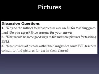
Pictures
E N D
Presentation Transcript
Pictures Broken down
Typography in this image is used to change the mood of the picture to make it seem funny It suggests your in the wrong place with an example The use of colour is effective because its all black and white apart from where you attention is supposed to be focused The quality of the image is of a good standard The picture is very appropriate for its primary use which was a background for an un-used website
This image could possibly be made to be an advertising banner for the show “Wilfred” The target audience could be anyone who has seen the show or anyone who can link this image to the program The quality of the image isn't great however its of a good shape so that it can be used as a banner. The light is effective as all parts of the image are viable/not blurred or hidden in shadows. The camera angle is good as it is capturing a motion image.
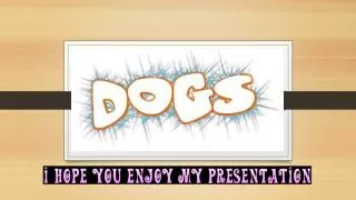
This image has no purpose and is mainly made for “a laugh” The context is casual. The creator probably wanted to express his love of the game Minecraft as is displayed by the use of the “creepers” in the background The target audience is people who play Minecraft The quality of the image is okay The picture isn't offensive in any way The use of colour is effective however the green is quite overpowering to the rest of the image. The lighting isn't great, the whole image is easy to see however the cat is reflecting quite a lot of light at the camera