Revitalizing Royal Holloway’s Visual Identity: A Strategic Overview
360 likes | 480 Views
This presentation offers an animated review of Royal Holloway's visual identity through the lens of the Communications and External Relations team. Aimed at students, staff, and alumni, it discusses the need for a modernized identity that aligns with our strategic goals. You'll learn about our current visual identity issues, feedback from stakeholders, and our aspirations to enhance our reputation and recognition. The presentation concludes with an invitation for you to share your views on proposed changes, contributing to a clearer, more effective identity for the College.

Revitalizing Royal Holloway’s Visual Identity: A Strategic Overview
E N D
Presentation Transcript
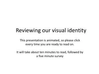
Reviewing our visual identity This presentation is animated, so please click every time you are ready to read on. It will take about ten minutes to read, followed by a five minute survey
What’s the project about? This is a presentation for students, staff and alumni of Royal Holloway, by the Communications and External Relations team, to tell you about our work to review the College’s visual identity, and show you our proposals for change. Once you’ve watched the presentation, you’ll be invited to give your views on the proposals. Thank you for taking part.
Why are we reviewing our identity? Our mandate is provided by the new College Strategy: • To build our identity • Increase our impact and influence • Grow a little to 10,500 students • And become a top 20 university …by 2020 It’s important because we think our current identity and reputation are holding us back…
How do we know that? According to the Times World Higher Education rankings, we’re 15th in the UK, and well above the median compared to our competitors. However…
Our reputation is not keeping pace • According to a national survey of 13,000 undergraduates last year, Royal Holloway scores lower than our competitors on perceptions of: • Being seen as a prestigious place to go • Strong in league tables • Reputation of course/department/lecturer • Traditional and solid reputation • Research reputation • We investigated this further with a perception audit of 2700 of our stakeholders last year, including students, alumni and staff….
You told us that: We have an unclear and weak identity even though our research and teaching are generally well regarded “It is an amazing university with great results, campus, and research by top professionals in their field. I just don't think enough people know about it” (Alumnus) (Even though Thomas Holloway was once said to be more famous than Napoleon!)
Plus, you told us that: • The relationship with University of London is in question; we are seen to hide behind it, and it is a diminishing brand “It is important that we have the University of London behind us but College hides behind the University of London name”. Member of staff (Although we do recognise how important our association is, especially overseas, we need to have a reputation of our own, not just by association)
And finally, you told us that: • We are confused about our location; is it vibrant and exciting London, or safe, quiet and leafy Egham? • “People who chose RHUL as a London based college will be disappointed. Needs to target better the attributes it has. Suffers from mixed messages on location” • (Alumnus) We think the dependence on University of London in the name might confuse people; and we know that we need to be clearer about where we actually are in our materials.
Fixing the problem • All sorts of things have an impact on our reputation: • Appearances in the media (we’ve doubled our media hits in the past year) • Where we are in the league tables, which includes student satisfaction levels, and employment rates (we’re working hard on improving these too) • And whether people have heard of us, and know who we are when they hear our name. We need a visual identity that is clear and memorable, and this is the focus of our project
What is a visual identity? It’s more than just a logo
Here’s our current identity system; there are a few problems we need to fix
The system is too restrictive and inflexible to work for different audiences • It looks a bit dated and cheesy • The serif font is hard to read in small sizes and online • The blue is harsh and hard to work with • The block format doesn’t leave much space And because it doesn’t work, it is not universally applied, making our brand landscape look like this..
Some variation is good, but this much is just confusing, and doesn’t help to promote Royal Holloway consistently, so that people remember who we are
Online, our logo is almost impossible to see, as this advert shows
And because our name is rather complicated, the media struggle with it
So we want to introduce a new system • Our name, who and what we are, should be clearer • It should build on our existing brand and heritage • It should be flexible, and work for different departments and different audiences • It should look contemporary, but fitting for an institution of our standing • It should fit in with our competitors, so we are recognisably a top tier university, but it should stand out too, so that we are distinctly Royal Holloway
So, over the past months • We’ve set up a project board, with academics, staff and students • We’ve appointed an external agency – The Team • We’ve built on last year’s extensive research • We’ve developed ideas, and tested them with staff and students • And now, we’ve identified a possible way ahead • We’d like to know what you think of it, and the options you prefer; it’s not complete, it’s work in progress
This is the combined crest of our two Colleges As well as our rich history as two merged Colleges of the University of London
(This is the tower from our existing logo, which we’d update and redraw if thiswere the chosen route) Or our beautiful Founder’s building which is an integral part of the current logo
Not final logos, these are just examples. The system is adaptable, so that different departmentscan create their own identity within the Royal Holloway brand, either using abstract patterns taken from around College… The system is adaptable, so that different departmentscan create their own identity within the Royal Holloway Brand
Not final logos, these are just examples. Or a pattern or image of their own, relating to their subject area
And there’s a stronger emphasis on the fact that we’re a university, whilst retaining the important link to the University of London
We think this new identity will help us build our reputation • Our name, and the fact we are a university, is much clearer • The system is flexible and easy for departments to use • The obvious shorthand for the media is ‘Royal Holloway University’, which is better for us than University of London (although we can’t completely solve this problem without changing the name, which isn’t an option) • We look strong amongst our competitors • It’s contemporary, but our heritage is there
Remember, our visual identity is just part of the solution, and lots of other changes are also underway. What do you think?
Click here to transfer to the survey https://www.research.net/s/Alumniidentitysurvey