Download
1 / 11
110 likes | 191 Views
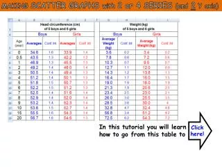
Learn to create scatter graphs with 2 or 4 series and dual Y axes from pre-calculated data. Compare body weight and head circumference changes from birth to adulthood for boys and girls. No need for original data calculations. Includes a dataset from 11 mothers. Assumes basic Excel knowledge for graph creation.

E N D
MAKING SCATTER GRAPHS with 2 or 4 SERIES (and 2 Y axis) Click here! In this tutorial you will learn how to go from this table to
MAKING SCATTER GRAPHS with 2 or 4 SERIES (and 2 Y axis) 1st Y axis 2nd Y axis THAT 4 series -> Average Head circumference of Girls -> Average Head circumference of Boys -> Average Body weight of Girls -> Average Body weight of Boys 2 series -> Average Head circumference of Girls -> Average Head circumference of Boys
11 competitive and very weird mothers of only children measured the body weight and head circumference of their kid from conception to their 20th birthday. They heard about your study and send you the averages and confidence intervals of the data they collected over the years. Plotting their data on a XY (or scatter) graph will allow you to compare the change in body weight and head circumference of boys and girls from birth to adulthood. We do not have to calculate the averages or the confidence intervals from the original data, it has been done for us!
11 competitive and very weird mothers of only children measured the body weight and head circumference of their kid from conception to their 20th birthday. They heard about your study and send you the averages and confidence intervals of the data they collected over the years. Plotting their data on a XY (or scatter) graph will allow you to compare the change in body weight and head circumference of boys and girls from birth to adulthood.
DATASET sent by the 11 mothers We do not have to calculate the averages or the confidence intervals from the original data, it has been done for us!
We will Make XY (scatter) graphs with 2 and 4 series Include a secondary Y axis I will assume that you possess a basic knowledge of Excel (see Tutorials 1,2,3,4,5&6); To learn how to calculate means & Confidence intervals, please go to Excel 2 (or 3&4).
The head circumference of males is not significantly higher than that of females of the same age.


![[4.3] Reflecting Graphs, & Symmetry](https://cdn2.slideserve.com/4738068/4-3-reflecting-graphs-symmetry-dt.jpg)