Download
1 / 40
400 likes | 473 Views
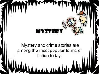
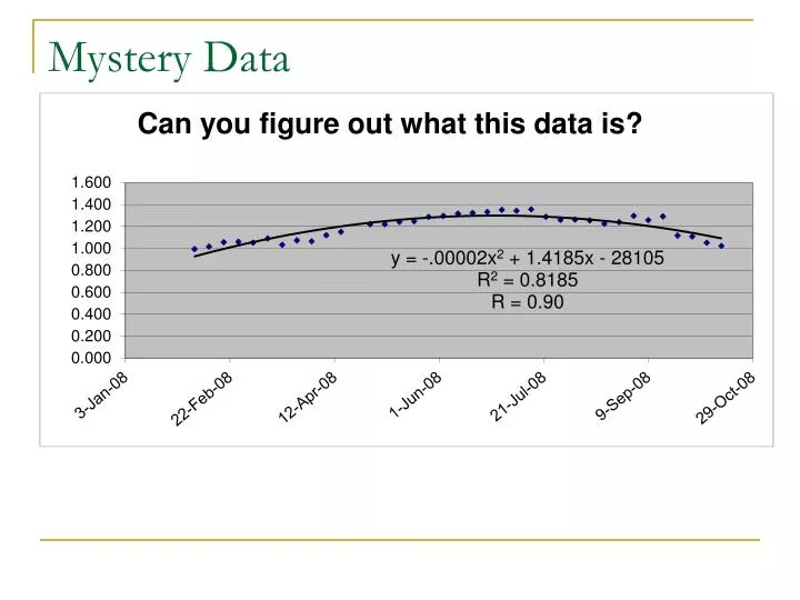
Mystery Data. 1.1 example. these are prices for Internet service packages find the mean, median and mode determine what type of data this is create a suitable frequency table, stem and leaf plot and graph 13.60 15.60 17.20 16.00 17.50 18.60 18.70

E N D
1.1 example these are prices for Internet service packages find the mean, median and mode determine what type of data this is create a suitable frequency table, stem and leaf plot and graph 13.60 15.60 17.20 16.00 17.50 18.60 18.70 12.20 18.60 15.70 15.30 13.00 16.40 14.30 18.10 18.60 17.60 18.40 19.30 15.60 17.10 18.30 15.20 15.70 17.20 18.10 18.40 12.00 16.40 15.60
Answers to yesterday’s problem Mean = 494.30/30 = 16.50 Median = average of 15th and 16th numbers Median = (16.40 + 17.10)/2 = 16.75 Mode = 15.60 and 18.60 bimodal What type of data? numerical, so at least Interval data. It has an absolute starting point, so it is ratio data Given this, a histogram is appropriate
Histogram • How many class intervals? • What does the height of each bar mean? • What does the histogram tell us about the data?
Trends in Data Chapter 1.3 – Visualizing Trends Mathematics of Data Management (Nelson) MDM 4U
Variables • Variable (Mathematics) • a symbol denoting a quantity or symbolic representation • an unknown quantity • Variable (Statistics) • A measurable attribute; these typically vary over time or between individuals • Can be Discrete or Continous or neither • Temperature is a continuous variable • Number of siblings is a discrete variable
The Two Types of Variables • Independent Variable • values are arbitrarily chosen • horizontal axis • time is usually independent (why?) • Counter-example: time to do the wave vs. size of group • Dependent Variable • values depend on the independent variable • vertical axis • Syntax: A graph of arm span vs. height means arm span is the dependent variable and height is independent
Scatter Plots • a graphical method of showing two variables • each axis represents a variable • each point indicates a pair of values (x, y) • may show a trend
What is a trend? • a pattern of average behavior that occurs over time • e.g., costs tend to increase over time • need two variables to exhibit a trend (time can be one)
An Example of a trend • U.S. population from 1780 to 1960 • Describe the trend
Line of Best Fit • A line that represents the trend in the data • Can be used tomake predictions • Can be drawn by hand or calculated (median-median and least squares) • Gives no indication of the strength of the trend (use the r or r2 value §1.4)
An example of the line of best fit • this is temperature data from New York over time, with a median-median line added • what type of trend are we looking at?
Creating a Median-Median Line • Divide the points into 3 symmetric groups • If there is 1 extra point, include it in the middle group • If there are 2 extra points, include one in each end group • Calculate the median x- and y-coordinates for each group and plot the median point (x, y) • If the median points are on a straight line, connect them • Otherwise, line up the two outer points, move 1/3 of the way to the middle point and draw a line of best fit
Creating a Median-Median Line Using Technology • Click on the wikispace • Right-click the file armspan_v_height_4_ med-med.ftm and save to your M:\ or USB drive • Open the file • Create a scatter plot for each set of data • Right-click and select Median-Median Line
MSIP / Homework • Complete p. 37 #2, 3, 6, 8
Trends in Data Using Technology Chapter 1.4 – Trends in Technology Mathematics of Data Management (Nelson) MDM 4U
Categories of Correlation • A scatter plot can show a correlation that is positive or negative and strong or weak • There can also be no correlation between two variables • Look at the Correlation Picture and Regression Line examples on this website to help you understand: http://www.seeingstatistics.com/seeing1999/gallery/CorrelationPicture.html http://www.seeingstatistics.com/seeing1999/gallery/CorrelationPicture.html
Regression • a process of fitting a line or curve to a set of data • if a line is used, it is linear regression • if a curve is used, it may be quadratic regression, cubic regression, etc. • Why do we do this? • What can we do with the resulting function?
Correlation Coefficient • The correlation coefficient, r, is an indicator of the strength and direction of a linear relationship • r = 0 no relationship • r = 1 perfect positive correlation • r = -1 perfect negative correlation • r2 is the coefficient of determination • Takes on values from 0 to 1 • if r2 = 0.42, that means that 42% of the variation in y is due to x
Residuals • a residual is the vertical distance between a point and the line of best fit • if the model you are considering is a good fit, the residuals should be small and have no noticeable pattern • The least-squares line minimizes the sum of the squares of the residuals http://www.math.csusb.edu/faculty/stanton/m262/regress/
MSIP / Homework • Fathom activity • NHL Team Data http://www.nhl.com/ice/playerstats.htm • TEAM: Pick your favourite • Click SEARCH> • Click BIOS • Click # to sort (if desired) • Copy URL • FileImportImport From URL • Complete p. 51 #1-6, 7 bcd, 8
Linear RegressionWeight vs. Height (NHL) • w = 7.23h – 325
Using the equation • How much does a player who is 203cm tall weigh? • 203 cm ÷ 2.54 = 71” • w = 7.23(741 – 325) • = 188.33 lbs • How tall is a player who weighs 180 lbs? • w = 7.23h – 325 h = (w+325)÷7.23 • So h = (180+325)÷7.23 = 69.85” or 177.4cm
References • Wikipedia (2004). Online Encyclopedia. Retrieved September 1, 2004 from http://en.wikipedia.org/wiki/Main_Page
1.5 Comparing Apples to Oranges • http://www.smarter.org/research/apples-to-oranges/
The Power of Data Chapter 1.5 – The Media Mathematics of Data Management (Nelson) MDM 4U There are 3 kinds of lies: lies, damn lies and statistics.
Example 1 – Changing the scale on the axis • Why is the following graph misleading?
Example 1 – Scale from 0 • Consider that this is a bar graph – could it still be misleading?
Example 2 – Using a Small Sample • For the following surveys, consider: • The sample size • If there is any (mis)leading language
Example 2 – Using a Small Sample • “4 out of 5 dentists recommend Trident sugarless gum to their patients who chew gum.” • “In the past, we found errors in 4 out of 5 of the returns people brought infor a Second Lookreview.” (H&R Block) • “Did you know that 1 in 4 women can misread a traditional pregnancy test result?” (Clearblue Easy Digital Pregnancy Test) • “Using Pedigree® DentaStix® daily can reduce the build up of tartar by up to 80%.” • “Did you know that the average Canadian wastes $500 of food in a year?” (Zip-Lock Freezer bags)
Details on the Trident Survey • How many dentists did they ask? • Actual number: 1200 • 4 out of 5 is convincing but reasonable • 5 out of 5 is preposterous • 3 out of 5 is good but not great • Actual statistic 85% • Recommend Trident over what? • There were 2 other options: • Chewing sugared gum • Not chewing gum
Misleading Statements(?) • How could these statements be misleading? • “More people stay with Bell Mobility than any other provider.” • “Every minute of every hour of every business day, someone comes back to Bell.”
“More people stay with Bell Mobility than any other provider.” • Does not specify how many more customers stay with Bell. • e.g. Percentage of customers renewing their plan: Bell: 30% Rogers: 29% Telus: 25% Fido: 28% • Did they compare percentages or totals? • What does it mean to “stay with Bell”? Honour entire contract? Renew contract at the end of a term? • Are early terminations factored in? If so, does Bell have a higher cost for early terminations? • Competitors’ renewal rates may have decreased due to family plans / bundling • Does the data include Private / Corporate plans?
“Every minute of every hour of every business day, someone comes back to Bell.” • 60 mins x 7 hours x 5 days = 2 100/wk • What does it mean to “Come back to Bell”? • How many hours in a business day?
How does the media use (misuse) data? • To inform the public about world events in an objective manner • It sometimes gives misleading or false impressions to sway the public or to increase ratings • It is important to: • Study statistics to understand how information is represented or misrepresented • Correctly interpret tables/charts presented by the media
MSIP / Homework • Read pp. 57 – 60 Ex. 1-2 • Complete p. 60 #1-6 • Final Project Example – Manipulating Data (on wiki) • Examples • http://junkcharts.typepad.com/ • http://www.coolschool.ca/lor/AMA11/unit1/U01L02.htm • http://mediamatters.org/research/200503220005