Professional Template for a 40x32 poster presentation
220 likes | 794 Views
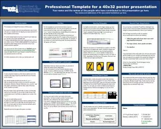
(Figure 9). Figure 4. Figure 10: Original image at 100%, enlarged 200% and 400%. Figure 7. Figure 8. Figure 1. A B. Figure 2. Figure 3. Professional Template for a 40x32 poster presentation

Professional Template for a 40x32 poster presentation
E N D
Presentation Transcript
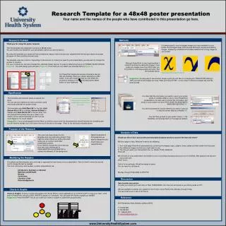
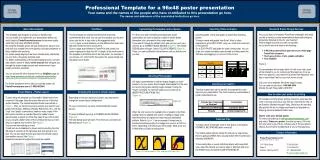
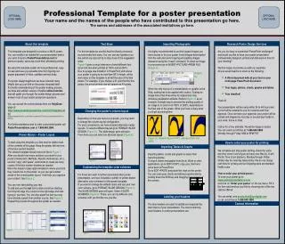
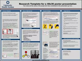
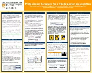
(Figure 9) Figure 4 Figure 10: Original image at 100%, enlarged 200% and 400%. Figure 7 Figure 8 Figure 1 A B Figure 2 Figure 3 Professional Template for a 40x32 poster presentation Your name and the names of the people who have contributed to this presentation go here.The names and addresses of the associated institutions go here. Text Fonts and Sizes Importing Photographs Using the College Logo About this template This template was designed to produce a 40x32 poster.You can modify it as needed for your presentation before you send it back to Kirk.Starczewski@esc.edu for premium quality, printing at no cost to you.By using and modifying this template, your poster will look professional, easy to read and save you valuable time from figuring out proper placement of titles, subtitles and text body.For poster design beginners we have included many helpful tips on the poster template itself. You also have the option of sending us the text and images you want to use, and we will help layout the poster with you. For a better understanding of the poster-making process, we offer a series of helpful online tutorials that will guide you through the poster design process. These online tutorials, produced by PosterPresentations.com, answer some common questions in preparing a poster presentation. Go to http://www.posterpresentations.com/html/helpdesk.html (copy and paste this link to your browser or press the F5 key on you keyboard and click on the link) • As part of the college’s branding, there are strict rules on using the college’s logo: • The shield cannot be separated at anytime from the name. • The colors cannot be changed. • The logo cannot be stretched out of proportion. • To enlarge or reduce the logo (or any image/photo piece of art), select the object, and then while holding down the shift key, select one of the corner anchor points and drag on a diagonal to the size you’d like. For this template we use the Arial font family at several recommended text sizes. This is a very legible san serif type. The serif typeface the college uses is Times or New Times Roman. You can use any typeface you like and at any size but try to stay close to the suggested limits. A couple of tips on typefaces: Avoid using ALL CAPS, especially in novelty typefaces. YOU CAN SEE HOW HARD IT IS TO READ THIS WAY (You can see how hard it is to read this way) Try not to use more than two or three typefaces Do not underline. Use Bold type and/oritalics for emphasis Figure 4 gives a visual reference of what different font sizes look like when printed at 100% and at 200%. Due to a page size limitation in PowerPoint and unless your poster is going to be less than 56” in length, all the work done on this template is at half the size of the final poster. For example, if you choose a 21 point font for this poster, the actual printed size will appear as 42 points. It is highly recommended to use the largest images you have access to for your poster. Avoid images downloaded from the Web at 72 dpi and avoid copying and pasting images instead of using the “Insert” command. To insert an image to your poster go to INSERT>PICTURE>FROM FILE (Figure 9). You want images in the 150-300 dpi range if possible. When the only source of a photo or graphic is the Web, scaling has to be applied with caution. Scaling an image more than three times its original size may introduce pixelization artifacts. Refer to figure 10 as an example. A simple way to preview the printing quality of an image is to zoom in at 100% or 200%, depending on the final size of the poster. What you’ll see is likely what you’ll get at printing time. Some Basic College Style Guidelines • As part of the college’s branding, there are preferred ways of referring to the college and its many facets: • It is Empire State College, or the college – never ESC. • Write in first and second person plural, or “we” and “you.” • If copy must appear in third person, use third person plural. • Use “and” not “&”. • Spell out numbers one to nine, numerals after 10. • Times should be listed as lower case, with periods (a.m./p.m.) • Our degrees are associate, bachelor’s and master’s. • Web words get a capital w – Web page, Web site • Non words don’t need a hyphen: nontraditional, nonresident • Avoid exclamation points! Really!! We mean it !!! • Don’t underline. Use bold or italics to emphasize. Poster Basics – Poster Layout To start using this template you first need to delete most of the contents of this page. Keep the poster title and one of the blue section headers.The cleared template should now look like in Figure 1. After you decide how many sections you need for your poster (Introduction, Methods, Results, References, etc.), use the “copy” and “paste” commands to create as many copies of the blue section headers as needed.Move the header copies approximately to where you think they need to be on the poster, so you can get a better sense of the overall poster layout. It will help you organize your content. See Figure 2. You can now start adding your text. To add text use the text tool to draw a text box starting from the left edge of a column to the right edge and start typing in your text. You can also paste the text you may have already copied from another source. See Figure 3.Repeat the process throughout the poster as needed. Importing Tables & Graphs Changing the poster’s column layout Depending on how you layout your poster, you may want to change the column layout configuration. Importing tables, charts and graphs is easier than importing photos. To import charts and graphs from Excel, Word or other applications, go to EDIT>COPY, copy your chart and come back to PowerPoint. Go to EDIT>PASTE and paste the chart on the poster. You can scale your charts and tables proportionally by holding down the Shift key and dragging in or out one of the corners. Poster Session Design Services • Are you too busy or somewhat “PowerPoint-challenged” and would you like to have your poster presentation professionally designed and printed? • We’ll be happy to provide you with our expertise.All you would need is to e-mail us the following: • A Word document with all your text or your multi-page PowerPoint document. • Your logos, photos, charts, graphs and tables. • Your presentation will be laid out and a proof will be e-mailed to you for revisions and final approval. Once we have your approval, your poster will be printed and delivered to the All College Conference. • Call us at x2251 if you have any questions or would like to get started on your poster presentation. • You can e-mail your files and information to Kirk.Starczewski@esc.edu Customizing the template color schemes For those who wish to further personalize their poster presentation, you may want to change the default colors and use your own color scheme. Go to FORMAT>SLIDE DESIGN (Figure 7). The SLIDE DESIGN pane will open. Select COLOR SCHEMES (Figure 8). There, you can try different color schemes until you find the one you like. Just like with typefaces, you you should avoid creating multicolor peacock displays where colors clash and fight one another for attention. Usually, two or three colors suffice. To view the college’s approved colors, check out the the college’s styleguide on ESCNet. Labeling your headers The blue headers are used to identify and separate the main topics of your presentation. The most commonly used headers in poster presentations are: