Download
1 / 11
130 likes | 269 Views
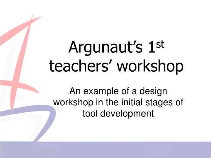
Argunaut’s 1 st teachers’ workshop. An example of a design workshop in the initial stages of tool development. The Digalo discussion tool. Graphical, synchronous e-discussion Ontology of shapes and connectors Small groups of 3-6 discussants Moderated / un-moderated.

E N D
Argunaut’s 1st teachers’ workshop An example of a design workshop in the initial stages of tool development
The Digalo discussion tool • Graphical, synchronous e-discussion • Ontology of shapes and connectors • Small groups of 3-6 discussants • Moderated / un-moderated
Planning the workshop… • The “Hen and Egg” problem • Solution strategy: using mock-ups • Initial awareness indicators selected based on: • Literature review • Pedagogical experience • Mock-up visualizations: • Static vs. animated vs. interactive • Familiar vs. unique/innovative • Amount of data in one graph?
Brief description of the workshop • Questions: What awareness data are needed for effective online moderation of e-discussions? How should these data be presented to the moderator? • Participants: 12 teachers with Digalo classroom experience. • Schedule: • Introduction to the ideas of Argunaut. • Visualization workshop (mock-ups->feedback). • “Free” annotation/evaluation of Digalo maps • Data sources: questionnaires, group discussion, observation sheets
A taste of the visualization workshop… For each of the following displays, please note: • How important/useful is the type information displayed, for moderating Digalo discussions online? • How intuitive/easy to understand was the display of information? (Also Likert scale) • Any comments?
Sample feedback & reflection • Activity 1 > Activity2 • SNA-simple > SNA-full • “Information should be added, like coloring the arrows from one to the others in colors of support/opposition.” (SNA-simple) • “I prefer the user's name to automatically appear inside the circle, the shapes are too abstracted for me.” (SNA-simple) • Information overload, too many shapes. Not suitable for real-time (=on-the-fly) work, requires too much time to process/analyze. (SNA-full) • There are a lot of things you have to know in order to interpret the information. (SNA-full)