Download
1 / 40
400 likes | 425 Views
Explore how to analyze downhill race times through frequency diagrams, histogram creation, and data grouping. Learn to draw conclusions from continuous data for insightful racing performance evaluation.

E N D
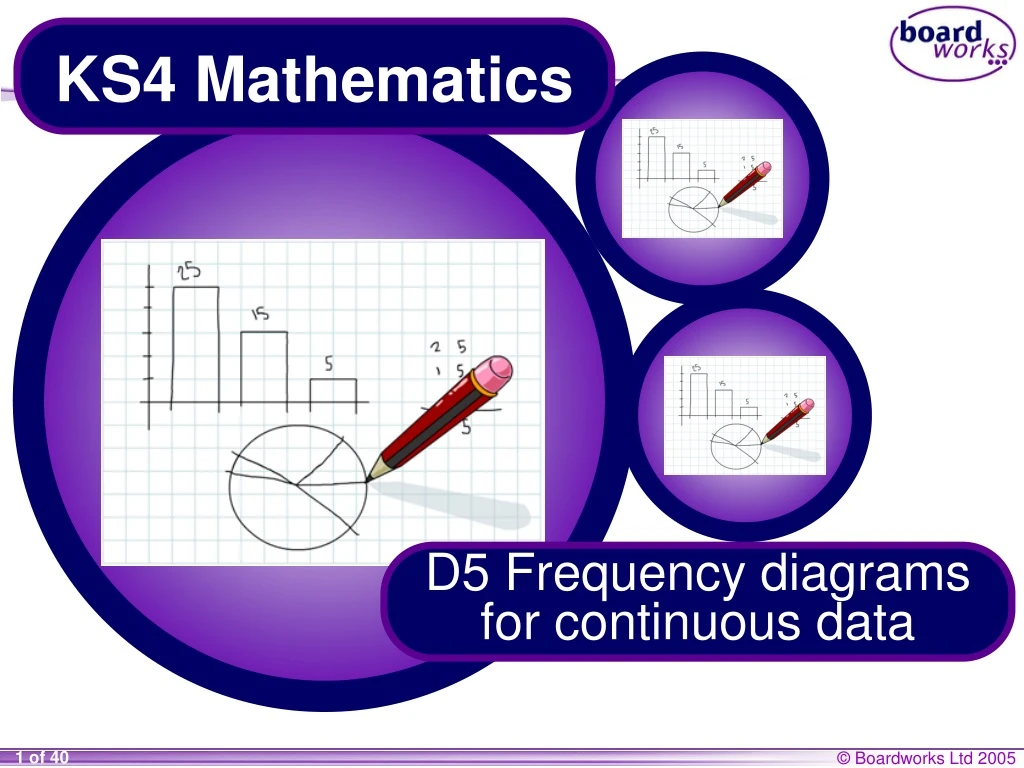
KS4 Mathematics D5 Frequency diagrams for continuous data
D5 Frequency diagrams for continuous data • A Contents D5.2 Frequency diagrams • A D5.3 Frequency polygons • A D5.1 Grouping continuous data D5.4 Histograms • A D5.5 Frequency density • A
Analysing data Tom regularly takes part in downhill cycle races. He records the race times of all the competitors in a race on a spreadsheet. Tom’s best time is 101.6 seconds. How accurately has he measured this time? Is the data continuous or discrete?
Analysing data Here are some race times in seconds from the downhill racing event. 88.491.592.193.393.994.795.0 95.395.5 95.695.696.396.596.997.097.097.097.3 97.497.497.797.898.098.298.298.498.4 98.598.999.099.199.699.699.8100.0 100.6 100.6101.1101.4101.4101.5101.6101.6101.8101.9 102.1102.5102.6102.7103.1103.1103.1104.1105.0 105.2105.6105.6105.7105.8105.9 • If you wanted to analyze the performances, what could you do with the data? • How easy is the data to analyze in this format? Can you draw any conclusions?
110.0 105.0 100.0 95.0 90.0 85.0 80.0 Choosing the right graph In a piece of GCSE coursework, a student used a spreadsheet program to produce a graph of the race data. This is the graph he printed. What labels could be added to the axes? What does the graph show? Is it an appropriate graph?
Grouping data A list of results is called a data set. It is often easier to analyze a large data set if the data is put into groups. The widths of the groups are called class intervals. A frequency diagram or histogram can then be drawn. You will need to decide on the size of each class interval so that there are between 5 and 10 class intervals. What is the best size for the class intervals for the race times data?
class intervals 88.491.592.193.393.994.795.0 95.395.5 95.695.696.396.596.997.097.097.097.3 97.497.497.797.898.098.298.298.498.4 98.598.999.099.199.699.699.8100.0 100.6 100.6101.1101.4101.4101.5101.6101.6101.8101.9 102.1102.5102.6102.7103.1103.1103.1104.1105.0 105.2105.6105.6105.7105.8105.9 The times range from about 85 to about 110 seconds. 110 – 85 = 25 seconds. Suppose we decide to use class intervals with a width of 5 seconds. 25 ÷ 5 = 5 class intervals
Notation for class intervals How should the class intervals be written down? What is wrong with this table?
Time in seconds Time in seconds Frequency 85 – 90 but not including 90 85 ≤ t < 90 90 ≤ t < 95 95 ≤ t < 100 100 ≤ t < 105 105 ≤ t < 110 Notation for class intervals Can you explain what the symbols in the middle column mean? 90 – 95 but not including 95 95 – 100 but not including 100 100 – 105 but not including 105 105 – 110 but not including 110
Notation for class intervals 85 ≤ t < 90 means “times larger than or equal to 85 seconds and less than 90 seconds” Another way to say this is “from 85 up to but not including 90” Can you say these in both ways? 1) 90 ≤ t < 95 “times larger than or equal to 90 seconds and less than 95 seconds” or “from 90 up to but not including 95”. 2) 105 ≤ t < 110 “times larger than or equal to 105 seconds and less than 110 seconds” or “from 105 up to but not including 110”.
Time in seconds Frequency 85 ≤ t < 90 90 ≤ t < 95 95 ≤ t < 100 100 ≤ t < 105 105 ≤ t < 110 Class intervals 88.491.592.193.393.994.795.0 95.395.5 95.695.696.396.596.997.097.097.097.3 97.497.497.797.898.098.298.298.498.4 98.598.999.099.199.699.699.8100.0 100.6 100.6101.1101.4101.4101.5101.6101.6101.8101.9 102.1102.5102.6102.7103.1103.1103.1104.1105.0 105.2105.6105.6105.7105.8105.9 1 Use the data to fill in the table. 5 28 19 7
D5 Frequency diagrams for continuous data D5.1 Grouping continuous data • A Contents • A D5.3 Frequency polygons • A D5.2 Frequency diagrams D5.4 Histograms • A D5.5 Frequency density • A
Heights of students 35 30 25 20 Frequency 15 10 5 0 155 160 165 170 175 180 185 150 Height (cm) Frequency diagrams Frequency diagrams can be used to display grouped continuous data. For example, this frequency diagram shows the distribution of heights for a group of students: This type of frequency diagram is often called a histogram.
The highest and lowest possible times in each interval go at either end of the bar, as shown below: 80 85 90 Drawing frequency diagrams When drawing frequency diagrams for grouped continuous data, remember the following points: • The class intervals go on the horizontal axis. • The frequencies go on the vertical axis. • The bars must be joined together, to indicate that the data is continuous.
30 25 20 Frequency 15 10 5 0 80 85 90 95 100 105 Times in seconds Frequency diagram of cycling data The cycling data we looked at earlier can be displayed in the following frequency diagram: What conclusions can you draw from the graph?
20 15 Frequency 10 5 0 85 87.5 90 92.5 95 97.5 100 102.5 105 107.5 Times in seconds Changing the class interval When the class intervals are changed, the same data produces the following graph: • What size class intervals have been used? • What additional information is available from this graph? • Which graph is more useful?
D5 Frequency diagrams for continuous data D5.1 Grouping continuous data • A Contents D5.2 Frequency diagrams • A • A D5.3 Frequency polygons D5.4 Histograms • A D5.5 Frequency density • A
Midpoints As well as a frequency diagram, it might also be appropriate to construct a frequency polygon. This plots the midpoints of each bar and joins them together. What are the midpoints of each class interval for the race times data? To find the midpoint of two numbers, add them together and divide by 2. 87.5 92.5 97.5 102.5 107.5
30 25 20 Frequency 15 10 5 0 75 80 85 90 95 100 105 110 Times in seconds Line graph of midpoints If we plot the midpoints at the top of each bar and join them together the following graph is produced:
30 30 25 25 20 20 Frequency Frequency 15 15 10 10 5 5 0 0 75 75 80 80 85 85 90 90 95 95 100 100 105 105 110 110 Times in seconds Times in seconds Frequency polygon of cycling data Removing the bars leaves a frequency polygon.
Junior category Senior category 10 20 8 15 6 10 4 5 2 0 0 100 85 90 95 100 105 110 115 120 125 130 135 85 90 95 105 110 115 120 125 135 130 Comparing frequency polygons Here are the race times for two age categories. Juniors are aged from 17 to 18 and seniors are aged from 19 to 30. For each category, find • the size of the class intervals • the modal class interval • the range. Compare the performances in the two categories.
Comparing frequency polygons The same data has been used in these graphs. Junior category Senior category 20 30 20 10 10 0 0 85 95 105 115 125 135 85 95 105 115 125 135 For each category, find • the size of the class intervals • the number of class intervals • the modal class interval. Compare these graphs with the previous ones. Which do you find more useful for analyzing the race times and why?
Comparing sets of data Therange of times for the Junior category is smaller than for the Senior category. This suggests the Seniors are less consistent. Using the first set of graphs, the modal class interval for the Juniors is 95 ≤ t < 100, whereas the modal class interval for the Seniors is 110 ≤ t < 115. Using the second set of graphs, the modal class interval for the Juniors is 95 ≤ t < 105, whereas the modal class interval for the Seniors is 105 ≤ t < 115. This means that on average Juniors are faster than Seniors.
D5 Frequency diagrams for continuous data D5.1 Grouping continuous data • A Contents D5.2 Frequency diagrams • A D5.3 Frequency polygons • A D5.4 Histograms • A D5.5 Frequency density • A
12 10 8 Frequency 6 4 2 0 95 100 105 110 115 120 125 130 135 Time in seconds Histograms This frequency diagram represents the race times for the Youth category, which is for 14 to 16 year olds. There are __ times as many people in the 105 ≤ t < 110 interval as there are in the 95 ≤ t < 100 interval. 3 How many people are represented by each square on the grid?
12 10 8 Frequency 6 4 2 0 95 100 105 110 115 120 125 130 135 Time in seconds Histograms Discuss this statement. Do you agree or disagree? “If a bar is twice as high as another, the area will be twice as big and so the frequency will be twice the size.”
12 10 8 Frequency 6 4 2 0 95 100 105 110 115 120 125 130 135 Time in seconds Combining intervals Some of the intervals are very small, which makes any conclusions about them unreliable. It is sometimes sensible to combine intervals together. Which intervals would you combine?
12 10 8 Frequency 6 4 2 0 95 100 105 110 115 120 125 130 135 Time in seconds Histograms with bars of unequal width This graph represents the same data as the previous one. What has changed? The first two intervals both had a frequency of 2. The first bar now represents an interval twice as big. How many people are in this interval? How many people does one square represent? Do the numbers along the vertical axis still represent frequency?
Frequency 0 95 100 105 110 115 120 125 130 135 Time in seconds Histograms with bars of unequal width In the original histogram, the frequency was proportional to the area. Is this still true in the new histogram? The frequency for 105 ≤ t < 110 is the same as the frequency for ___________. 120 ≤ t < 135 Are the areas of the bars the same? Each square stills represents two people. In a histogram, the frequency is equal to the area of the bar.
D5 Frequency diagrams for continuous data D5.1 Grouping continuous data • A Contents D5.2 Frequency diagrams • A D5.3 Frequency polygons • A D5.5 Frequency density D5.4 Histograms • A • A
frequency Height of the bar = width of interval frequencydensity 4 people 95 110 105 Frequency density In a histogram, the frequency is given by the area of each bar. It follows that the height of the bar × the width of the bar must be the area. Therefore, the height must equal the area ÷ the width. The area of the bar gives the frequency and so we can write, This height is called the frequency density.
Frequency density = 0.4 frequency width of interval 4 people 95 110 105 Frequency density In our example, each square represents 2 people. What scale do we need for the vertical axis? Width of interval = 10 Area = 4 Height = 4 ÷ 10 = 0.4 Frequency density = 0.4
2.4 2.0 Time in seconds Frequency density × width Area (frequency) 1.6 Frequency density 1.2 95 ≤ t < 105 0.8 105 ≤ t < 110 0.4 110 ≤ t < 115 0 95 100 105 110 115 120 125 130 135 115 ≤ t < 120 Time in seconds 120 ≤ t < 135 Calculating the frequency We can use the formula, Frequency = frequency density × width of interval to check this scale for the other bars in the graph. 0.4 × 10 4 1.2 × 5 6 1.4 × 5 7 2.2 × 5 11 0.4 × 15 6
Frequency density = Time in seconds Frequency Frequency ÷ width of interval Frequency density frequency 95 ≤ t < 100 8 width of interval 100 ≤ t < 105 5 105 ≤ t < 115 8 115 ≤ t < 130 12 130 ≤ t < 150 2 Calculating the frequency density Complete the table for this data and draw a histogram. 8 ÷ 5 1.6 5 ÷ 5 1.0 8 ÷ 10 0.8 12 ÷ 15 0.8 2 ÷ 20 0.1
1.6 1.4 1.2 1.0 Frequency density 0.8 0.6 0.4 0.2 0 95 100 105 110 115 120 125 130 135 140 145 150 Time in seconds Calculating the frequency density Your histogram should look like this:
8 6 Frequency density 4 2 0 Time in seconds Calculating the class intervals This is a histogram of race times from a longer race. The first bar represents 40 people. The lowest time was 100 seconds. 100 Work out the scale along the bottom and the frequencies for each interval.
Frequency Frequency density Length of interval class interval Calculating the frequency density We can use the formula, Frequency = frequency density × width of interval to complete the following table for the data in the histogram. 40 1 40 ÷ 1= 40 100 ≤ t < 140 4 × 40 = 160 4 40 140 ≤ t < 180 80 × 6 = 480 6 80 180 ≤ t < 260 20 × 5 = 100 5 20 260 ≤ t < 280 20 × 3 = 60 3 20 280 ≤ t < 300
Review Write a definition of each word below and then design a mind map outlining the key facts you have learnt. • data set • class interval • midpoint • range • axes • frequency diagram • frequency • frequency polygon • modal class interval • histogram • frequency density Include methods for calculating and drawing; possible mistakes to avoid …