Download
1 / 16
160 likes | 285 Views
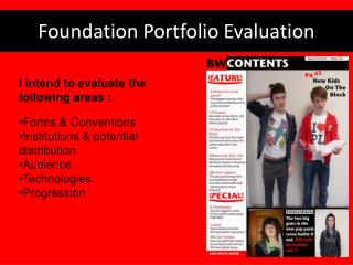
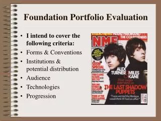
As Media Foundation Portfolio . Music Magazine Evaluation Brett Whittaker Further Information. Conventions - Cover. Image that directly addresses the audience Header/footer Masthead Cover-lines Left Third Barcode. Conventions - Cover.

E N D
As Media Foundation Portfolio Music Magazine Evaluation Brett Whittaker Further Information
Conventions - Cover Image that directly addresses the audience Header/footer Masthead Cover-lines Left Third Barcode
Conventions - Cover Masthead- a large graphic used to depict the title of the magazine . Here I opted for a highly distressed font as I felt it had clear links to the teenage alternative audience. Strapline – a quick summary line that indicates what the magazine is about. ‘The sole voice of alternative music’ clearly indicates the genre and audience of the magazine Cover lines – give an indication of the articles in the magazine. I have used vastly different fonts for each of these giving a unique look and help clarify the difference between articles, bands and the masthead. To further differentiate articles I used of range of colours and sizes as an indication of their importance in the magazine Image – Large image which directly addresses the audience. Model’s clothing and props suggest the alternative genre to which it is being marketed. The pose of the model also furthers the magazines motif of rebellion. Header/Footer – used to give additional information on the articles inside, typically ones that carry less importance. In this case other bands featured in the magazine are listed. Further articles are listed also, using a graffiti splat to fit with the rebellious theme. When designing my cover I drew inspiration from these conventions for my own cover:
Conventions - Contents Contents table ‘Screen shots’ of later articles Images from featured articles Links to cover
Conventions - Contents “In this issue” – The largest text on the page clearly indicates the readers location in the magazine. Using a distressed font to link to the audience. Links to cover – The magazine’s masthead is repeated at the top of the contentsas well as the date. A screenshot of the cover has also been used. All of these features help build an authentic house style that thematically link the cover and contents. Contents Table– The table is split with frequent articles being smaller and in their own table. They are also lack descriptions. Contents Table (Featured) – This table takes the majority of the page; including images, descriptions and pull quotes. This added detail is because these are the most interesting articles of magazine, especially to new readers. Editorial – The editorial gives a preface for the magazine, introducing some of the featured articles and setting the tone for the magazine in general. Eye-catching Graphics – The ‘Explosive Plosive’ logo is large and has a vastly contrasting colour to the rest of the magazine, this helps attract readers to the featured article immediately. Colour scheme – To maintain the aesthetic of magazine the cover share the same colours.
Conventions - DPS Unique aesthetic Pull Quotes Drop Cap Standfirst
DPS House Style – While having a unique design there are still elements of the magazines theme, occasionally using the same colour scheme and fonts to give cohesion with earlier articles. Unique aesthetic – The design of the of article contrasts massively to the previous two pages; this was to give a design that characterised the band as well as indicate the article. Being an interview with the bands female singer I chose to use a cleaner, more feminine look, while still keeping the bands explosive look. Additional images – Breaks up the text to prevent the text becoming monotonous, using a pose intended to relate to the audience. Another image links to the purpose of the article, being a mock up of the featured album cover. Standfirst – A succinct introduction to the article using language relevant to the band’s motif, ‘volatile’, in order to create interest in the article. Large image – The use of one large image, which directly engages the reader, helps attract the eye to the article. The positioning and framing also lead the eye to the band name and standfirst. Pull Quote – The text used is intended to intriguing. It is also chosen to appeal to the magazines target audience by having a subtext of rebellion.
Audience Teenagers – My magazine is targeted at readers in their late teens or early adulthood i.e 17-25. This done by using similarly aged models/bands. Gender – I tried to appeal to both genders, focusing mainly to target by genre instead. For example, the colour scheme has quite masculine elements (Black, Blue, Green; explosions) whereas the article is much more feminine, being mostly white with a female model. Music – The genre being targeted is alternative music. This is reflected in the design of the magazine, featuring thematic elements related to bands from two-tone (w.o.b), punk (graffiti splats), ska (checkerboards), and metal (fire) genres.
Representation of Social Groups Teenagers – My magazine has a subtext of rebellion, be it in the band names or design. While this plays slightly to the stereotypes of teenagers and the music they listen to being aggressive; potentially propagating stigma, is something my magazine does not encourage. Women – My featured article is an interview with a female artist, portraying them neutrally; there would be little difference in design or content if it were an interview with a male or group. Musicians – My article describes the experiences of a musician, suggesting a depth in the industry which people may not consider.
Publishers • While researching existing magazines I found that there are several companies that may distribute a magazine. • Bauer Media Group publishes many of the more popular magazines on sale. They are responsible for the distribution of both Q and Kerrang! Magazines that deal in somewhat broad genres and are highly marketable. • Future Publishing is specialist interest publisher, focusing on the more niche subjects for their magazines. Their music magazines, Total Guitar for example, are marketed at aspiring musicians. • I would see my magazine being more fitting for Future, as it contains elements that require some musical knowledge: • There are mentions of guitar reviews and tips on how to improve sound and recording. • While not being targeted at any specific type of musician, those with a passing interest may find some of this content meaningless. • Bauer – That being said, there are still elements that may interest Bauer; the range of genres, gender and age make the magazine easy to market.
Technology • Image editing – While I had edited images before, I had never done it as excessively as I did while creating the magazine pieces. • I had to learn to how to extract a subject from its background; a skill I found invaluable, as many of my shots would have looked unprofessional without doing so. • I leant to ‘touch up’ images, removing un-wanted elements such as blemishes or jewelry as well as learning how to digitally enhance the colours of an image. • Graphic Editing – Again I had some experience in graphic editing prior to this course but, much like with photo editing, I had never done anything this involving. • I had to learn how to manage layers and brush styles in order to create the design for the cover and create the fire graphic for band’s logo. • To create my designs I used a combination of GIMP – an open source piece of image editing software, Pixelmatorand Serif Draw, as the more professional Adobe Suites were unavailable After Before
Preliminary Comparison Cover There is a clear progression from my preliminary task to my final piece. The final design is far more sophisticated, implementing a greater range of conventions. My preliminary cover doesn’t make use of the left third at all. The image choice was poor, as the model doesn’taddress the audience and the overall image is blurry. The colour scheme is also poor, with the cover lines blending with the background making them difficult to read. This progression has came about through a greater understanding of magazine conventions, which has developed through research and study. This allowed me to better implement the features of existing magazines. My designs have also improved as my skills with Serif and GIMP progressed, allowing me to create what I wouldn’t have been able to previously.
Preliminary ComparisonContents Similarly to the cover pieces, there is a clear improvement in the final contents when compared to the preliminary design. There is a much more professional use of fonts, with the preliminary having vastly differing sizes and positions. Space is used to a much greater effect in the final draft with it being far busier and giving a more professional design. The design of the preliminary contents is much simpler, a factor caused by my basic knowledge of the graphic design program. The progression made is once again due to the additional research and study into magazine conventions, while at the same time building my design skills to be able to recreate them.
Audience Feedback After completing the final drafts, I progressed to seeking feedback through a questionnaire which I made available on social media sites. This helped me ensure that my survey would be answered by those in my target audience; users of social media websites are typically between 17 and 25. The first question asked if the design of the magazine was professional. 92% agreed, 41% of which strongly agreed. Only 8% disagreed. Facebook user statistics
Audience Feedback They were then asked how likely they were to purchase the magazine if it were for sale. 88% of those asked gave positive responses (Probably or better).
Audience FeedbackAnalysis Looking at the results from my audience feedback, there is a mostly positive response. The 92% of people that thought the design was professional helps to indicate that the conventions used in my design are appropriate. And the 88% that considered buying the magazine support this. The negative feedback, due to its small numbers, maybe because those asked were not part of my target audience – While the majority of social media users fit into my age range, it doesn’t rule out that those out side of the age range still use them, and so they too may have answered. To further this point, not all of those in my age range will like the genre of music that my magazine is aimed at.